- A+
前言
树形下拉菜单是许多WPF应用程序中常见的用户界面元素,它能够以分层的方式展示数据,提供更好的用户体验。本文将深入探讨如何基于WPF创建一个可定制的树形下拉菜单控件,涵盖从原理到实际实现的关键步骤。
一、需求分析
树形下拉菜单控件的核心是将ComboBox与TreeView结合起来,以实现下拉时的树状数据展示。在WPF中,可以通过自定义控件模板、样式和数据绑定来实现这一目标。
我们首先来分析一下ComboBox控件的模板。
<ControlTemplate x:Key="ComboBoxTemplate" TargetType="{x:Type ComboBox}"> <Grid x:Name="templateRoot" SnapsToDevicePixels="true"> <Grid.ColumnDefinitions> <ColumnDefinition Width="*"/> <ColumnDefinition MinWidth="{DynamicResource {x:Static SystemParameters.VerticalScrollBarWidthKey}}" Width="0"/> </Grid.ColumnDefinitions> <Popup x:Name="PART_Popup" AllowsTransparency="true" Grid.ColumnSpan="2" IsOpen="{Binding IsDropDownOpen, Mode=TwoWay, RelativeSource={RelativeSource Mode=TemplatedParent}}" Margin="1" Placement="Bottom" PopupAnimation="{DynamicResource {x:Static SystemParameters.ComboBoxPopupAnimationKey}}"> <theme:SystemDropShadowChrome x:Name="shadow" Color="Transparent" MinWidth="{Binding ActualWidth, ElementName=templateRoot}" MaxHeight="{TemplateBinding MaxDropDownHeight}"> <Border x:Name="dropDownBorder" Background="{DynamicResource {x:Static SystemColors.WindowBrushKey}}" BorderBrush="{DynamicResource {x:Static SystemColors.WindowFrameBrushKey}}" BorderThickness="1"> <ScrollViewer x:Name="DropDownScrollViewer"> <Grid x:Name="grid" RenderOptions.ClearTypeHint="Enabled"> <Canvas x:Name="canvas" HorizontalAlignment="Left" Height="0" VerticalAlignment="Top" Width="0"> <Rectangle x:Name="opaqueRect" Fill="{Binding Background, ElementName=dropDownBorder}" Height="{Binding ActualHeight, ElementName=dropDownBorder}" Width="{Binding ActualWidth, ElementName=dropDownBorder}"/> </Canvas> <ItemsPresenter x:Name="ItemsPresenter" KeyboardNavigation.DirectionalNavigation="Contained" SnapsToDevicePixels="{TemplateBinding SnapsToDevicePixels}"/> </Grid> </ScrollViewer> </Border> </theme:SystemDropShadowChrome> </Popup> <ToggleButton x:Name="toggleButton" Background="{TemplateBinding Background}" BorderBrush="{TemplateBinding BorderBrush}" BorderThickness="{TemplateBinding BorderThickness}" Grid.ColumnSpan="2" IsChecked="{Binding IsDropDownOpen, Mode=TwoWay, RelativeSource={RelativeSource Mode=TemplatedParent}}" Style="{StaticResource ComboBoxToggleButton}"/> <ContentPresenter x:Name="contentPresenter" ContentStringFormat="{TemplateBinding SelectionBoxItemStringFormat}" ContentTemplate="{TemplateBinding SelectionBoxItemTemplate}" Content="{TemplateBinding SelectionBoxItem}" ContentTemplateSelector="{TemplateBinding ItemTemplateSelector}" HorizontalAlignment="{TemplateBinding HorizontalContentAlignment}" IsHitTestVisible="false" Margin="{TemplateBinding Padding}" SnapsToDevicePixels="{TemplateBinding SnapsToDevicePixels}" VerticalAlignment="{TemplateBinding VerticalContentAlignment}"/> </Grid> </ControlTemplate>
从以上代码可以看出,其中的Popup控件就是下拉部分,那么按照常理,我们在Popup控件中放入一个TreeView控件即可实现该需求,但是现实情况远没有这么简单。我们开发一个控件,不仅要从外观上实现功能,还需要考虑数据绑定、事件触发、自定义模板等方面的问题,显然,直接放置一个TreeView控件虽然也能实现功能,但是从封装的角度看,它并不优雅,使用也不方便。那么有没有更好的方法满足以上需求呢?下面提供另一种思路,其核心思想就是融合ComboBox控件与TreeView控件模板,让控件既保留TreeView的特性,又拥有ComboBox的外观。
二、代码实现
2.1 编辑TreeView模板;
2.2 提取ComboBox的模板代码;
2.3 将ComboBox的模板代码移植到TreeView模板中;
2.4 将TreeView模板包含ItemsPresenter部分的关键代码放入ComboBox模板中的Popup控件内;
以下为融合后的xaml代码
<ControlTemplate TargetType="{x:Type local:TreeComboBox}"> <Grid x:Name="templateRoot" SnapsToDevicePixels="true"> <Grid.ColumnDefinitions> <ColumnDefinition Width="*" /> <ColumnDefinition Width="0" MinWidth="{DynamicResource {x:Static SystemParameters.VerticalScrollBarWidthKey}}" /> </Grid.ColumnDefinitions> <Popup x:Name="PART_Popup" Grid.ColumnSpan="2" MaxHeight="{TemplateBinding MaxDropDownHeight}" Margin="1" AllowsTransparency="true" IsOpen="{Binding IsDropDownOpen, Mode=TwoWay, RelativeSource={RelativeSource Mode=TemplatedParent}}" Placement="Bottom" PopupAnimation="{DynamicResource {x:Static SystemParameters.ComboBoxPopupAnimationKey}}"> <Border x:Name="PART_Border" Width="{Binding RelativeSource={RelativeSource AncestorType=local:TreeComboBox}, Path=ActualWidth}" Background="{DynamicResource {x:Static SystemColors.WindowBrushKey}}" BorderBrush="{DynamicResource {x:Static SystemColors.WindowFrameBrushKey}}" BorderThickness="1" SnapsToDevicePixels="true"> <ScrollViewer x:Name="_tv_scrollviewer_" Padding="{TemplateBinding Padding}" Background="{TemplateBinding Background}" CanContentScroll="false" Focusable="false" HorizontalScrollBarVisibility="{TemplateBinding ScrollViewer.HorizontalScrollBarVisibility}" SnapsToDevicePixels="{TemplateBinding SnapsToDevicePixels}" VerticalScrollBarVisibility="{TemplateBinding ScrollViewer.VerticalScrollBarVisibility}"> <ItemsPresenter /> </ScrollViewer> </Border> </Popup> <ToggleButton x:Name="toggleButton" Grid.ColumnSpan="2" Background="{TemplateBinding Background}" BorderBrush="{TemplateBinding BorderBrush}" BorderThickness="{TemplateBinding BorderThickness}" IsChecked="{Binding IsDropDownOpen, Mode=TwoWay, RelativeSource={RelativeSource Mode=TemplatedParent}}" Style="{StaticResource ComboBoxToggleButton}" /> <ContentPresenter x:Name="contentPresenter" Margin="{TemplateBinding Padding}" HorizontalAlignment="{TemplateBinding HorizontalContentAlignment}" VerticalAlignment="{TemplateBinding VerticalContentAlignment}" Content="{TemplateBinding SelectionBoxItem}" ContentTemplate="{TemplateBinding SelectionBoxItemTemplate}" IsHitTestVisible="False" /> </Grid> <ControlTemplate.Triggers> <Trigger Property="IsEnabled" Value="false"> <Setter TargetName="PART_Border" Property="Background" Value="{DynamicResource {x:Static SystemColors.ControlBrushKey}}" /> </Trigger> <Trigger Property="VirtualizingPanel.IsVirtualizing" Value="true"> <Setter TargetName="_tv_scrollviewer_" Property="CanContentScroll" Value="true" /> </Trigger> <MultiTrigger> <MultiTrigger.Conditions> <Condition Property="IsGrouping" Value="true" /> <Condition Property="VirtualizingPanel.IsVirtualizingWhenGrouping" Value="false" /> </MultiTrigger.Conditions> <Setter Property="ScrollViewer.CanContentScroll" Value="false" /> </MultiTrigger> </ControlTemplate.Triggers> </ControlTemplate>
以下为使用控件的代码。
<TreeComboBox Width="315" MinHeight="30" Padding="5" HorizontalAlignment="Center" VerticalAlignment="Top" VerticalContentAlignment="Stretch" IsAutoCollapse="True" ItemsSource="{Binding Collection}"> <TreeComboBox.SelectionBoxItemTemplate> <ItemContainerTemplate> <Border> <TextBlock VerticalAlignment="Center" Text="{Binding Property1}" /> </Border> </ItemContainerTemplate> </TreeComboBox.SelectionBoxItemTemplate> <TreeComboBox.ItemTemplate> <HierarchicalDataTemplate ItemsSource="{Binding Collection}"> <TextBlock Margin="5,0,0,0" VerticalAlignment="Center" Text="{Binding Property1}" /> </HierarchicalDataTemplate> </TreeComboBox.ItemTemplate> </TreeComboBox>
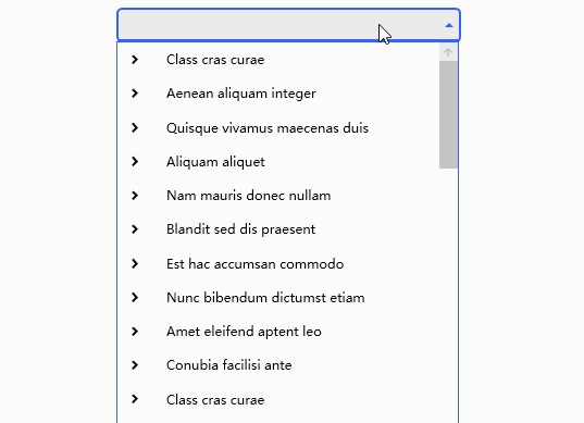
三、运行效果
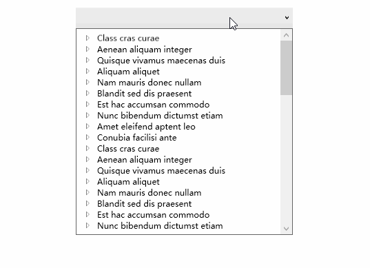
3.1 单选效果
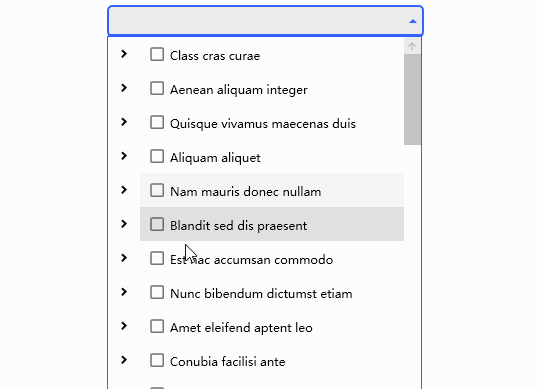
3.2 多选效果
四、个性化外观
当控件默认外观无法满足需求时,我们可以通过编辑样式的方式来实现个性化外观,也可以引用第三方UI库样式,以下为使用MaterialDesign的效果。
4.1 单选效果
4.2 多选效果