- A+
其他章节请看:
表格
有一种页面在后台系统中比较常见:页面分上下两部分,上部分是 input、select、时间等查询项,下部分是查询项对应的表格数据。包含增删改查,例如点击新建进行新增操作。就像这样:


本篇将对 ant 的表格进行封装。效果如下:

spug 中 Table 封装的分析
入口
我们选择 spug 比较简单的模块(角色管理)进行分析。

进入角色管理模块入口,发现表格区封装到模块当前目录的 Table.js 中:
// spugsrcpagessystemroleindex.js import ComTable from './Table'; export default observer(function () { return ( <AuthDiv auth="system.role.view"> <Breadcrumb> <Breadcrumb.Item>首页</Breadcrumb.Item> <Breadcrumb.Item>系统管理</Breadcrumb.Item> <Breadcrumb.Item>角色管理</Breadcrumb.Item> </Breadcrumb> {/* 查询区域 */} <SearchForm> <SearchForm.Item span={8} title="角色名称"> <Input allowClear value={store.f_name} onChange={e => store.f_name = e.target.value} placeholder="请输入"/> </SearchForm.Item> </SearchForm> {/* 将表格区域封装到了 Table.js 中 */} <ComTable/> </AuthDiv> ); }) 查阅 Table.js 发现表格使用的是 components 中的 TableCard。
// spugsrcpagessystemroleTable.js import { TableCard, ... } from 'components'; @observer class ComTable extends React.Component { ... render() { return ( <TableCard rowKey="id" title="角色列表" loading={store.isFetching} dataSource={store.dataSource} onReload={store.fetchRecords} actions={[ <AuthButton type="primary" icon={<PlusOutlined/>} onClick={() => store.showForm()}>新建</AuthButton> ]} pagination={{ showSizeChanger: true, showLessItems: true, showTotal: total => `共 ${total} 条`, pageSizeOptions: ['10', '20', '50', '100'] }} columns={this.columns}/> ) } } export default ComTable 进一步跟进不难发现 TableCard.js 就是 spug 中 封装好的 Table 组件。
Tip: vscode 搜索 TableCard, 发现有 17 处,推测至少有 16 个模块使用的这个封装好的 Table 组件
表格封装的组件
下面我们来分析spug 中表格分装组件:TableCard。
TableCard 从界面上分三部分:头部、表格主体(包含分页器)、Footer。请看代码:
// spugsrccomponentsTableCard.js return ( <div ref={rootRef} className={styles.tableCard} style={{ ...props.customStyles }}> {/* 头部。例如表格标题 */} <Header title={props.title} columns={columns} actions={props.actions} fields={fields} rootRef={rootRef} defaultFields={defaultFields} onFieldsChange={handleFieldsChange} onReload={props.onReload} /> {/* 表格主体,包含分页。如果没数据分页器页不会显示 */} <Table tableLayout={props.tableLayout} scroll={props.scroll} rowKey={props.rowKey} loading={props.loading} columns={columns.filter((_, index) => fields.includes(index))} dataSource={props.dataSource} rowSelection={props.rowSelection} expandable={props.expandable} size={props.size} onChange={props.onChange} // 分页器 pagination={props.pagination} /> {/* Footer 根据props.selected 来显示,里面显示`选择了几项...` */} {selected.length ? <Footer selected={selected} actions={batchActions} /> : null} </div> ) 头部
头部分三部分,左侧是表格的标题,中间是是一些操作,例如新增、批量删除等,右侧是表格的操作。如下图所示:

右侧表格操作也有三部分:刷新表格、列展示、表格全屏。
Tip:表格刷新很简单,就是调用父组件的 reload 重新发请求。
全屏
表格全屏也很简单,利用的是浏览器原生支持的功能。
// 全屏操作。使用浏览器自带全屏功能 function handleFullscreen() { // props.rootRef.current 是表格组件的原始 Element // fullscreenEnabled 属性提供了启用全屏模式的可能性。当它的值是 false 的时候,表示全屏模式不可用(可能的原因有 "fullscreen" 特性不被允许,或全屏模式不被支持等)。 if (props.rootRef.current && document.fullscreenEnabled) { // 如果处在全屏。 // fullscreenElement 返回当前文档中正在以全屏模式显示的Element节点,如果没有使用全屏模式,则返回null. if (document.fullscreenElement) { document.exitFullscreen() } else { props.rootRef.current.requestFullscreen() } } } 
列展示
比如取消描述信息,表格中将不会显示该列。效果如下图所示:

这个过程不会发送请求。
整个逻辑如下:
- 父组件会给
<Header>组件传入 columns、fields、onFieldsChange、defaultFields等属性方法。
<Header title={props.title} columns={columns} actions={props.actions} fields={fields} rootRef={rootRef} defaultFields={defaultFields} onFieldsChange={handleFieldsChange} onReload={props.onReload} /> 绿框的 checkbox 由传入的 columns 决定列展示由传入的 columns 和 fields 决定,当选中的个数(fields)等于 columns 的个数,则全选重置主要针对 fields,页面一进来就会取到默认选中字段。
表格主体
表格主体就是调用 antd 中的 Table 组件:
注: antd 中的 Table 有许多属性,这里只对外暴露有限个 antd 表格属性,这种做法不是很好。
<Table // 表格元素的 table-layout 属性,例如可以实现`固定表头/列` tableLayout={props.tableLayout} // 表格是否可滚动 scroll={props.scroll} // 表格行 key 的取值,可以是字符串或一个函数。spug 中 `rowKey="id"` 重现出现在 29 个文件中。 rowKey={props.rowKey} // 加载中的 loading 效果 loading={props.loading} // 表格的列。用户可以选择哪些列不显示 columns={columns.filter((_, index) => fields.includes(index))} // 数据源 dataSource={props.dataSource} // 表格行是否可选择,配置项(object)。可以不传 rowSelection={props.rowSelection} // 展开功能的配置。可以不传 expandable={props.expandable} // 表格大小 default | middle | small size={props.size} // 分页、排序、筛选变化时触发 onChange={props.onChange} // 分页器,参考配置项或 pagination 文档,设为 false 时不展示和进行分页 pagination={props.pagination} /> 尾部
根据父组件的 selected 决定是否显示 Footer:
{/* selected 来自 props,在 Footer 组件中显示选中了多少项等信息,spug 中没有使用到 */} {selected.length ? <Footer selected={selected} actions={batchActions} /> : null} Footer 主要显示已选择...,spug 中出现得很少:
function Footer(props) { const actions = props.actions || []; const length = props.selected.length; return length > 0 ? ( <div className={styles.tableFooter}> <div className={styles.left}>已选择 <span>{length}</span> 项</div> <Space size="middle"> {actions.map((item, index) => ( <React.Fragment key={index}>{item}</React.Fragment> ))} </Space> </div> ) : null } TableCard.js
spug 中表格封装的完整代码如下:
// spugsrccomponentsTableCard.js import React, { useState, useEffect, useRef } from 'react'; import { Table, Space, Divider, Popover, Checkbox, Button, Input, Select } from 'antd'; import { ReloadOutlined, SettingOutlined, FullscreenOutlined, SearchOutlined } from '@ant-design/icons'; import styles from './index.module.less'; // 从缓存中取得之前设置的列。记录要隐藏的字段。比如之前将 `状态` 这列隐藏 let TableFields = localStorage.getItem('TableFields') TableFields = TableFields ? JSON.parse(TableFields) : {} function Search(props) { // ... } // 已选择多少项。 function Footer(props) { const actions = props.actions || []; const length = props.selected.length; return length > 0 ? ( <div className={styles.tableFooter}> <div className={styles.left}>已选择 <span>{length}</span> 项</div> <Space size="middle"> {actions.map((item, index) => ( <React.Fragment key={index}>{item}</React.Fragment> ))} </Space> </div> ) : null } function Header(props) { // 表格所有的列 const columns = props.columns || []; // 例如创建、批量删除等操作 const actions = props.actions || []; // 选中列,也就是表格要显示的列 const fields = props.fields || []; // 取消或选中某列时触发 const onFieldsChange = props.onFieldsChange; // 列展示组件 const Fields = () => { return ( // value - 指定选中的选项 string[] // onChange- 变化时的回调函数 function(checkedValue)。 // 例如取消`状态`这列的选中 <Checkbox.Group value={fields} onChange={onFieldsChange}> {/* 展示所有的列 */} {columns.map((item, index) => ( // 注:值的选中是根据索引来的,因为 columns 是数组,是有顺序的。 <Checkbox value={index} key={index}>{item.title}</Checkbox> ))} </Checkbox.Group> ) } // 列展示 - 全选或取消全部 function handleCheckAll(e) { if (e.target.checked) { // 例如:[0, 1, 2, 3] // console.log('columns', columns.map((_, index) => index)) onFieldsChange(columns.map((_, index) => index)) } else { onFieldsChange([]) } } // 全屏操作。使用浏览器自带全屏功能 function handleFullscreen() { // props.rootRef.current 是表格组件的原始 Element // fullscreenEnabled 属性提供了启用全屏模式的可能性。当它的值是 false 的时候,表示全屏模式不可用(可能的原因有 "fullscreen" 特性不被允许,或全屏模式不被支持等)。 if (props.rootRef.current && document.fullscreenEnabled) { // 如果处在全屏。 // fullscreenElement 返回当前文档中正在以全屏模式显示的Element节点,如果没有使用全屏模式,则返回null. if (document.fullscreenElement) { // console.log('退出全屏') document.exitFullscreen() } else { // console.log('全屏该元素') props.rootRef.current.requestFullscreen() } } } // 头部分左右两部分:表格标题 和 options。options 又分两部分:操作项(例如新建、批量删除)、表格操作(刷新表格、表格列显隐控制、表格全屏控制) return ( <div className={styles.toolbar}> <div className={styles.title}>{props.title}</div> <div className={styles.option}> {/* 新建、删除等项 */} <Space size="middle" style={{ marginRight: 10 }}> {actions.map((item, index) => ( // 这种用法有意思 <React.Fragment key={index}>{item}</React.Fragment> ))} </Space> {/* 如果有新建等按钮就得加一个分隔符 | */} {actions.length ? <Divider type="vertical" /> : null} {/* 表格操作:刷新表格、表格列显隐控制、表格全屏控制 */} <Space className={styles.icons}> {/* 刷新表格 */} <ReloadOutlined onClick={props.onReload} /> {/* 控制表格列的显示,比如让`状态`这列隐藏 */} <Popover arrowPointAtCenter destroyTooltipOnHide={{ keepParent: false }} // 头部:列展示、重置 title={[ <Checkbox key="1" // 全选状态。选中的列数 === 表格中定义的列数 checked={fields.length === columns.length} // 在实现全选效果时,你可能会用到 indeterminate 属性。 // 设置 indeterminate 状态,只负责样式控制 indeterminate={![0, columns.length].includes(fields.length)} onChange={handleCheckAll}>列展示</Checkbox>, // 重置展示最初的列,也就是页面刚进来时列展示的状态。localStorage 会记录对表格列展示的状态。 <Button key="2" type="link" style={{ padding: 0 }} onClick={() => onFieldsChange(props.defaultFields)}>重置</Button> ]} overlayClassName={styles.tableFields} // 触发方式是 click trigger="click" placement="bottomRight" // 卡片内容 content={<Fields />}> <SettingOutlined /> </Popover> {/* 表格全屏控制 */} <FullscreenOutlined onClick={handleFullscreen} /> </Space> </div> </div> ) } function TableCard(props) { // 定义一个 ref,用于表格的全屏控制 const rootRef = useRef(); // Footer 组件中使用 const batchActions = props.batchActions || []; // Footer 组件中使用 const selected = props.selected || []; // 记录要展示的列 // 例如全选则是 [0, 1, 2, 3 ...],空数组表示不展示任何列 const [fields, setFields] = useState([]); // 用于列展示中的重置功能。页面一进来就会将选中的列进行保存 const [defaultFields, setDefaultFields] = useState([]); // 用于保存传入的表格的列数据 const [columns, setColumns] = useState([]); useEffect(() => { // _columns - 传入的列数据 let [_columns, _fields] = [props.columns, []]; // `角色名称`这种功能 props.children 是空。 if (props.children) { if (Array.isArray(props.children)) { _columns = props.children.filter(x => x.props).map(x => x.props) } else { _columns = [props.children.props] } } // 隐藏字段。有 hide 属性的是要隐藏的字段。如果有 tKey 字段,隐藏字段则以缓存的为准 let hideFields = _columns.filter(x => x.hide).map(x => x.title) // tKey 是表格标识,比如这个表要隐藏 `状态` 字段,另一个表格要隐藏 `地址` 字段,与表格初始列展示对应。 // 如果表格有唯一标识(tKey),再看TableFields(来自localStorage)中是否有数据,如果没有则更新缓存 if (props.tKey) { if (TableFields[props.tKey]) { hideFields = TableFields[props.tKey] } else { TableFields[props.tKey] = hideFields localStorage.setItem('TableFields', JSON.stringify(TableFields)) } } // Array.prototype.entries() 方法返回一个新的数组迭代器对象,该对象包含数组中每个索引的键/值对。 for (let [index, item] of _columns.entries()) { // 比如之前将 `状态` 这列隐藏,输出:hideFields ['状态'] // console.log('hideFields', hideFields) if (!hideFields.includes(item.title)) _fields.push(index) } // setFields(_fields); // 将传入的列数据保存在 state 中 setColumns(_columns); // 记录初始展示的列 setDefaultFields(_fields); // eslint-disable-next-line react-hooks/exhaustive-deps }, []) // 列展示的操作。 function handleFieldsChange(fields) { // 更新选中的 fields setFields(fields) // tKey 就是一个标识,可以将未选中的fields存入 localStorage。比如用户取消了 `状态` 这列的展示,只要没有清空缓存,下次查看表格中仍旧不会显示`状态`这列 // 将列展示状态保存到缓存 if (props.tKey) { TableFields[props.tKey] = columns.filter((_, index) => !fields.includes(index)).map(x => x.title) localStorage.setItem('TableFields', JSON.stringify(TableFields)) // 隐藏三列("频率","描述","操作"),输入: {"hi":["备注信息"],"cb":[],"cg":[],"cc":[],"sa":[],"mi":["频率","描述","操作"]} // console.log(localStorage.getItem('TableFields')) } } // 分为三部分:Header、Table和 Footer。 return ( <div ref={rootRef} className={styles.tableCard}> {/* 头部。 */} <Header // 表格标题。例如`角色列表` title={props.title} // 表格的列 columns={columns} // 操作。例如新增、批量删除等操作 actions={props.actions} // 不隐藏的列 fields={fields} rootRef={rootRef} defaultFields={defaultFields} // 所选列变化时触发 onFieldsChange={handleFieldsChange} onReload={props.onReload} /> {/* antd 的 Table 组件 */} <Table // 表格元素的 table-layout 属性,例如可以实现`固定表头/列` tableLayout={props.tableLayout} // 表格是否可滚动 scroll={props.scroll} // 表格行 key 的取值,可以是字符串或一个函数。spug 中 `rowKey="id"` 重现出现在 29 个文件中。 rowKey={props.rowKey} // 加载中的 loading 效果 loading={props.loading} // 表格的列。用户可以选择哪些列不显示 columns={columns.filter((_, index) => fields.includes(index))} // 数据源 dataSource={props.dataSource} // 表格行是否可选择,配置项(object)。可以不传 rowSelection={props.rowSelection} // 展开功能的配置。可以不传 expandable={props.expandable} // 表格大小 default | middle | small size={props.size} // 分页、排序、筛选变化时触发 onChange={props.onChange} // 分页器,参考配置项或 pagination 文档,设为 false 时不展示和进行分页 pagination={props.pagination} /> {/* selected 来自 props,在 Footer 组件中显示选中了多少项等信息,spug 中没有使用到 */} {selected.length ? <Footer selected={selected} actions={batchActions} /> : null} </div> ) } // spug 没有用到 TableCard.Search = Search; export default TableCard myspug 中 Table 封装的实现
配置 mobx
笔者这里验证效果时需要使用状态管理器 mobx,目前项目会报如下 2 种错误:
Support for the experimental syntax 'decorators' isn't currently enabled (10:1): srcpagessystemroleTable.js Line 10: Parsing error: This experimental syntax requires enabling one of the following parser plugin(s): "decorators", "decorators-legacy". (10:0) 这里需要两处修改即可:
- config-overrides.js 中增加
addDecoratorsLegacy的支持 - 项目根目录新建
.babelrc文件
Tip: 具体细节请看 这里。
至此 mobx 仍有问题,经过一番折腾,最终才验证表格成功。
笔者在表格中使用一个变量(store.isFetching)控制 loading 效果,但页面一直显示加载效果。而加载完毕将 isFetching 置为 false 的语句也执行了,怀疑是 store.isFetching 变量没有同步到组件。折腾了一番...,最后将 mobx和 mobx-react 包版本改成和 spug 中相同:
- "mobx": "^6.7.0", - "mobx-react": "^7.6.0", + "mobx": "^5.15.7", + "mobx-react": "^6.3.1", 期间无意发现我的组件加载完毕后输出两次
componentDidMount(){ // 执行2次 console.log('hi') } 删除 <React.StrictMode>。
效果
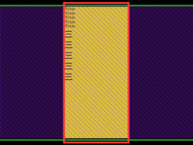
笔者在新建页面(角色管理)中验证封装的表格组件,效果如下:

代码
有关导航的配置,路由、mock数据、样式都无需讲解,这里主要说一下表格模块的封装(TableCard.js)和表格的使用(store.js、Table.js)。
TableCard.js
前面我们已经分析过了 spug 中表格的封装,这里与之类似,不在冗余。
// myspugsrccomponentsTableCard.js import React, { useState, useEffect, useRef } from 'react'; import { Table, Space, Divider, Popover, Checkbox, Button, Input, Select } from 'antd'; import { ReloadOutlined, SettingOutlined, FullscreenOutlined, SearchOutlined } from '@ant-design/icons'; import styles from './index.module.less'; // 从缓存中取得之前设置的列。记录要隐藏的字段。比如之前将 `状态` 这列隐藏 let TableFields = localStorage.getItem('TableFields') TableFields = TableFields ? JSON.parse(TableFields) : {} // 已选择多少项。 function Footer(props) { const actions = props.actions || []; const length = props.selected.length; return length > 0 ? ( <div className={styles.tableFooter}> <div className={styles.left}>已选择 <span>{length}</span> 项</div> <Space size="middle"> {actions.map((item, index) => ( <React.Fragment key={index}>{item}</React.Fragment> ))} </Space> </div> ) : null } function Header(props) { const columns = props.columns || []; const actions = props.actions || []; // 选中列,也就是表格要显示的列 const fields = props.fields || []; const onFieldsChange = props.onFieldsChange; // 列展示组件 const Fields = () => { return ( // value - 指定选中的选项 string[] // onChange- 变化时的回调函数 function(checkedValue)。 // 例如取消`状态`这列的选中 <Checkbox.Group value={fields} onChange={onFieldsChange}> {/* 展示所有的列 */} {columns.map((item, index) => ( // 注:值的选中是根据索引来的,因为 columns 是数组,是有顺序的。 <Checkbox value={index} key={index}>{item.title}</Checkbox> ))} </Checkbox.Group> ) } // 列展示 - 全选或取消全部 function handleCheckAll(e) { if (e.target.checked) { // 例如:[0, 1, 2, 3] // console.log('columns', columns.map((_, index) => index)) onFieldsChange(columns.map((_, index) => index)) } else { onFieldsChange([]) } } // 全屏操作。使用浏览器自带全屏功能 function handleFullscreen() { // props.rootRef.current 是表格组件的原始 Element // fullscreenEnabled 属性提供了启用全屏模式的可能性。当它的值是 false 的时候,表示全屏模式不可用(可能的原因有 "fullscreen" 特性不被允许,或全屏模式不被支持等)。 if (props.rootRef.current && document.fullscreenEnabled) { // 如果处在全屏。 // fullscreenElement 返回当前文档中正在以全屏模式显示的Element节点,如果没有使用全屏模式,则返回null. if (document.fullscreenElement) { // console.log('退出全屏') document.exitFullscreen() } else { // console.log('全屏该元素') props.rootRef.current.requestFullscreen() } } } // 头部分左右两部分:表格标题 和 options。options 又分两部分:操作项(例如新建、批量删除)、表格操作(刷新表格、表格列显隐控制、表格全屏控制) return ( <div className={styles.toolbar}> <div className={styles.title}>{props.title}</div> <div className={styles.option}> {/* 新建、删除等项 */} <Space size="middle" style={{ marginRight: 10 }}> {actions.map((item, index) => ( // 这种用法有意思 <React.Fragment key={index}>{item}</React.Fragment> ))} </Space> {/* 如果有新建等按钮就得加一个分隔符 | */} {actions.length ? <Divider type="vertical" /> : null} {/* 表格操作:刷新表格、表格列显隐控制、表格全屏控制 */} <Space className={styles.icons}> {/* 刷新表格 */} <ReloadOutlined onClick={props.onReload} /> {/* 控制表格列的显示,比如让`状态`这列隐藏 */} <Popover arrowPointAtCenter destroyTooltipOnHide={{ keepParent: false }} // 头部:列展示、重置 title={[ <Checkbox key="1" // 全选状态。选中的列数 === 表格中定义的列数 checked={fields.length === columns.length} // 在实现全选效果时,你可能会用到 indeterminate 属性。 // 设置 indeterminate 状态,只负责样式控制 indeterminate={![0, columns.length].includes(fields.length)} onChange={handleCheckAll}>列展示</Checkbox>, // 重置展示最初的列,也就是页面刚进来时列展示的状态。localStorage 会记录对表格列展示的状态。 <Button key="2" type="link" style={{ padding: 0 }} onClick={() => onFieldsChange(props.defaultFields)}>重置</Button> ]} overlayClassName={styles.tableFields} // 触发方式是 click trigger="click" placement="bottomRight" // 卡片内容 content={<Fields />}> <SettingOutlined /> </Popover> {/* 表格全屏控制 */} <FullscreenOutlined onClick={handleFullscreen} /> </Space> </div> </div> ) } function TableCard(props) { // 定义一个 ref,用于表格的全屏控制 const rootRef = useRef(); // Footer 组件中使用 const batchActions = props.batchActions || []; // Footer 组件中使用 const selected = props.selected || []; // 记录要展示的列 // 例如全选则是 [0, 1, 2, 3 ...],空数组表示不展示任何列 const [fields, setFields] = useState([]); const [defaultFields, setDefaultFields] = useState([]); // 用于保存传入的表格的列数据 const [columns, setColumns] = useState([]); useEffect(() => { // _columns - 传入的列数据 let [_columns, _fields] = [props.columns, []]; if (props.children) { if (Array.isArray(props.children)) { _columns = props.children.filter(x => x.props).map(x => x.props) } else { _columns = [props.children.props] } } // 隐藏字段。有 hide 属性的是要隐藏的字段。如果有 tKey 字段,隐藏字段则以缓存的为准 let hideFields = _columns.filter(x => x.hide).map(x => x.title) // tKey 是表格标识,比如这个表要隐藏 `状态` 字段,另一个表格要隐藏 `地址` 字段,与表格初始列展示对应。 // 如果表格有唯一标识(tKey),再看TableFields(来自localStorage)中是否有数据,如果没有则更新缓存 if (props.tKey) { if (TableFields[props.tKey]) { hideFields = TableFields[props.tKey] } else { TableFields[props.tKey] = hideFields localStorage.setItem('TableFields', JSON.stringify(TableFields)) } } // Array.prototype.entries() 方法返回一个新的数组迭代器对象,该对象包含数组中每个索引的键/值对。 for (let [index, item] of _columns.entries()) { // 比如之前将 `状态` 这列隐藏,输出:hideFields ['状态'] // console.log('hideFields', hideFields) if (!hideFields.includes(item.title)) _fields.push(index) } // setFields(_fields); // 将传入的列数据保存在 state 中 setColumns(_columns); // 记录初始展示的列 setDefaultFields(_fields); // eslint-disable-next-line react-hooks/exhaustive-deps }, []) // 列展示的操作。 function handleFieldsChange(fields) { // 更新选中的 fields setFields(fields) // tKey 就是一个标识,可以将未选中的fields存入 localStorage。比如用户取消了 `状态` 这列的展示,只要没有清空缓存,下次查看表格中仍旧不会显示`状态`这列 // 将列展示状态保存到缓存 if (props.tKey) { TableFields[props.tKey] = columns.filter((_, index) => !fields.includes(index)).map(x => x.title) localStorage.setItem('TableFields', JSON.stringify(TableFields)) // 隐藏三列("频率","描述","操作"),输入: {"hi":["备注信息"],"cb":[],"cg":[],"cc":[],"sa":[],"mi":["频率","描述","操作"]} // console.log(localStorage.getItem('TableFields')) } } // 分为三部分:Header、Table和 Footer。 return ( <div ref={rootRef} className={styles.tableCard}> {/* 头部。 */} <Header // 表格标题。例如`角色列表` title={props.title} // 表格的列 columns={columns} // 操作。例如新增、批量删除等操作 actions={props.actions} // 不隐藏的列 fields={fields} rootRef={rootRef} defaultFields={defaultFields} // 所选列变化时触发 onFieldsChange={handleFieldsChange} onReload={props.onReload} /> {/* antd 的 Table 组件 */} <Table // 表格元素的 table-layout 属性,例如可以实现`固定表头/列` tableLayout={props.tableLayout} // 表格是否可滚动 scroll={props.scroll} // 表格行 key 的取值,可以是字符串或一个函数。spug 中 `rowKey="id"` 重现出现在 29 个文件中。 rowKey={props.rowKey} // 加载中的 loading 效果 loading={props.loading} // 表格的列。用户可以选择哪些列不显示 columns={columns.filter((_, index) => fields.includes(index))} // 数据源 dataSource={props.dataSource} // 表格行是否可选择,配置项(object)。可以不传 rowSelection={props.rowSelection} // 展开功能的配置。可以不传 expandable={props.expandable} // 表格大小 default | middle | small size={props.size} // 分页、排序、筛选变化时触发 onChange={props.onChange} // 分页器,参考配置项或 pagination 文档,设为 false 时不展示和进行分页 pagination={props.pagination} /> {/* selected 来自 props,在 Footer 组件中显示选中了多少项等信息,spug 中没有使用到 */} {selected.length ? <Footer selected={selected} actions={batchActions} /> : null} </div> ) } // spug 没有用到,我们也删除 // TableCard.Search = Search; export default TableCard Table.js
这里是表格的使用,与 antd Table 类似,主要是 columns(列) 和 dataSource(数据源):
// myspugsrcpagessystemroleTable.js import React from 'react'; import { observer } from 'mobx-react'; import { Modal, Popover, Button, message } from 'antd'; // PlusOutlined:antd 2.2.8 找到 import { PlusOutlined } from '@ant-design/icons'; import { TableCard, } from '@/components'; import store from './store'; @observer class ComTable extends React.Component { componentDidMount() { store.fetchRecords() } columns = [{ title: '角色名称', dataIndex: 'name', }, { title: '关联账户', render: info => 0 }, { title: '描述信息', dataIndex: 'desc', ellipsis: true }, { title: '操作', width: 400, render: info => ( '编辑按钮' ) }]; render() { return ( <TableCard rowKey="id" title="角色列表" loading={store.isFetching} dataSource={store.dataSource} // 刷新表格 onReload={store.fetchRecords} actions={[ <Button type="primary" icon={<PlusOutlined />}>新增</Button> ]} pagination={{ showSizeChanger: true, showLessItems: true, showTotal: total => `共 ${total} 条`, pageSizeOptions: ['10', '20', '50', '100'] }} columns={this.columns} /> ) } } export default ComTable store.js
状态管理。例如表格的数据的请求,控制表格 loading 效果的 isFetching:
// myspugsrcpagessystemrolestore.js import { observable, computed, } from 'mobx'; import http from '@/libs/http'; class Store { @observable records = []; @observable isFetching = false; @computed get dataSource() { let records = this.records; return records } fetchRecords = () => { // 加载中 this.isFetching = true; http.get('/api/account/role/') .then(res => { this.records = res }) .finally(() => this.isFetching = false) }; } export default new Store() 分页请求数据
spug 中的表格数据是一次性加载出来的,点击上下翻页不会发请求给后端。配合表格上方的过滤条件,体验不错,因为无需请求,数据都在前端。就像这样:

但是如果数据量很大,按照常规做法,翻页、查询等操作都需要从后端重新请求数据。
要实现表格翻页时重新请求数据也很简单,使用 antd Table 的 onChange 属性(分页、排序、筛选变化时触发)即可。
前面我们已经在 TableCard.js 中增加了该属性(即onChange={props.onChange})
下面我们将角色管理页面的表格改为分页请求数据:
首先我们回顾下目前这种一次请求表格所有数据,纯前端分页效果。请看代码:
render() { return ( <TableCard rowKey="id" title="角色列表" loading={store.isFetching} // 后端的数据源 dataSource={store.dataSource} onReload={store.fetchRecords} actions={[ <Button type="primary" icon={<PlusOutlined />}>新增</Button> ]} // 分页器 pagination={{ showSizeChanger: true, showLessItems: true, showTotal: total => `共 ${total} 条`, pageSizeOptions: ['10', '20', '50', '100'] }} columns={this.columns} /> ) } 只需要给表格传入数据源(dataSource),antd Table 自动完成前端分页效果。
接着我们修改代码如下:
- Table.js - 给表格增加了 onChange 对应的回调以及给分页器增加 total 属性
- store.js - 定义新状态 current、total
// myspugsrcpagessystemroleTable.js ... import { TableCard, } from '@/components'; import store from './store'; @observer class ComTable extends React.Component { componentDidMount() { store.fetchRecords() } columns = [...]; handleTableChange = ({current}, filters, sorter) => { store.current = current store.tableOptions = { // 排序:好像只支持单个排序 sortField: sorter.field, sortOrder: sorter.order, ...filters } store.fetchRecords(); }; render() { return ( <TableCard rowKey="id" title="角色列表" loading={store.isFetching} // 后端的数据源 dataSource={store.dataSource} onReload={store.fetchRecords} onChange={this.handleTableChange} // 分页器 pagination={{ showSizeChanger: true, showLessItems: true, showTotal: total => `共 ${total} 条`, pageSizeOptions: ['10', '20', '50', '100'], // 如果不传 total,则以后端返回数据条数作为 total 的值 total: store.total, // 如果不传,则默认是第一条,如果需要默认显示第3条,则必须传 current: store.current, }} columns={this.columns} /> ) } } export default ComTable // myspugsrcpagessystemrolestore.js class Store { ... // 默认第1页 @observable current = 1; // 总共多少页 @observable total = ''; // 其他参数,例如排序、过滤等等 @observable tableOptions = {} fetchRecords = () => { const realParams = {current: this.current, ...this.tableOptions} this.isFetching = true; http.get('/api/account/role/', {params: realParams}) .then(res => { // 可以这么赋值 // ({data: this.records, total: this.pagination.total} = res) this.total = res.total this.records = res.data }) .finally(() => this.isFetching = false) } } export default new Store() 最终效果如下图所示:

Tip:本地 mock 模拟数据如下
const getNum = () => String(+new Date()).slice(-3) // 注:第三个参数必须不能是对象,否则 getNum 不会重新执行 Mock.mock(//api/account/role/.*/, 'get', function () { return { "data": { data: new Array(10).fill(0).map((item, index) => ({ "id": index + getNum(), "name": 'name' + index + getNum(), "desc": null, })), total: 10000, } , "error": "" } }) 扩展
create-react-app 组件为什么加载两次
试试删除 <React.StrictMode>(官网说:这仅适用于开发模式。生产模式下生命周期不会被调用两次)
疑惑:笔者验证表格时使用了 mobx,表格没渲染出来,删除 <React.StrictMode> 后表格正常,不知是否是 <React.StrictMode> 的副作用。
spug 中表格的不足
-
antd Table 组件某些属性无法使用:spug 中表格是对 antd Table 组件的封装,但是现在封装的组件对外的接口只提供了 antd Table 中有限的几个属性。例如上文提到的翻页请求后端数据需要使用 antd Table 中的 onChange 属性就没有提供出来
-
头部一定会有:不需要都不行
其他章节请看: