- A+
所属分类:Web前端
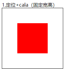
第一种:定位+cala(固定宽高)
html部分:
<div class="box1"> <div class="inner"></div> </div>
css部分:
.box1{   width: 200px;   height: 200px;   border: 1px solid black;   position: relative; }
  .box1 .inner {     width: 100px;     height: 100px;     background-color: red;     position: absolute;     /* 下面这个减号两边要隔开一个空格 */     top: calc(50% - 50px);     left: calc(50% - 50px);       }
运行截图如下:
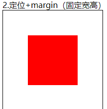
第二种:.定位+margin(固定宽高)
html部分:
<div class="box2"> <div class="inner"></div> </div>
css部分:
.box2{ width: 200px; height: 200px; border: 1px solid black; position: relative; } .box2 .inner { width: 100px; height: 100px; background-color: red; position: absolute; left: 50%; top: 50%; margin-top: -50px; margin-left: -50px; }
运行截图如下:
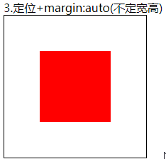
第三种:定位+margin:auto(不定宽高)
html部分:
<div class="box3"> <div class="inner"></div> </div>
css部分:
.box3 { width: 200px; height: 200px; border: 1px solid black; position: relative; } .box3 .inner { width: 100px; height: 100px; background-color: red; position: absolute; margin: auto; left: 0; right: 0; top: 0; bottom: 0; }
运行截图如下:
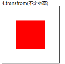
第四种:transfrom(不定宽高)
html部分:
<div class="box4"> <div class="inner"></div> </div>
css部分:
.box4 { width: 200px; height: 200px; border: 1px solid black; position: relative; } .box4 .inner { width: 100px; height: 100px; background-color: red; position: absolute; left: 50%; top: 50%; transform: translate(-50%, -50%); }
运行截图如下:
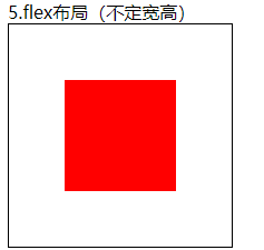
第五种:flex布局(不定宽高)
html部分:
<div class="box5"> <div class="inner"></div> </div>
css部分:
.box5 { display: flex; width: 200px; height: 200px; border: 1px solid black; justify-content: center; align-items: center; } .box5 .inner { width: 100px; height: 100px; background-color: red; }
运行截图如下:
第六种:grid布局(不定宽高)
html部分:
<div class="box6"> <div class="inner"></div> </div>
css部分:
.box6 { display: grid; justify-content: center; align-items: center; width: 200px; height: 200px; border: 1px solid black; } .box6 .inner { width: 100px; height: 100px; background-color: red; }
运行截图如下:

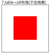
第七种:table-cell布局(不定宽高)
html部分:
<div class="box7"> <div class="inner"></div> </div>
css部分:
.box7 { width: 200px; height: 200px; border: 1px solid black; display: table-cell; /* 使用这个布局里面的元素必须是inline-block元素 */ text-align: center; vertical-align: middle; } .box7 .inner { display: inline-block; width: 100px; height: 100px; background-color: red; }
运行截图如下: