- A+
所属分类:Web前端
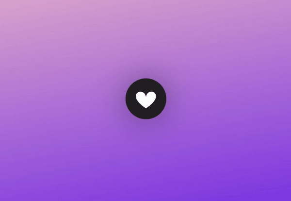
在现代网页中,我们经常可以在一些文章、视频和图片页面上找到”Like”按钮,并且通过点击该按钮来表示自己对该内容的喜欢或者不喜欢。大部分”Like”按钮是纯文本按钮或者图片按钮,如果你想让它们具有特别的动画特效,那么我们就需要用到CSS3或者JavaScript了。本文给大家带来一个带有爱心散列动画的Like按钮,主要采用了SVG和CSS3这两个技术。当你点亮Like按钮时,按钮的四周将会散发出多个五彩绚丽的爱心。
效果预览
代码实现
HTML代码
首先我们用SVG的Path路径绘制了一个爱心按钮:
<svg height="320" width="320" class="like" onclick="document.body.classList.toggle('liked')"> <path class="path" d="M 160 145 c 15 -90 170 -20 0 90 m 0 -90 c -15 -90 -170 -20 0 90" fill="white"> <!-- 80 by 70 --> </svg>
同时定义了onclick事件,当点击这个爱心按钮时,CSS类将会在like和liked之间切换。
就下来就是定义爱心按钮点击后周围出现的元素,主要是一些五彩的小圆点和一些不同风格颜色的SVG小爱心,代码如下:
<div class="dot dot-1"></div> <div class="dot dot-2"></div> <div class="dot dot-3"></div> <div class="dot dot-4"></div> <div class="dot dot-5"></div> <div class="dot dot-6"></div> <div class="dot dot-7"></div> <div class="dot dot-8"></div> <svg height="40" width="40" viewBox="0 0 320 320" class="h h-1"><path class="path" d="M 160 145 c 15 -90 170 -20 0 90 m 0 -90 c -15 -90 -170 -20 0 90"></svg> <svg height="40" width="40" viewBox="0 0 320 320" class="h h-2"><path class="path" d="M 160 145 c 15 -90 170 -20 0 90 m 0 -90 c -15 -90 -170 -20 0 90"></svg> <svg height="40" width="40" viewBox="0 0 320 320" class="h h-3"><path class="path" d="M 160 145 c 15 -90 170 -20 0 90 m 0 -90 c -15 -90 -170 -20 0 90"></svg> <svg height="40" width="40" viewBox="0 0 320 320" class="h h-4"><path class="path" d="M 160 145 c 15 -90 170 -20 0 90 m 0 -90 c -15 -90 -170 -20 0 90"></svg> <svg height="40" width="40" viewBox="0 0 320 320" class="h h-5"><path class="path" d="M 160 145 c 15 -90 170 -20 0 90 m 0 -90 c -15 -90 -170 -20 0 90"></svg> <svg height="40" width="40" viewBox="0 0 320 320" class="h h-6"><path class="path" d="M 160 145 c 15 -90 170 -20 0 90 m 0 -90 c -15 -90 -170 -20 0 90"></svg> <svg height="40" width="40" viewBox="0 0 320 320" class="h h-7"><path class="path" d="M 160 145 c 15 -90 170 -20 0 90 m 0 -90 c -15 -90 -170 -20 0 90"></svg> <svg height="40" width="40" viewBox="0 0 320 320" class="h h-8"><path class="path" d="M 160 145 c 15 -90 170 -20 0 90 m 0 -90 c -15 -90 -170 -20 0 90"></svg> <svg height="110" width="110" viewBox="0 0 320 320" class="fly fly-1"><path class="path" d="M 160 145 c 15 -90 170 -20 0 90 m 0 -90 c -15 -90 -170 -20 0 90"></svg> <svg height="110" width="110" viewBox="0 0 320 320" class="fly fly-2"><path class="path" d="M 160 145 c 15 -90 170 -20 0 90 m 0 -90 c -15 -90 -170 -20 0 90"></svg>
到这里为止,我们利用了HTML和SVG将Like爱心按钮以及点击后的动画元素全部绘制了出来。接下来就是添加相应CSS来实现动画效果了。
CSS代码
首先是SVG爱心按钮的CSS代码,这是点击前的默认样式:
svg.like { position: fixed; z-index: 10; top: calc(50vh - 160px); left: calc(50vw - 160px); border-radius: 100%; -webkit-transform: scale(0.3); transform: scale(0.3); -webkit-transform-origin: 50% 50%; transform-origin: 50% 50%; box-shadow: 0 0 250px rgba(0, 0, 0, 0.4); background: #212121; cursor: pointer; }
然后点击按钮后,CSS类将会切换到liked,这时候按钮将会闪动一下,同时周围将会飞入许多五彩的小圆点和小爱心。闪动动画的代码如下:
body.liked svg.like { -webkit-animation: blink 1s forwards; animation: blink 1s forwards; } @-webkit-keyframes blink { 10% { -webkit-transform: scale(0.42); transform: scale(0.42); background: #8815b7; } 100% { background: #e01f4f; } } @keyframes blink { 10% { -webkit-transform: scale(0.42); transform: scale(0.42); background: #8815b7; } 100% { background: #e01f4f; } }
小圆点和小爱心飞入的动画代码如下:
body.liked svg.fly.fly-1 { -webkit-animation: fly-1 1s 0.1s; animation: fly-1 1s 0.1s; } body.liked svg.fly.fly-2 { -webkit-animation: fly-2 1s 0.1s; animation: fly-2 1s 0.1s; } @-webkit-keyframes fly-1 { 25% { margin: -100px 0 0 100px; } 75% { margin: 100px 0 0 -100px; z-index: 5; } 100% { z-index: 11; } } @keyframes fly-1 { 25% { margin: -100px 0 0 100px; } 75% { margin: 100px 0 0 -100px; z-index: 5; } 100% { z-index: 11; } } @-webkit-keyframes fly-2 { 25% { margin: -100px 0 0 -100px; } 75% { margin: 100px 0 0 100px; z-index: 5; } 100% { z-index: 11; } } @keyframes fly-2 { 25% { margin: -100px 0 0 -100px; } 75% { margin: 100px 0 0 100px; z-index: 5; } 100% { z-index: 11; } }
最后我们把五彩小圆点和小爱心的CSS代码也贴出来:
div.dot { width: 12px; height: 12px; background: white; position: fixed; z-index: 9; border-radius: 100%; top: calc(50vh - 6px); left: calc(50vw - 6px); } div.dot:before { content: ""; width: 8px; height: 8px; border-radius: 100%; top: -20px; left: 2px; position: absolute; background: white; } div.dot:after { content: ""; width: 11px; height: 11px; border-radius: 100%; top: -160px; left: 2px; position: absolute; background: white; display: none; } body.liked div.dot { opacity: 0; -webkit-transform: translateY(-100px); transform: translateY(-100px); background: #00e5ff; transition: opacity 0.5s 1s, background 0.1s 0.2s, -webkit-transform 1s; transition: transform 1s, opacity 0.5s 1s, background 0.1s 0.2s; transition: transform 1s, opacity 0.5s 1s, background 0.1s 0.2s, -webkit-transform 1s; } body.liked div.dot:after { display: block; } body.liked div.dot.dot-2 { -webkit-transform: rotate(45deg) translateY(-100px); transform: rotate(45deg) translateY(-100px); } body.liked div.dot.dot-3 { -webkit-transform: rotate(90deg) translateY(-100px); transform: rotate(90deg) translateY(-100px); } body.liked div.dot.dot-4 { -webkit-transform: rotate(135deg) translateY(-100px); transform: rotate(135deg) translateY(-100px); } body.liked div.dot.dot-5 { -webkit-transform: rotate(180deg) translateY(-100px); transform: rotate(180deg) translateY(-100px); } body.liked div.dot.dot-6 { -webkit-transform: rotate(225deg) translateY(-100px); transform: rotate(225deg) translateY(-100px); } body.liked div.dot.dot-7 { -webkit-transform: rotate(270deg) translateY(-100px); transform: rotate(270deg) translateY(-100px); } body.liked div.dot.dot-8 { -webkit-transform: rotate(305deg) translateY(-100px); transform: rotate(305deg) translateY(-100px); }
到这里,整个Like爱心按钮动画就完成了。文章最后也将源码献给大家。
源码下载
完整的代码我已经整理出了一个源码包,供大家下载学习。
代码仅供参考和学习,请不要用于商业用途。
最后总结
这个SVG和CSS实现的Like按钮非常有创意,很适合在一些商品展示平台上使用。另外,对于like后出现的五彩小圆点和小爱心,大家也可以发挥自己的想象,修改或者添加别的元素,因为SVG非常灵活,可以轻松绘制任何你喜欢的形状。