- A+
需求实战一
样式展示
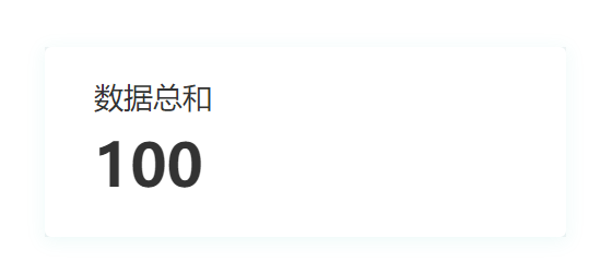
代码展示
<template> <ARow> <ACol style="background-color:#F1F4F5 "> <div class="info-card"> <div class="info-title"> 数据总和 </div> <div class="info-value"> 100 </div> </div> </ACol> </ARow> </template> <script setup lang="ts"> </script> <style scoped> :deep(.info-card){ width: 318px; height: 116px; background-color: #FFFFFF; box-shadow: 0px 2px 10px 1px rgba(23,179,163,0.07); border-radius: 4px; } :deep(.info-title){ font-size: 18px; font-family: Microsoft YaHei; font-weight: 400; color: #333333; line-height: 21px; padding:20px 0 20px 30px; } :deep(.info-value){ font-size: 36px; font-family: Microsoft YaHei; font-weight: bold; color: #333333; line-height: 21px; padding:0 0 0 30px; } </style>代码解读
这段代码是一个Vue组件的模板部分,用于展示一个信息卡片。具体解释如下:
- <template> 标签用于定义组件的模板部分。
- <ARow> 和 <ACol> 是自定义的组件,用于布局。<ARow> 表示一行,<ACol> 表示一列。
- <ACol> 标签内部有一个 style 属性,用于设置背景颜色为 #F1F4F5。
- <div class="info-card"> 是一个具有 info-card 类名的 div 元素,表示信息卡片的容器。
- <div class="info-title"> 是一个具有 info-title 类名的 div 元素,表示信息卡片的标题。
- <div class="info-value"> 是一个具有 info-value 类名的 div 元素,表示信息卡片的数值。
接下来是 <script setup lang="ts"> 标签,用于编写组件的逻辑部分,这里是空的,没有任何代码。
最后是 <style scoped> 标签,用于定义组件的样式。:deep() 是一个深度选择器,用于选择组件内部的元素。.info-card 表示选择具有 info-card 类名的元素,设置了宽度、高度、背景颜色、阴影和边框圆角等样式。.info-title 和 .info-value 分别表示选择具有对应类名的元素,设置了字体大小、字体样式、颜色、行高和内边距等样式。
这段代码的作用是创建一个信息卡片组件,显示一个标题为 "数据总和",数值为 "100" 的信息。信息卡片具有特定的样式,包括背景颜色、阴影和边框圆角等。
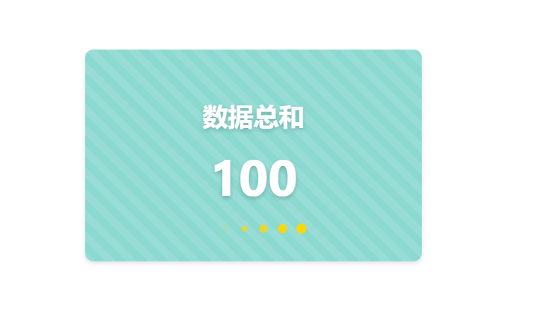
需求实战二
样式展示

代码展示
<template> <div class="info-card"> <div class="info-title"> 数据总和 </div> <div class="info-value"> 100 </div> <div class="animation-container"> <div class="circle"></div> <div class="circle"></div> <div class="circle"></div> <div class="circle"></div> <div class="circle"></div> <div class="circle"></div> </div> </div> </template> <script setup lang="ts"></script> <style scoped> .info-card { width: 318px; height: 200px; background-color: #17b3a3; border-radius: 8px; display: flex; flex-direction: column; align-items: center; justify-content: center; position: relative; } .info-title { font-size: 24px; font-weight: bold; color: #FFFFFF; } .info-value { font-size: 48px; font-weight: bold; color: #FFFFFF; } .animation-container { display: flex; position: absolute; bottom: 25px; } .circle { width: 10px; height: 10px; background-color: #FFFFFF; border-radius: 50%; margin: 0 4px; transform: scale(0); animation: pulse 1.5s infinite cubic-bezier(0.215, 0.61, 0.355, 1) alternate; } .circle:nth-child(1) { animation-delay: 0.1s; } .circle:nth-child(2) { animation-delay: 0.2s; } .circle:nth-child(3) { animation-delay: 0.3s; } .circle:nth-child(4) { animation-delay: 0.4s; } .circle:nth-child(5) { animation-delay: 0.5s; } .circle:nth-child(6) { animation-delay: 0.6s; } @keyframes pulse { 0% { opacity: 0; transform: scale(0); } 50% { opacity: 1; transform: scale(1); } 100% { opacity: 0; transform: scale(0); } } </style>代码解读
这段代码是一个Vue组件的模板部分,用于展示一个带有动画效果的信息卡片。具体解释如下:
- <template> 标签用于定义组件的模板部分。
- <div class="info-card"> 是一个具有 info-card 类名的 div 元素,表示信息卡片的容器。
- <div class="info-title"> 是一个具有 info-title 类名的 div 元素,表示信息卡片的标题。
- <div class="info-value"> 是一个具有 info-value 类名的 div 元素,表示信息卡片的数值。
- <div class="animation-container"> 是一个具有 animation-container 类名的 div 元素,用于容纳动画效果的圆圈。
- <div class="circle"> 是一个具有 circle 类名的 div 元素,表示一个圆圈。
接下来是 <script setup lang="ts"> 标签,用于编写组件的逻辑部分,这里是空的,没有任何代码。
最后是 <style scoped> 标签,用于定义组件的样式。.info-card 表示选择具有 info-card 类名的元素,设置了宽度、高度、背景颜色、边框圆角等样式,并使用了 Flex 布局使内容垂直居中。.info-title 和 .info-value 分别表示选择具有对应类名的元素,设置了字体大小、字体样式、颜色等样式。.animation-container 表示选择具有 animation-container 类名的元素,设置了绝对定位和底部偏移量。.circle 表示选择具有 circle 类名的元素,设置了圆圈的样式,包括宽度、高度、背景颜色、边框圆角、外边距和动画效果。
动画效果使用了 @keyframes 关键字定义了一个名为 pulse 的关键帧动画,通过改变透明度和缩放来实现圆圈的闪烁效果。.circle:nth-child(n) 选择了第 n 个具有 circle 类名的元素,并设置了不同的动画延迟时间,以实现圆圈的依次闪烁效果。
这段代码的作用是创建一个带有动画效果的信息卡片组件,显示一个标题为 "数据总和",数值为 "100" 的信息。信息卡片具有特定的样式,包括背景颜色、边框圆角和居中对齐等。同时,信息卡片底部有一组圆圈,通过动画效果实现闪烁的效果。
需求实战三
样式展示
代码展示
<template> <div class="info-card"> <div class="info-title"> 数据总和 </div> <div class="info-value"> 100 </div> <div class="animation-container"> <div class="circle"></div> <div class="circle"></div> <div class="circle"></div> <div class="circle"></div> <div class="circle"></div> <div class="circle"></div> </div> </div> </template> <script setup lang="ts"></script> <style scoped> .info-card { width: 318px; height: 200px; background-color: rgba(23, 179, 163, 0.5); backdrop-filter: blur(10px); border-radius: 8px; display: flex; flex-direction: column; align-items: center; justify-content: center; position: relative; border: 1px solid rgba(255, 255, 255, 0.2); box-shadow: 0 2px 4px rgba(0, 0, 0, 0.1); background-image: linear-gradient(45deg, rgba(255, 255, 255, 0.1) 25%, transparent 25%, transparent 50%, rgba(255, 255, 255, 0.1) 50%, rgba(255, 255, 255, 0.1) 75%, transparent 75%, transparent); background-size: 20px 20px; } .info-title { font-size: 24px; font-weight: bold; color: #FFFFFF; text-shadow: 0 2px 4px rgba(0, 0, 0, 0.2); } .info-value { font-size: 48px; font-weight: bold; color: #FFFFFF; text-shadow: 0 2px 4px rgba(0, 0, 0, 0.2); } .animation-container { display: flex; position: absolute; bottom: 25px; } .circle { width: 10px; height: 10px; background-color: #FFD700; border-radius: 50%; margin: 0 4px; transform: scale(0); animation: pulse 1.5s infinite cubic-bezier(0.215, 0.61, 0.355, 1) alternate; } .circle:nth-child(1) { animation-delay: 0.1s; } .circle:nth-child(2) { animation-delay: 0.2s; } .circle:nth-child(3) { animation-delay: 0.3s; } .circle:nth-child(4) { animation-delay: 0.4s; } .circle:nth-child(5) { animation-delay: 0.5s; } .circle:nth-child(6) { animation-delay: 0.6s; } @keyframes pulse { 0% { opacity: 0; transform: scale(0); } 50% { opacity: 1; transform: scale(1); } 100% { opacity: 0; transform: scale(0); } } </style>代码解读
这段代码是一个Vue组件的模板部分,用于展示一个带有动画效果和背景模糊的信息卡片。具体解释如下:
- <template> 标签用于定义组件的模板部分。
- <div class="info-card"> 是一个具有 info-card 类名的 div 元素,表示信息卡片的容器。
- <div class="info-title"> 是一个具有 info-title 类名的 div 元素,表示信息卡片的标题。
- <div class="info-value"> 是一个具有 info-value 类名的 div 元素,表示信息卡片的数值。
- <div class="animation-container"> 是一个具有 animation-container 类名的 div 元素,用于容纳动画效果的圆圈。
- <div class="circle"> 是一个具有 circle 类名的 div 元素,表示一个圆圈。
接下来是 <script setup lang="ts"> 标签,用于编写组件的逻辑部分,这里是空的,没有任何代码。
最后是 <style scoped> 标签,用于定义组件的样式。.info-card 表示选择具有 info-card 类名的元素,设置了宽度、高度、背景颜色、背景模糊、边框圆角、阴影和背景图案等样式,并使用了 Flex 布局使内容垂直居中。.info-title 和 .info-value 分别表示选择具有对应类名的元素,设置了字体大小、字体样式、颜色和文字阴影等样式。.animation-container 表示选择具有 animation-container 类名的元素,设置了绝对定位和底部偏移量。.circle 表示选择具有 circle 类名的元素,设置了圆圈的样式,包括宽度、高度、背景颜色、边框圆角、外边距和动画效果。
动画效果使用了 @keyframes 关键字定义了一个名为 pulse 的关键帧动画,通过改变透明度和缩放来实现圆圈的闪烁效果。.circle:nth-child(n) 选择了第 n 个具有 circle 类名的元素,并设置了不同的动画延迟时间,以实现圆圈的依次闪烁效果。
这段代码的作用是创建一个带有动画效果和背景模糊的信息卡片组件,显示一个标题为 "数据总和",数值为 "100" 的信息。信息卡片具有特定的样式,包括背景颜色、背景模糊、边框圆角、阴影和背景图案等。同时,信息卡片底部有一组圆圈,通过动画效果实现闪烁的效果。
需求实战四
样式展示
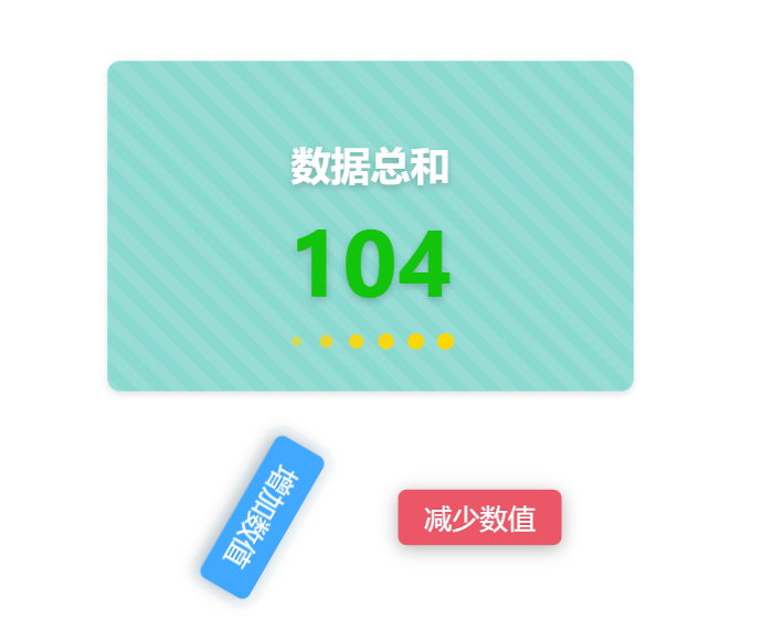
代码展示
<template> <div class="home-component"> <ARow style="padding:0 0 30px 0"> <div class="info-card"> <div class="info-title"> 数据总和 </div> <transition name="number-transition"> <div class="info-value" :class="{ init:init,changed: isNumberIncreased, decreased: isNumberDecreased }"> {{ animatedValue }} </div> </transition> <div class="animation-container"> <div class="circle"></div> <div class="circle"></div> <div class="circle"></div> <div class="circle"></div> <div class="circle"></div> <div class="circle"></div> </div> </div> </ARow> <ARow> <ACol span="10"> <div class="button-container"> <a-button class="increase-button" type="primary" @click="addNumber">增加数值</a-button> </div> </ACol> <ACol span="4"> </ACol> <ACol span="10"> <div class="button-container"> <a-button class="decrease-button" type="primary" @click="minNumber">减少数值</a-button> </div> </ACol> </ARow> </div> </template> <script setup lang="ts"> import { ref, watch } from 'vue'; const value = ref(100); const isNumberIncreased = ref(false); const isNumberDecreased = ref(false); const animatedValue = ref(value.value); const init=ref(true) const addNumber = () => { const startValue = value.value; const endValue = startValue + 10; animateNumber(startValue, endValue); value.value = endValue; init.value=false; isNumberDecreased.value = false; isNumberIncreased.value = true; }; const minNumber = () => { const startValue = value.value; const endValue = startValue - 10; animateNumber(startValue, endValue); value.value = endValue; init.value=false; isNumberIncreased.value = false; isNumberDecreased.value = true; }; const animateNumber = (startValue:any, endValue:any) => { const duration = 1000; // 动画持续时间,单位为毫秒 const frameRate = 10; // 每秒帧数 const totalFrames = duration / (1000 / frameRate); const frameIncrement = (endValue - startValue) / totalFrames; let currentFrame = 0; const timer = setInterval(() => { currentFrame++; animatedValue.value = Math.round(startValue + frameIncrement * currentFrame); if (currentFrame === totalFrames) { clearInterval(timer); } }, 1000 / frameRate); }; watch(value, () => { animatedValue.value = value.value; }); </script> <style scoped> .home-component { display: flex; flex-direction: column; align-items: center; justify-content: center; } .info-card { width: 318px; height: 200px; background-color: rgba(23, 179, 163, 0.5); backdrop-filter: blur(10px); border-radius: 8px; display: flex; flex-direction: column; align-items: center; justify-content: center; position: relative; border: 1px solid rgba(255, 255, 255, 0.2); box-shadow: 0 2px 4px rgba(0, 0, 0, 0.1); background-image: linear-gradient( 45deg, rgba(255, 255, 255, 0.1) 25%, transparent 25%, transparent 50%, rgba(255, 255, 255, 0.1) 50%, rgba(255, 255, 255, 0.1) 75%, transparent 75%, transparent ); background-size: 20px 20px; } .info-title { font-size: 24px; font-weight: bold; color: #ffffff; text-shadow: 0 2px 4px rgba(0, 0, 0, 0.2); } .info-value { font-size: 48px; font-weight: bold; color: #ffffff; text-shadow: 0 2px 4px rgba(0, 0, 0, 0.2); } .info-value.init { color: #ffffff; transform: scale(1.2); } .info-value.changed { color: #13c40d; transform: scale(1.2); } .info-value.decreased { color: #eb5766; transform: scale(1.2); } .animation-container { display: flex; position: absolute; bottom: 25px; } .circle { width: 10px; height: 10px; background-color: #ffd700; border-radius: 50%; margin: 0 4px; transform: scale(0); animation: pulse 1.5s infinite cubic-bezier(0.215, 0.61, 0.355, 1) alternate; } .circle:nth-child(1) { animation-delay: 0.1s; } .circle:nth-child(2) { animation-delay: 0.2s; } .circle:nth-child(3) { animation-delay: 0.3s; } .circle:nth-child(4) { animation-delay: 0.4s; } .circle:nth-child(5) { animation-delay: 0.5s; } .circle:nth-child(6) { animation-delay: 0.6s; } @keyframes pulse { 0% { opacity: 0; transform: scale(0); } 50% { opacity: 1; transform: scale(1); } 100% { opacity: 0; transform: scale(0); } } .button-container { display: flex; justify-content: center; padding: 30px 0; animation: bounce 2s infinite; animation-delay: 1s; } .increase-button, .decrease-button { font-size: 16px; font-weight: bold; text-transform: uppercase; box-shadow: 0 2px 10px rgba(0, 0, 0, 0.3); border: none; transform: scale(1.05) rotate(360deg); transition: transform 1s; border-radius: 5px; } .increase-button { background-color: #38b2ac; margin-right: 10px; } .decrease-button { background-color: #eb5766; margin-left: 10px; } .increase-button:hover, .decrease-button:hover { transform: scale(1.05); box-shadow: 0 2px 15px rgba(0, 0, 0, 0.4); } </style>代码解读
这段代码是一个Vue组件的模板部分,用于展示一个带有动画效果和交互功能的信息卡片。具体解释如下:
- <template> 标签用于定义组件的模板部分。
- <div class="home-component"> 是一个具有 home-component 类名的 div 元素,表示整个组件的容器。
- <ARow> 和 <ACol> 是自定义的组件,用于布局。<ARow> 表示一行,<ACol> 表示一列。
- <div class="info-card"> 是一个具有 info-card 类名的 div 元素,表示信息卡片的容器。
- <div class="info-title"> 是一个具有 info-title 类名的 div 元素,表示信息卡片的标题。
- <transition> 标签用于添加过渡效果,name 属性指定过渡效果的名称。
- <div class="info-value"> 是一个具有 info-value 类名的 div 元素,表示信息卡片的数值。使用了动态绑定 :class 来根据条件添加不同的类名,实现数值变化时的样式变化。
- {{ animatedValue }} 是一个插值表达式,用于显示动态绑定的 animatedValue 变量的值。
- <div class="animation-container"> 是一个具有 animation-container 类名的 div 元素,用于容纳动画效果的圆圈。
- <div class="circle"> 是一个具有 circle 类名的 div 元素,表示一个圆圈。
接下来是 <script setup lang="ts"> 标签,用于编写组件的逻辑部分。通过 import 导入了 ref 和 watch 方法,用于创建响应式数据和监听数据变化。定义了一些变量和方法,包括 value、isNumberIncreased、isNumberDecreased、animatedValue、init、addNumber、minNumber 和 animateNumber。addNumber 方法用于增加数值,minNumber 方法用于减少数值,animateNumber 方法用于实现数值变化的动画效果。使用 watch 监听 value 的变化,并更新 animatedValue 的值。
最后是 <style scoped> 标签,用于定义组件的样式。.home-component 表示选择具有 home-component 类名的元素,设置了居中对齐等样式。.info-card 表示选择具有 info-card 类名的元素,设置了宽度、高度、背景颜色、背景模糊、边框圆角、阴影和背景图案等样式。.info-title 和 .info-value 分别表示选择具有对应类名的元素,设置了字体大小、字体样式、颜色和文字阴影等样式。.info-value.init、.info-value.changed 和 .info-value.decreased 分别表示根据条件添加的类名,用于实现数值变化时的样式变化。.animation-container 表示选择具有 animation-container 类名的元素,设置了绝对定位和底部偏移量。.circle 表示选择具有 circle 类名的元素,设置了圆圈的样式,包括宽度、高度、背景颜色、边框圆角、外边距和动画效果。
动画效果使用了 @keyframes 关键字定义了一个名为 pulse 的关键帧动画,通过改变透明度和缩放来实现圆圈的闪烁效果。.circle:nth-child(n) 选择了第 n 个具有 circle 类名的元素,并设置了不同的动画延迟时间,以实现圆圈的依次闪烁效果。
这段代码的作用是创建一个带有动画效果和交互功能的信息卡片组件。信息卡片显示一个标题为 "数据总和",数值初始值为 "100",并根据用户点击增加或减少数值,同时显示数值的变化动画效果。信息卡片具有特定的样式,包括背景颜色、背景模糊、边框圆角、阴影和背景图案等。同时,信息卡片底部有一组圆圈,通过动画效果实现闪烁的效果。


