- A+
所属分类:Web前端
在日常开发中,随着需求的个性化,逻辑的复杂化,自定义组件也变得越来越常见,而且组件具有扩展性强,易复用,封装复杂的代码逻辑等优点,可以用小组件来构建大型应用系统。本文以一个简单的小例子,简述Vue进行组件开发的常见步骤,如有不足之处,还请指正。
涉及知识点
本文案例,不仅用到了之前的基础知识,如:v-if, 样式绑定,属性传值等,还用到了组件的特有知识,如下所示:
- 组件:可复用的Vue实例,具有封装,复用等特点。
- Vue项目构建:一个vue后缀的文件,就表示一个组件。但是浏览器并不认识vue文件,所有需要进行编译才能运行,Vue提供了一个脚手架(CLI)来编译运行项目。
- 组件构成:由props(属性),computed(计算属性),method(方法)等构成,来支持组件的不同需求。
- 开发工具:Visual Studio Code
- 运行工具:Vue CLI 运行命令:vue serve
设计思路
- 进度条分类:线性进度条(采用DIV嵌套实现),环形进度条(采用SVG实现)。
- 提取共性特征:颜色,高度,显示内容,图标样式等属性值的提取,根据属性来区分展示的,采用计算属性实现。
- 图标样式:本例中的图标样式采用Wingdings字体实现,可通过windows-->附件-->字符映射表 去查询。
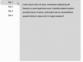
示例效果图
线性进度条:分为进度显示在右侧,还是内侧且跟随进度条移动。如下所示:

环形进度条:大小可以设置,显示内容和线性进度条一致。如下所示:

核心代码
本例所有代码进行封装【Progress.vue】主要包含三部分:模板(template)脚本(script)样式(style)。
一个template下只能包含一个div,但是div下可以包含多个子节点。如下所示:


1 <template> 2 <div class="progress " :class="'progress--'+ptype"> 3 <!-- 条形进度条 --> 4 <div class="progress-bar" v-if="ptype==='line'"> 5 <div class="progress-bar__outer" :style="{height:strokeHeight+'px'}"> 6 <div class="progress-bar__inner" :style="barStyle"> 7 <!-- 进度条内显示百分比 --> 8 <div v-if="textInside" class="progress__text" style="color:white;"> {{percentage}}% </div> 9 </div> 10 </div> 11 12 </div> 13 <!-- 环形进度条 采用SVG实现 --> 14 <div class="progress_circle" :style="{width:cwidth+'px',height:cwidth+'px'}" v-else> 15 <svg viewBox="0 0 100 100" :style="{width:cwidth+'px',height:cwidth+'px'}"> 16 <!-- 背景圆形 --> 17 <path :d="trackPath" fill="none" :stroke-width="relativeStrokeHeight" stroke="#e5e9f2" /> 18 <!-- 进度圆形 --> 19 <path :d="trackPath" fill="none" :stroke-width="relativeStrokeHeight" :stroke="stroke" :style="circlePathStyle" stroke-linecap="round" /> 20 </svg> 21 </div> 22 <div v-if="!textInside" class="progress__text" :style="{fontSize:progressTextSize+'px'}"> 23 <template v-if="!status"> {{percentage}}% </template> 24 <i v-else class="icon" :class="iconCls"></i> 25 </div> 26 </div> 27 </template>
View Code
script部分,本例主要用到props,和computed,如下所示:
1 <script> 2 export default { 3 props:{ 4 strokeHeight:{ 5 // 进度条高度 6 // required:true, 7 type:Number, 8 default:10 9 }, 10 percentage:{ 11 // 进度条百分比 12 type:Number, 13 default:0, 14 required:true, 15 valiator(value){ 16 return value>=0 && value<=100 17 }, 18 }, 19 status:{ 20 // 进度条状态:正常状态,成功状态,异常状态 21 type:String, 22 23 }, 24 ptype:{ 25 // 进度条样式:条形,还是圆形 26 type:String, 27 default:'line', 28 validator:val=>['circle','line'].includes(val) 29 }, 30 textInside:{ 31 // 文字是否內显 32 type:Boolean, 33 default:false, 34 }, 35 pcolor:{ 36 // 进度条颜色 37 type:String 38 }, 39 cwidth:{ 40 type:Number, 41 default:126, 42 } 43 }, 44 computed:{ 45 progressTextSize(){ 46 return 9+this.strokeHeight*0.4; 47 }, 48 stroke(){ 49 let color; 50 if(this.pcolor){ 51 return this.pcolor; 52 } 53 switch(this.status){ 54 case 'success': 55 color='#13ce66'; 56 break; 57 case 'failure': 58 color='#ff4949'; 59 break; 60 default: 61 color='#20a0ff'; 62 break; 63 } 64 return color; 65 }, 66 barStyle(){ 67 // 计算属性调用其他计算属性,必须加this关键字,否则找不到 68 return {width:this.percentage+'%',backgroundColor:this.stroke} 69 }, 70 iconCls(){ 71 if( this.ptype ==='line'){ 72 // 如果是线性进度条 73 return this.status ==='success'?'icon-circle-check':'icon-circle-close'; 74 }else{ 75 return this.status ==='success'?'icon-check':'icon-close'; 76 } 77 }, 78 trackPath(){ 79 const radius = 50-this.relativeStrokeHeight/2; 80 return 'M 50 50 m 0 -'+radius+' a '+radius+' '+radius+' 0 1 1 0 '+radius*2+' a '+radius+' '+radius+' 0 1 1 0 -'+radius*2+' ' ; 81 }, 82 relativeStrokeHeight(){ 83 return this.strokeHeight*100 / this.cwidth; 84 }, 85 perimeter(){ 86 const radius = 50-this.relativeStrokeHeight/2; 87 return 2*Math.PI*radius; 88 }, 89 circlePathStyle(){ 90 const perimeter = this.perimeter; 91 return{ 92 strokeDasharray:''+perimeter+'px,'+perimeter+'px', 93 strokeDashoffset:(1-this.percentage/100)*perimeter+'px', 94 95 } 96 } 97 } 98 } 99 </script>
View Code
style部分,本例使用了伪元素(::before)显示图标,如下所示:
1 <style> 2 .progress{ 3 margin: 10px; 4 /* border: 1px solid #ffbbff; */ 5 } 6 .progress-bar{ 7 display:inline-block; 8 width: 98%; 9 box-sizing: border-box; /* 盒模型的方式 */ 10 margin-right: -50px; 11 padding-right: 50px; 12 } 13 .progress-bar__outer{ 14 width: 100%; 15 border-radius: 10px; 16 background-color: #ebeef5; 17 } 18 .progress-bar__inner{ 19 /* width: 60%; */ 20 background-color: rebeccapurple; 21 border-radius: 10px; 22 height: 100%; 23 transition: width 0.6s ease; 24 text-align: right; 25 line-height: 80%; 26 } 27 .progress__text{ 28 font-size: 12px; 29 margin-left: 6px; 30 display: inline-block; 31 vertical-align: middle; 32 margin-right: 5px; 33 } 34 .icon-circle-close,.icon-close{ 35 font-family: 'Wingdings' !important; 36 color:red; 37 } 38 .icon-circle-check,.icon-check{ 39 font-family: 'Wingdings' !important; 40 color:seagreen; 41 } 42 43 .icon-circle-close::before{ 44 content: 'FD'; 45 } 46 .icon-close::before{ 47 content: 'FB'; 48 } 49 .icon-circle-check::before{ 50 content: 'FE'; 51 } 52 .icon-check::before{ 53 content: 'FC'; 54 } 55 56 .progress_circle{ 57 /* 环形进度条 */ 58 } 59 .progress--circle{ 60 display: inline-block; 61 position: relative; 62 } 63 64 .progress--circle .progress__text{ 65 position:absolute; 66 top:50%; 67 transform: translateY(-50%); 68 margin-left: 0px; 69 text-align: center; 70 width: 100%; 71 } 72 73 </style>
View Code
组件调用源码
首先引入组件,并注册组件,如下所示:
1 <script> 2 // 组件名称大小写敏感,不能和已经存在的HTML里面的控件同名,如果是驼峰形式,则可以用短横线的方式(如:d=progress)或者和名称保持一致 3 import dProgress from './Progress'; 4 export default { 5 components:{ 6 dProgress 7 }, 8 9 } 10 </script>
View Code
然后进行调用即可,如下所示:
1 <template> 2 3 <div> 4 <H2>线性进度条--百分比外显</H2> 5 <dProgress :percentage="0" /> 6 <dProgress :percentage="40" pcolor="orange" /> 7 <dProgress :percentage="60" status="success" /> 8 <dProgress :percentage="80" status="failure" /> 9 <H2>线性进度条--百分比内显</H2> 10 <dProgress :percentage="0" :text-inside="true" :stroke-height="16"/> 11 <dProgress :percentage="40" :text-inside="true" :stroke-height="16"/> 12 <dProgress :percentage="60" status="success" :text-inside="true" :stroke-height="16"/> 13 <dProgress :percentage="80" status="failure" :text-inside="true" :stroke-height="16"/> 14 <h2>环形进度条</h2> 15 <dProgress :percentage="0" ptype="circle" /> 16 <dProgress :percentage="40" ptype="circle" /> 17 <dProgress :percentage="60" ptype="circle" status="success" /> 18 <dProgress :percentage="80" ptype="circle" status="failure" /> 19 </div> 20 </template>
View Code
如需本例完整代码,可以点击代码链接进行下载
备注
【曲玉管】
作者:柳永[宋]
陇首云飞,江边日晚,烟波满目凭阑久。
一望关河萧索,千里清秋,忍凝眸?
杳杳神京,盈盈仙子,别来锦字终难偶。
断雁无凭,冉冉飞下汀洲,思悠悠。
暗想当初,有多少、幽欢佳会,
岂知聚散难期,翻成雨恨云愁?
阻追游。每登山临水,惹起平生心事,
一场消黯,永日无言,却下层楼。