- A+
所属分类:Web前端
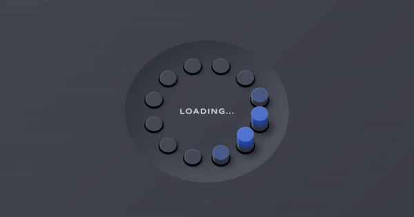
今天给大家带来一个非常炫酷的CSS3加载Loading动画,它的特别之处在于,整个Loading动画呈现出了3D的视觉效果。这个Loading加载动画由12个3D圆柱体围成一个椭圆形,同时这12个圆柱体依次波浪式地起伏,从而传递给用户“正在加载”的信息。
效果预览
代码实现
HTML代码
HTML代码十分简单,一共有三类对象,一个是最外面的椭圆容器,一个是12个圆柱体,最后是“Loading”文本。
<div class="pl"> <div class="pl__dot"></div> <div class="pl__dot"></div> <div class="pl__dot"></div> <div class="pl__dot"></div> <div class="pl__dot"></div> <div class="pl__dot"></div> <div class="pl__dot"></div> <div class="pl__dot"></div> <div class="pl__dot"></div> <div class="pl__dot"></div> <div class="pl__dot"></div> <div class="pl__dot"></div> <div class="pl__text">Loading…</div> </div> CSS代码
CSS代码主要做三件事情:
首先是让最外面的椭圆容器呈现出内陷的3D视觉效果,这里用带了box-shadow属性:
.pl { box-shadow: 2em 0 2em rgba(0, 0, 0, 0.2) inset, -2em 0 2em rgba(255, 255, 255, 0.1) inset; display: flex; justify-content: center; align-items: center; position: relative; letter-spacing: 0.1em; text-transform: uppercase; transform: rotateX(30deg) rotateZ(45deg); width: 15em; height: 15em; } 然后是让12个<div>元素成为3D效果的小圆圈,这里主要用到了box-shadow和border-radius属性:
.pl__dot { border-radius: 50%; } .pl__dot { animation-name: shadow; box-shadow: 0.1em 0.1em 0 0.1em black, 0.3em 0 0.3em rgba(0, 0, 0, 0.5); top: calc(50% - 0.75em); left: calc(50% - 0.75em); width: 1.5em; height: 1.5em; } .pl__dot, .pl__dot:before, .pl__dot:after { animation-duration: 2s; animation-iteration-count: infinite; position: absolute; } .pl__dot:before, .pl__dot:after { content: ""; display: block; left: 0; width: inherit; transition: background-color var(--trans-dur); } .pl__dot:before { animation-name: pushInOut1; background-color: var(--bg); border-radius: inherit; box-shadow: 0.05em 0 0.1em rgba(255, 255, 255, 0.2) inset; height: inherit; z-index: 1; } .pl__dot:after { animation-name: pushInOut2; background-color: var(--primary1); border-radius: 0.75em; box-shadow: 0.1em 0.3em 0.2em rgba(255, 255, 255, 0.4) inset, 0 -0.4em 0.2em #2e3138 inset, 0 -1em 0.25em rgba(0, 0, 0, 0.3) inset; bottom: 0; clip-path: polygon(0 75%, 100% 75%, 100% 100%, 0 100%); height: 3em; transform: rotate(-45deg); transform-origin: 50% 2.25em; } 最后一步就是让12个小圆圈按不同是时间间隔旋转不同的角度,从而形成波浪式的起伏效果。
.pl__dot:nth-child(1) { transform: rotate(0deg) translateX(5em) rotate(0deg); z-index: 5; } .pl__dot:nth-child(1), .pl__dot:nth-child(1):before, .pl__dot:nth-child(1):after { animation-delay: 0s; } .pl__dot:nth-child(2) { transform: rotate(-30deg) translateX(5em) rotate(30deg); z-index: 4; } .pl__dot:nth-child(2), .pl__dot:nth-child(2):before, .pl__dot:nth-child(2):after { animation-delay: -0.1666666667s; } .pl__dot:nth-child(3) { transform: rotate(-60deg) translateX(5em) rotate(60deg); z-index: 3; } .pl__dot:nth-child(3), .pl__dot:nth-child(3):before, .pl__dot:nth-child(3):after { animation-delay: -0.3333333333s; } .pl__dot:nth-child(4) { transform: rotate(-90deg) translateX(5em) rotate(90deg); z-index: 2; } .pl__dot:nth-child(4), .pl__dot:nth-child(4):before, .pl__dot:nth-child(4):after { animation-delay: -0.5s; } .pl__dot:nth-child(5) { transform: rotate(-120deg) translateX(5em) rotate(120deg); z-index: 1; } .pl__dot:nth-child(5), .pl__dot:nth-child(5):before, .pl__dot:nth-child(5):after { animation-delay: -0.6666666667s; } .pl__dot:nth-child(6) { transform: rotate(-150deg) translateX(5em) rotate(150deg); z-index: 1; } .pl__dot:nth-child(6), .pl__dot:nth-child(6):before, .pl__dot:nth-child(6):after { animation-delay: -0.8333333333s; } .pl__dot:nth-child(7) { transform: rotate(-180deg) translateX(5em) rotate(180deg); z-index: 2; } .pl__dot:nth-child(7), .pl__dot:nth-child(7):before, .pl__dot:nth-child(7):after { animation-delay: -1s; } .pl__dot:nth-child(8) { transform: rotate(-210deg) translateX(5em) rotate(210deg); z-index: 3; } .pl__dot:nth-child(8), .pl__dot:nth-child(8):before, .pl__dot:nth-child(8):after { animation-delay: -1.1666666667s; } .pl__dot:nth-child(9) { transform: rotate(-240deg) translateX(5em) rotate(240deg); z-index: 4; } .pl__dot:nth-child(9), .pl__dot:nth-child(9):before, .pl__dot:nth-child(9):after { animation-delay: -1.3333333333s; } .pl__dot:nth-child(10) { transform: rotate(-270deg) translateX(5em) rotate(270deg); z-index: 5; } .pl__dot:nth-child(10), .pl__dot:nth-child(10):before, .pl__dot:nth-child(10):after { animation-delay: -1.5s; } .pl__dot:nth-child(11) { transform: rotate(-300deg) translateX(5em) rotate(300deg); z-index: 6; } .pl__dot:nth-child(11), .pl__dot:nth-child(11):before, .pl__dot:nth-child(11):after { animation-delay: -1.6666666667s; } .pl__dot:nth-child(12) { transform: rotate(-330deg) translateX(5em) rotate(330deg); z-index: 6; } .pl__dot:nth-child(12), .pl__dot:nth-child(12):before, .pl__dot:nth-child(12):after { animation-delay: -1.8333333333s; } 另外,在12个小圆圈渐进式地变成小圆柱体的时候,圆柱体的阴影和高度变化运用到了下面的CSS3动画:
@keyframes shadow { from { animation-timing-function: ease-in; box-shadow: 0.1em 0.1em 0 0.1em black, 0.3em 0 0.3em rgba(0, 0, 0, 0.3); } 25% { animation-timing-function: ease-out; box-shadow: 0.1em 0.1em 0 0.1em black, 0.8em 0 0.8em rgba(0, 0, 0, 0.5); } 50%, to { box-shadow: 0.1em 0.1em 0 0.1em black, 0.3em 0 0.3em rgba(0, 0, 0, 0.3); } } @keyframes pushInOut1 { from { animation-timing-function: ease-in; background-color: var(--bg); transform: translate(0, 0); } 25% { animation-timing-function: ease-out; background-color: var(--primary2); transform: translate(-71%, -71%); } 50%, to { background-color: var(--bg); transform: translate(0, 0); } } @keyframes pushInOut2 { from { animation-timing-function: ease-in; background-color: var(--bg); clip-path: polygon(0 75%, 100% 75%, 100% 100%, 0 100%); } 25% { animation-timing-function: ease-out; background-color: var(--primary1); clip-path: polygon(0 25%, 100% 25%, 100% 100%, 0 100%); } 50%, to { background-color: var(--bg); clip-path: polygon(0 75%, 100% 75%, 100% 100%, 0 100%); } } 到这里,我们就完整地实现了这个纯CSS3 3D加载动画,文章最后也将源码献给大家。
源码下载
完整的代码我已经整理出了一个源码包,供大家下载学习。
关注我的