- A+
所属分类:Web前端
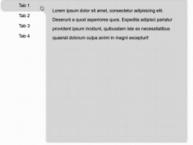
需求:根据时间轴进行tab页面内容切换(时间轴需要滑动查看并选择)
实现思路:
结合swiper插件实现滑动显示效果
根据transform: translateX进行左侧切换效果的实现(具体实现css如下),实现非滚动的点击切换效果,结合swiper进行修改
实现效果:

实现代码:需要配合swiper组件使用;左侧导航是根据html结构和css3代码,来生成的时间轴效果效果来源于http://www.htmleaf.com/css3/ui-design/201911275850.html
Swiper基础演示地址:
https://www.swiper.com.cn/demo/index.html
HTML:
<div class="swiper-container box"> <div class="swiper-wrapper main-timeline"> <div class="swiper-slide timeline fd-active-line"> <a href="javascript:void(0);" class="timeline-content"> <div class="timeline-year"> <span>2019</span> </div> </a> <div class="xians"></div> </div> <div class="swiper-slide timeline"> <a href="javascript:void(0);" class="timeline-content"> <div class="timeline-year"> <span>2018</span> </div> </a> <div class="xians"></div> </div> <div class="swiper-slide timeline"> <a href="javascript:void(0);" class="timeline-content"> <div class="timeline-year"> <span>2017</span> </div> </a> <div class="xians"></div> </div> <div class="swiper-slide timeline"> <a href="javascript:void(0);" class="timeline-content"> <div class="timeline-year"> <span>2016</span> </div> </a> <div class="xians"></div> </div> <div class="swiper-slide timeline"> <a href="javascript:void(0);" class="timeline-content"> <div class="timeline-year"> <span>2015</span> </div> </a> <div class="xians"></div> </div> <div class="swiper-slide timeline"> <a href="javascript:void(0);" class="timeline-content"> <div class="timeline-year"> <span>2014</span> </div> </a> <div class="xians"></div> </div> </div> </div> <ul class="event_list"> <div> <h3 id="2012">2019</h3> <img src="./img/lh.jpg" alt="jquery时间轴tab切换效果实现结合swiper实现滑动显示效果" alt=""> </div> <div style="display: none;"> <h3 id="2012">2018</h3> <img src="./img/lhls.jpg" alt="jquery时间轴tab切换效果实现结合swiper实现滑动显示效果" alt=""> </div> <div style="display: none;"> <h3 id="2011">2017</h3> <img src="./img/lkss.jpg" alt="jquery时间轴tab切换效果实现结合swiper实现滑动显示效果" alt=""> </div> <div style="display: none;"> <h3 id="2011">2016</h3> <img src="./img/luhu.jpg" alt="jquery时间轴tab切换效果实现结合swiper实现滑动显示效果" alt=""> </div> <div style="display: none;"> <h3 id="2011">2015</h3> <img src="./img/luhuwhite.jpg" alt="jquery时间轴tab切换效果实现结合swiper实现滑动显示效果" alt=""> </div> <div style="display: none;"> <h3 id="2011">2014</h3> <img src="./img/lhls.jpg" alt="jquery时间轴tab切换效果实现结合swiper实现滑动显示效果" alt=""> </div> </ul> </div> 所需外部链接文件:
<script src="js/jquery.min_v1.0.js" type="text/javascript"></script> <script src="js/swiper-bundle.min.js" type="text/javascript"></script> <link rel="stylesheet" href="css/swiper-bundle.min.css"> CSS
.page { width: 100%; } .main-timeline { font-family: 'Roboto', sans-serif; width: 200px; position: relative; float: left; } .main-timeline:after { content: ''; display: block; clear: both; } .main-timeline:before { /* content: ''; height: calc(100% + 80px); width: 0px; border: 2px solid #0870C5; transform: translateX(-50%); position: absolute; left: 114px; top: 0px; */ } .main-timeline .timeline { width: 4%; /* padding: 140px 70px 0 25px; */ margin: 0 50px 0 0; float: left; position: relative; } .main-timeline .timeline-content { /* padding: 15px 15px 15px 40px; border: 2px solid #00A79B; */ border-radius: 15px 0 15px 15px; display: block; position: relative; } .main-timeline .timeline-content:hover { text-decoration: none; } .fd-active-line .timeline-content:after { content: ''; background-color: #00A79B; height: 18px; width: 15px; position: absolute; right: -43px; top: 27px; /* clip-path: polygon(100% 0, 0 0, 0 100%); */ } .main-timeline .timeline-year { color: #fff; background-color: #00A79B; font-size: 24px; font-weight: 900; text-align: center; line-height: 80px; height: 80px; width: 80px; border-radius: 50%; position: absolute; right: -120px; top: -40px; } .main-timeline .timeline-year:after { content: ''; height: 100px; width: 100px; border: 8px solid #00A79B; border-left-color: transparent; border-radius: 50%; transform: translateX(-50%) translateY(-50%) rotate(-20deg); position: absolute; left: 50%; top: 50%; } .main-timeline .timeline-icon { color: #fff; background-color: #00A79B; font-size: 35px; text-align: center; line-height: 50px; height: 50px; width: 50px; border-radius: 50%; transform: translateY(-50%); position: absolute; top: 50%; left: -25px; transition: all 0.3s; } .main-timeline .title { color: #222; font-size: 20px; font-weight: 900; text-transform: uppercase; letter-spacing: 1px; margin: 0 0 7px 0; } .main-timeline .description { color: #222; font-size: 15px; letter-spacing: 1px; text-align: justify; margin: 0 0 5px; } .main-timeline .timeline:nth-child(even) .timeline-content {} .main-timeline .timeline:nth-child(even) .timeline-content:after { transform: rotateY(180deg); right: auto; left: 123px; } .main-timeline .timeline:nth-child(even) .timeline-year:after { transform: translateX(-50%) translateY(-50%) rotate(200deg); } .main-timeline .timeline:nth-child(even) .timeline-icon { left: auto; right: -25px; } .timeline:nth-child(4n+2) .timeline-content, .timeline:nth-child(4n+2) .timeline-year:after { border-color: #9E005D; } .timeline:nth-child(4n+2) .timeline-year:after { border-left-color: transparent; } .timeline:nth-child(4n+2) .timeline-content:after, .timeline:nth-child(4n+2) .timeline-icon, .timeline:nth-child(4n+2) .timeline-year { background-color: #9E005D; } .timeline:nth-child(4n+3) .timeline-content, .timeline:nth-child(4n+3) .timeline-year:after { border-color: #f24f0e; } .timeline:nth-child(4n+3) .timeline-year:after { border-left-color: transparent; } .timeline:nth-child(4n+3) .timeline-content:after, .timeline:nth-child(4n+3) .timeline-icon, .timeline:nth-child(4n+3) .timeline-year { background-color: #f24f0e; } .timeline:nth-child(4n+4) .timeline-content, .timeline:nth-child(4n+4) .timeline-year:after { border-color: #0870C5; } .timeline:nth-child(4n+4) .timeline-year:after { border-left-color: transparent; } .timeline:nth-child(4n+4) .timeline-content:after, .timeline:nth-child(4n+4) .timeline-icon, .timeline:nth-child(4n+4) .timeline-year { background-color: #0870C5; } @media screen and (max-width:767px) { .main-timeline:before { display: none; } .main-timeline .timeline { width: 100%; padding-top: 80px; padding-right: 12px; margin-bottom: 20px; } .main-timeline .timeline:nth-child(even) { padding-left: 10px; padding-top: 80px; margin-bottom: 20px; } .main-timeline .timeline-content, .main-timeline .main-timeline .timeline:nth-child(even) .timeline-content { background-color: #fff; padding-top: 25px; } .main-timeline .timeline-content:after { display: none; } .main-timeline .timeline-year { font-size: 24px; line-height: 70px; height: 70px; width: 70px; right: 0; top: -65px; } .main-timeline .timeline-year:after { display: none; } .main-timeline .timeline:nth-child(even) .timeline-year { left: 3px; } } @media screen and (max-width:567px) { .main-timeline .title { font-size: 18px; } } .swiper-container { width: 205px; height: 500px; float: left; } .swiper-slide { text-align: center; font-size: 18px; background: #fff; /* Center slide text vertically */ display: -webkit-box; display: -ms-flexbox; display: -webkit-flex; display: flex; -webkit-box-pack: center; -ms-flex-pack: center; -webkit-justify-content: center; justify-content: center; -webkit-box-align: center; -ms-flex-align: center; -webkit-align-items: center; align-items: center; } @media (max-width: 760px) { .swiper-button-next { right: 20px; transform: rotate(90deg); } .swiper-button-prev { left: 20px; transform: rotate(90deg); } } .event_list img { width: 880px; height: 470px; object-fit: cover; } .xians { width: 3px; height: 100%; background: #0870C5; position: absolute; left: 82px; z-index: -1; } js:
<script> $(function () { $(".main-timeline .timeline").click(function () { var TAG = $(this).siblings().length; if (TAG >= 1) { var index = $(this).index() $(this).addClass('fd-active-line').siblings().removeClass('fd-active-line') $(this).parent().parent().siblings('.event_list').children().eq(index).show().siblings().hide() } }) var swiper = new Swiper('.swiper-container', { slidesPerView: 4, direction: 'vertical', navigation: { nextEl: '.swiper-button-next', prevEl: '.swiper-button-prev', }, on: { resize: function () { swiper.changeDirection(getDirection()); } } }); }); </script> swiper使用方法
1.首先加载插件,需要用到的文件有swiper-bundle.min.js和swiper-bundle.min.css文件,不同Swiper版本用到的文件名略有不同。可下载Swiper文件或使用CDN。
<link rel="stylesheet" href="dist/css/swiper-bundle.min.css"> <script src="dist/js/swiper-bundle.min.js"></script> 2.HTML内容。
<div class="swiper-container"> <div class="swiper-wrapper"> <div class="swiper-slide">Slide 1</div> <div class="swiper-slide">Slide 2</div> <div class="swiper-slide">Slide 3</div> </div> <!-- 如果需要分页器 --> <div class="swiper-pagination"></div> <!-- 如果需要导航按钮 --> <div class="swiper-button-prev"></div> <div class="swiper-button-next"></div> <!-- 如果需要滚动条 --> <div class="swiper-scrollbar"></div> </div> 导航等组件可以放在container之外 3.你可能想要给Swiper定义一个大小,当然不要也行。
.swiper-container { width: 600px; height: 300px; } 4.初始化Swiper。Swiper6之前的默认容器是'.swiper-container',Swiper7以后是'.swiper'。
<script> var mySwiper = new Swiper ('.swiper-container', { direction: 'vertical', // 垂直切换选项 loop: true, // 循环模式选项 // 如果需要分页器 pagination: { el: '.swiper-pagination', }, // 如果需要前进后退按钮 navigation: { nextEl: '.swiper-button-next', prevEl: '.swiper-button-prev', }, // 如果需要滚动条 scrollbar: { el: '.swiper-scrollbar', }, }) </script> 5.完成。恭喜你,现在你的Swiper应该已经能正常切换了。
如果作为CommonJs 或ES 模块引入
//CommonJs var Swiper = require('swiper'); var mySwiper = new Swiper('.swiper-container', { /* ... */ }); //ES import Swiper from 'swiper'; var mySwiper = new Swiper('.swiper-container', { /* ... */ });