- A+
WPF相对于Winform而言,在WPF中是用不同的容器安排布局。每个容器都有各自的布局逻辑,有的以堆栈方式布置有的以单元格排列元素。这也是WPF中比较有意思的,更容易入门。通过了解WPF布局之后能有个大概的WPF乐趣之处。
1 - 理解WPF中布局
区别于Winform而言,Winform中使用刻板的基于坐标的布局将控件放到正确位置。在WPF中,使用流布局(flow)。能创建与显示分辨率和窗口大小无关的,在不同显示器正确缩放。
1.1 - WPF 布局原则
WPF窗口只能包含单个元素。在窗口放置一个容器,然后在该容器中添加其他元素。
WPF中,需要遵循以下几条重要原则:
- 不应显式设定元素尺寸。
- 不应使用屏幕坐标指定元素位置。
- 布局容器的子元素共享可用空间
- 可嵌套的布局容器
WPF应该遵循这些原则,如果不遵循这些原则,最终将得到不是很适合WPF的并且难以维护的用户界面。
1.2 - 布局过程
包含两个阶段:测量和排列。
测量阶段:容器遍历所有子元素,并询问子元素他们所期望的尺寸。
排列阶段:容器在合适的位置放置子元素。
1.3 - 布局容器
所有WPF布局容器都派生于System.Windows.Controls.Panel抽象类的面板
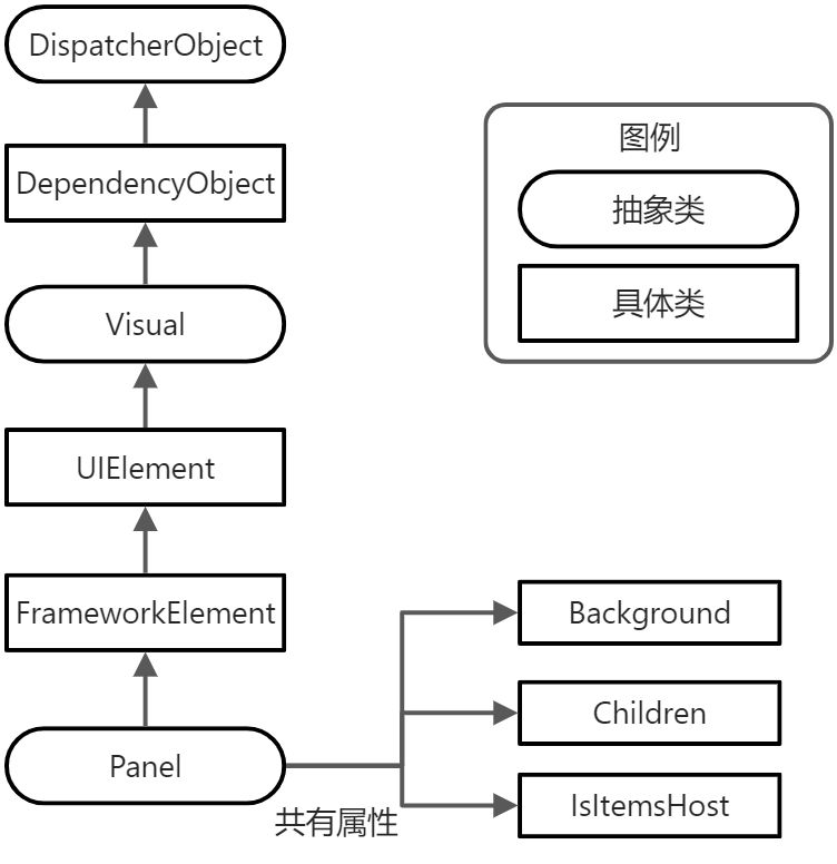
WPF中提供了大量继承于Panel的类。这些类都位于System.Windows.Controls命名空间中
|
名 称 |
说 明 |
|
StackPanel |
在水平或垂直的堆栈中放置元素。通常用于更大、更复杂窗口中的一些小区域。 |
|
WrapPanel |
在一系列中可换行的行中放置元素 |
|
DockPanel |
根据元素的整个边界调整元素 |
|
Grid |
根据不可见的表格在行列中排列元素,也是最灵活最常用的容器之一 |
|
UniformGrid |
在不可见但是强制所在单元格具有相同尺寸放置元素,不常见 |
|
Canvas |
使用固定坐标绝对定位元素与Winform相似,没有提供锚定或停靠功能。 |
除了这些容器外,还有几个更专业的面板。如TabPanel面板、ToolbarPanel面板和VirtualizingStackPanel面板、InkCanvas控件等等。
2 - 使用StackPanel面板进行简单布局
StackPanel面板是嘴贱的布局容器之一。在单行或者单列中以堆栈方式放置其子元素。
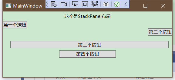
<Window x:Class="Demo_Layout.MainWindow" xmlns="http://schemas.microsoft.com/winfx/2006/xaml/presentation" xmlns:x="http://schemas.microsoft.com/winfx/2006/xaml" xmlns:d="http://schemas.microsoft.com/expression/blend/2008" xmlns:mc="http://schemas.openxmlformats.org/markup-compatibility/2006" xmlns:local="clr-namespace:Demo_Layout" mc:Ignorable="d" Title="MainWindow" Height="150" Width="200"> <StackPanel> <Label Content="这个是StackPanel布局"/> <Button Content="第一个按钮"/> <Button Content="第二个按钮"/> <Button Content="第三个按钮"/> <Button Content="第四个按钮"/> </StackPanel> </Window>界面如下
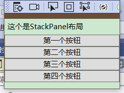
默认情况下,StackPanel面板按照自上而下顺序排列元素,使每个元素的高度适合它的内容。在上个Demo中,所有元素都被拉伸到整个程序的宽度,如果加宽从窗口,StackPanel也会变宽,里边对应的元素也会拉伸自身。
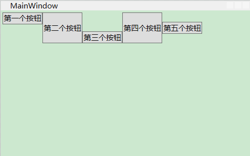
Orientation属性:可以使面板水平排列元素
<StackPanel Orientation="Horizontal">界面如下
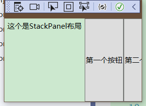
根据窗口的当前大小可能导致一些元素不适应、
2.1 - 布局属性
|
名 称 |
说 明 |
|
HorizontalAlignment |
水平方向有额外空间时,该属性决定了子元素在布局容器中如何定位,可选有Center Left Right Stretch等属性 |
|
VerticalAlignment |
垂直方向有额外空间时,该属性决定了子元素在布局容器中如何定位,可选有Center Left Right Stretch等属性 |
|
Margin |
设置对应边距,顺序分别为左上右下,如果两个的话为左右、上下 |
|
MinWidth和MinHeight |
设置元素的最小尺寸 |
|
MaxWidth和MaxHeight |
设置元素的最大尺寸 |
|
Width和Height |
设置元素的尺寸,宽度和高度,不能超过设置的最大值和最小值 |
所有的属性都从FrameworkElement基类继承而来。所以在WPF窗口中所使用的的所有图形小组件都支持这些属性。
2.2 - 对齐方式
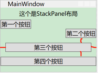
对齐方式可以通过下述代码来实现,对齐方式可以分为Left Right Center Stretch
<StackPanel> <Label HorizontalAlignment="Center" Content="这个是StackPanel布局"/> <Button HorizontalAlignment="Left" Content="第一个按钮"/> <Button HorizontalAlignment="Right" Content="第二个按钮"/> <Button Content="第三个按钮"/> <Button Content="第四个按钮"/> </StackPanel>界面如下
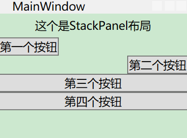
可以看到第一个元素居中,第二个元素居左,第三个元素居右。
2.3 - 边距(Margin)
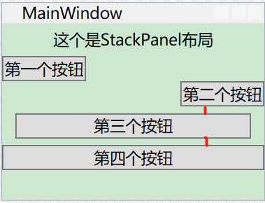
当我们设置对应第四个元素的Margin属性时,可以看到对应边距
<Button Margin="10" Content="第三个按钮"/>上下左右边距分别为10个元素
当设置为10,5时
<Button Margin="10,5" Content="第三个按钮"/>界面如下
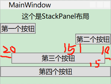
当设置为四个元素时
<Button Margin="20,15,10,5" Content="第三个按钮"/>界面如下
综上所述,当我们这只对应边距(Margin)时,可以分别设置为1,2,4时分别为:
一个时:上下左右分别为对应间距
两个时:左右为第一个、上下为第二个
四个时:分别为左上右下
2.4 - 最小尺寸、最大尺寸以及显式设置尺寸
最小尺寸设置为100时,最大尺寸设置为150时,代码和界面
<Button MinWidth="100" MaxWidth="150" Content="第四个按钮"/>
最小尺寸为每个按钮的尺寸始终不能小于最小尺寸
最大尺寸为不能超过最大尺寸
如果最小宽度大于容器宽度时,按钮一部分将被裁剪掉。否则不允许按钮比Panel面板更宽
3 - WrapPanel和DockPanel面板
3.1 - WrapPanel 面板
WrapPanel面板以一次一行或者一列方式部署控件。默认情况下,WrapPanel的Orientation属性为Horizontal,控件从左向右进行排列,再在下一行中排列。将其属性设置为Vertical,从而在多个列中放置元素。
代码和界面
<Window x:Class="Demo_Layout.MainWindow" xmlns="http://schemas.microsoft.com/winfx/2006/xaml/presentation" xmlns:x="http://schemas.microsoft.com/winfx/2006/xaml" xmlns:d="http://schemas.microsoft.com/expression/blend/2008" xmlns:mc="http://schemas.openxmlformats.org/markup-compatibility/2006" xmlns:local="clr-namespace:Demo_Layout" mc:Ignorable="d" Title="MainWindow" Height="250" Width="400"> <WrapPanel Margin="3"> <Button VerticalAlignment="Top" Content="第一个按钮"/> <Button MinHeight="50" Content="第二个按钮"/> <Button VerticalAlignment="Bottom" Content="第三个按钮"/> <Button Content="第四个按钮"/> <Button VerticalAlignment="Center" Content="第五个按钮"/> </WrapPanel> </Window>界面如下
WrapPanel是唯一一个不能通过灵活使用Grid面板代替的容器
3.2 - DockPanel面板
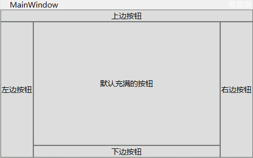
DockPanel沿着一条外边缘来拉伸所包含的控件。通过对应的附加属性选择靠边,可将对应属性设置为Left,Right,Top,和Bottom。放在DockPanel面板的每个元素都会自动获取该属性。
代码和界面如下
<Window x:Class="Demo_Layout.MainWindow" xmlns="http://schemas.microsoft.com/winfx/2006/xaml/presentation" xmlns:x="http://schemas.microsoft.com/winfx/2006/xaml" xmlns:d="http://schemas.microsoft.com/expression/blend/2008" xmlns:mc="http://schemas.openxmlformats.org/markup-compatibility/2006" xmlns:local="clr-namespace:Demo_Layout" mc:Ignorable="d" Title="MainWindow" Height="250" Width="400"> <DockPanel> <Button DockPanel.Dock="Top" Content="上边按钮"/> <Button DockPanel.Dock="Left" Content="左边按钮"/> <Button DockPanel.Dock="Right" Content="右边按钮"/> <Button DockPanel.Dock="Bottom" Content="下边按钮"/> <Button Content="默认充满的按钮"/> </DockPanel> </Window>界面如下
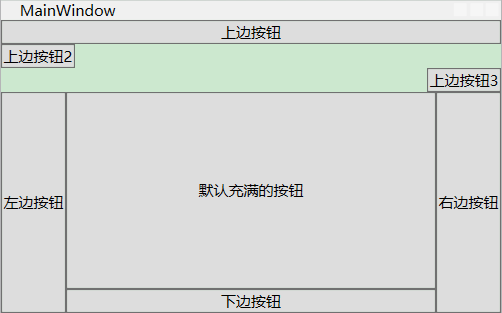
如果说对应一个里边包含了多个元素可以分别设置
<Window x:Class="Demo_Layout.MainWindow" xmlns="http://schemas.microsoft.com/winfx/2006/xaml/presentation" xmlns:x="http://schemas.microsoft.com/winfx/2006/xaml" xmlns:d="http://schemas.microsoft.com/expression/blend/2008" xmlns:mc="http://schemas.openxmlformats.org/markup-compatibility/2006" xmlns:local="clr-namespace:Demo_Layout" mc:Ignorable="d" Title="MainWindow" Height="250" Width="400"> <DockPanel> <StackPanel DockPanel.Dock="Top"> <Button Content="上边按钮"/> <Button HorizontalAlignment="Left" Content="上边按钮2"/> <Button HorizontalAlignment="Right" Content="上边按钮3"/> </StackPanel> <Button DockPanel.Dock="Left" Content="左边按钮"/> <Button DockPanel.Dock="Right" Content="右边按钮"/> <Button DockPanel.Dock="Bottom" Content="下边按钮"/> <Button Content="默认充满的按钮"/> </DockPanel> </Window>界面如下
3.3 - 嵌套布局容器
布局容器也是可以嵌套的。如创建一个标准对话框,右下角为确认和返回按钮,并在剩余部分创建对应文字说明。
1 - 创建StackPanel,将亮哥按钮放置一块
2 - 在DockPanel放置StackPanel 并停靠下边
3 - 将DockPanel的LastChildFill设置为True
4 - 设置边距属性,提供一定的空白空间
如下代码
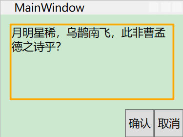
<Window x:Class="Demo_Layout.MainWindow" xmlns="http://schemas.microsoft.com/winfx/2006/xaml/presentation" xmlns:x="http://schemas.microsoft.com/winfx/2006/xaml" xmlns:d="http://schemas.microsoft.com/expression/blend/2008" xmlns:mc="http://schemas.openxmlformats.org/markup-compatibility/2006" xmlns:local="clr-namespace:Demo_Layout" mc:Ignorable="d" Title="MainWindow" Height="150" Width="200"> <DockPanel LastChildFill="True"> <Border Margin="10" DockPanel.Dock="Top" BorderBrush="Orange" BorderThickness="2" > <TextBlock TextWrapping="Wrap" Height="80" Text="月明星稀,乌鹊南飞,此非曹孟德之诗乎?"/> </Border> <StackPanel DockPanel.Dock="Bottom" HorizontalAlignment="Right" Orientation="Horizontal"> <Button Padding="3" Content="确认"/> <Button Padding="3" Content="取消"/> </StackPanel> </DockPanel> </Window>界面如下
3.4 - Grid面板
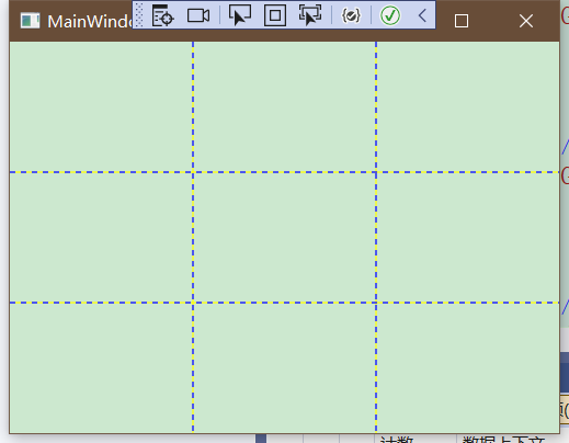
Grid是WPF中最强大的布局容器。很多使用其他完成的用Grid都可以完成。Grid是可以将面板分为几行几列的网格。Grid虽然不可见但是可以将Grid.ShowGridLines属性设置为True。方便调试。
创建Grid需要设置对应的行列,随后填充对应内容。
<Window x:Class="Demo_Layout.MainWindow" xmlns="http://schemas.microsoft.com/winfx/2006/xaml/presentation" xmlns:x="http://schemas.microsoft.com/winfx/2006/xaml" xmlns:d="http://schemas.microsoft.com/expression/blend/2008" xmlns:mc="http://schemas.openxmlformats.org/markup-compatibility/2006" xmlns:local="clr-namespace:Demo_Layout" mc:Ignorable="d" Title="MainWindow" Height="150" Width="200"> <Grid ShowGridLines="True"> <Grid.RowDefinitions> <RowDefinition/> <RowDefinition/> <RowDefinition/> </Grid.RowDefinitions> <Grid.ColumnDefinitions> <ColumnDefinition/> <ColumnDefinition/> <ColumnDefinition/> </Grid.ColumnDefinitions> </Grid> </Window>界面如下
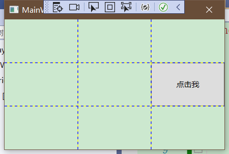
这是Grid的布局,此时我们可以开始向Grid中填充元素。比如我们向第二行第三列中添加一个显示内容为"点击我"的按钮
<Button Content="点击我" Grid.Column="2" Grid.Row="1"/>界面如下
调整行和列
Grid面板支持三种设置尺寸的方式:
- 绝对设置尺寸方式 如:Width=“100”
- 自动设置尺寸方式 如:Width=“Auto”
- 按照比例设置尺寸方式 如:Width=“*”
<Grid.RowDefinitions> <RowDefinition Height="*"/> <RowDefinition Height="1.5*"/> <RowDefinition Height="2.5*"/> </Grid.RowDefinitions>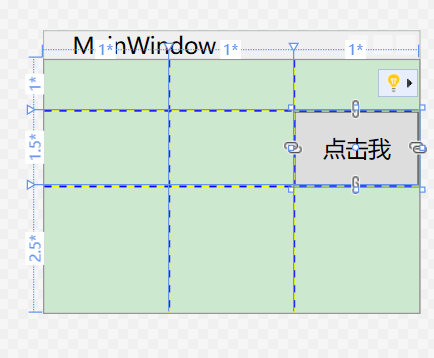
自动设置
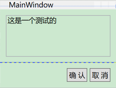
<Window x:Class="Demo_Layout.MainWindow" xmlns="http://schemas.microsoft.com/winfx/2006/xaml/presentation" xmlns:x="http://schemas.microsoft.com/winfx/2006/xaml" xmlns:d="http://schemas.microsoft.com/expression/blend/2008" xmlns:mc="http://schemas.openxmlformats.org/markup-compatibility/2006" xmlns:local="clr-namespace:Demo_Layout" mc:Ignorable="d" Title="MainWindow" Height="150" Width="200"> <Grid ShowGridLines="True"> <Grid.RowDefinitions> <RowDefinition Height="*"/> <RowDefinition Height="Auto"/> </Grid.RowDefinitions> <TextBox Margin="10" Grid.Row="0" Text="这是一个测试的"/> <StackPanel Grid.Row="1" HorizontalAlignment="Right" Orientation="Horizontal"> <Button Margin="10,10,2,10" Padding="3" Content="确 认"/> <Button Margin="2,10,10,10" Padding="3" Content="取 消"/> </StackPanel> </Grid> </Window>界面如下
3.5 - UniformGrid 和 Canvas面板
3.5.1 - UniformGrid面板
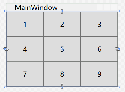
UniformGrid不同于Grid 不需要设置对应行列,设置简单Rows和Columns来设置尺寸即可。
比如:
<Window x:Class="Demo_Layout.MainWindow" xmlns="http://schemas.microsoft.com/winfx/2006/xaml/presentation" xmlns:x="http://schemas.microsoft.com/winfx/2006/xaml" xmlns:d="http://schemas.microsoft.com/expression/blend/2008" xmlns:mc="http://schemas.openxmlformats.org/markup-compatibility/2006" xmlns:local="clr-namespace:Demo_Layout" mc:Ignorable="d" Title="MainWindow" Height="150" Width="200"> <UniformGrid Rows="3" Columns="3"> <Button Content="1"/> <Button Content="2"/> <Button Content="3"/> <Button Content="4"/> <Button Content="5"/> <Button Content="6"/> <Button Content="7"/> <Button Content="8"/> <Button Content="9"/> </UniformGrid> </Window>界面如下
3.5.2 - Canvas 面板
Canvas面板允许使用精确的坐标放置元素。需要设置Canvas.Left和Canvas.Top附加属性,Left属性设置元素左边和Canvas面板左边之间的单位数。从左上角(0,0)开始到右下角分别为X,Y。
如下代码:
<Window x:Class="Demo_Layout.MainWindow" xmlns="http://schemas.microsoft.com/winfx/2006/xaml/presentation" xmlns:x="http://schemas.microsoft.com/winfx/2006/xaml" xmlns:d="http://schemas.microsoft.com/expression/blend/2008" xmlns:mc="http://schemas.openxmlformats.org/markup-compatibility/2006" xmlns:local="clr-namespace:Demo_Layout" mc:Ignorable="d" Title="MainWindow" Height="150" Width="240"> <Canvas> <Button Canvas.Left="10" Canvas.Top="10" Content="(10,10)"/> <Button Canvas.Left="40" Canvas.Top="60" Content="(40,60)"/> <Button Canvas.Left="100" Canvas.Top="20" Content="(100,20)"/> <Button Canvas.Left="140" Canvas.Top="90" Content="(140,90)"/> </Canvas> </Window>界面如下:
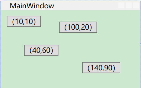
按照画布的坐标点布局。
其中Z顺序
<Button Canvas.Left="10" Panel.ZIndex="0" Canvas.Top="10" Content="(10,10)1"/> <Button Canvas.Left="10" Panel.ZIndex="1" Canvas.Top="10" Content="(10,10)2"/>同样的坐标体系,当ZIndex较大时,才会显示在最顶层。当设置第一个元素的ZIndex为2时,界面显示的名称是“(10,10)1”
3.6 - 布局Demo
行列设置:
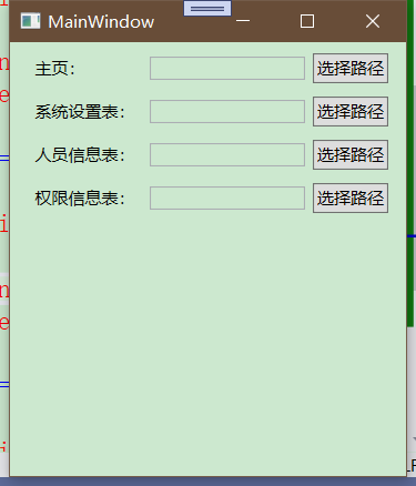
<Window x:Class="Demo_Layout.MainWindow" xmlns="http://schemas.microsoft.com/winfx/2006/xaml/presentation" xmlns:x="http://schemas.microsoft.com/winfx/2006/xaml" xmlns:d="http://schemas.microsoft.com/expression/blend/2008" xmlns:mc="http://schemas.openxmlformats.org/markup-compatibility/2006" xmlns:local="clr-namespace:Demo_Layout" mc:Ignorable="d" Title="MainWindow" Height="350" Width="300"> <Grid Margin="10,3,10,10"> <Grid.RowDefinitions> <RowDefinition Height="Auto"/> <RowDefinition Height="Auto"/> <RowDefinition Height="Auto"/> <RowDefinition Height="Auto"/> </Grid.RowDefinitions> <Grid.ColumnDefinitions> <ColumnDefinition Width="Auto"/> <ColumnDefinition Width="*"/> <ColumnDefinition Width="Auto"/> </Grid.ColumnDefinitions> <!--第一行--> <Label Grid.Row="0" Grid.Column="0" Margin="3" Content="主页:" VerticalAlignment="Center"/> <TextBox Grid.Row="0" Grid.Column="1" Margin="3" Height="Auto" VerticalAlignment="Center"/> <Button Grid.Column="2" Grid.Row="0" Content="选择路径" Margin="3" Padding="2" Height="Auto" VerticalAlignment="Center"/> <!--第二行--> <Label Grid.Row="1" Grid.Column="0" Margin="3" Content="系统设置表:" VerticalAlignment="Center"/> <TextBox Grid.Row="1" Grid.Column="1" Margin="3" Height="Auto" VerticalAlignment="Center"/> <Button Grid.Column="2" Grid.Row="1" Content="选择路径" Margin="3" Padding="2" Height="Auto" VerticalAlignment="Center"/> <!--第三行--> <Label Grid.Row="2" Grid.Column="0" Margin="3" Content="人员信息表:" VerticalAlignment="Center"/> <TextBox Grid.Row="2" Grid.Column="1" Margin="3" Height="Auto" VerticalAlignment="Center"/> <Button Grid.Column="2" Grid.Row="2" Content="选择路径" Margin="3" Padding="2" Height="Auto" VerticalAlignment="Center"/> <!--第四行--> <Label Grid.Row="3" Grid.Column="0" Margin="3" Content="权限信息表:" VerticalAlignment="Center"/> <TextBox Grid.Row="3" Grid.Column="1" Margin="3" Height="Auto" VerticalAlignment="Center"/> <Button Grid.Column="2" Grid.Row="3" Content="选择路径" Margin="3" Padding="2" Height="Auto" VerticalAlignment="Center"/> </Grid> </Window>界面如下:
Demo2
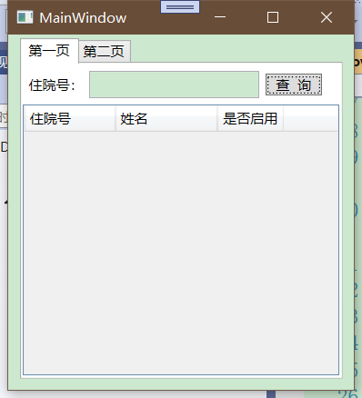
<Window x:Class="Demo_Layout.MainWindow" xmlns="http://schemas.microsoft.com/winfx/2006/xaml/presentation" xmlns:x="http://schemas.microsoft.com/winfx/2006/xaml" xmlns:d="http://schemas.microsoft.com/expression/blend/2008" xmlns:mc="http://schemas.openxmlformats.org/markup-compatibility/2006" xmlns:local="clr-namespace:Demo_Layout" mc:Ignorable="d" Title="MainWindow" Height="350" Width="300"> <Grid Margin="10,3,10,10"> <TabControl> <TabItem Header="第一页"> <Grid> <Grid.RowDefinitions> <RowDefinition Height="*"/> <RowDefinition Height="7*"/> </Grid.RowDefinitions> <StackPanel Orientation="Horizontal" Grid.Row="0"> <Label Content="住院号:" VerticalAlignment="Center"/> <TextBox Height="Auto" HorizontalAlignment="Center" Width="150" Margin="0,5"/> <Button VerticalAlignment="Center" Content="查 询" Height="Auto" Margin="5,5" Width="50"/> </StackPanel> <DataGrid Grid.Row="1"> <DataGrid.Columns> <DataGridTextColumn Header="住院号" Width="80"/> <DataGridTextColumn Header="姓名" Width="90"/> <DataGridTextColumn Header="是否启用" Width="Auto"/> </DataGrid.Columns> </DataGrid> </Grid> </TabItem> <TabItem Header="第二页"/> </TabControl> </Grid> </Window>界面