- A+
所属分类:Web前端
前言
这是疫情可视化最开始的文章,有需要了解的可前往查看:https://www.cnblogs.com/xi12/p/16690119.html。 本来说有时间就把这个项目完结了的,结果后面一直有事拖着,直到现在十一月份了才搞完。老样子,先看成果。
- 浏览链接:https://xi1213.gitee.io/covid19-visualization
- 项目链接(欢迎各位大哥star):https://gitee.com/xi1213/covid19-visualization
修改与添加
后面可能审美疲劳了,越看越丑,就干脆直接用dataV(这可不是阿里的那个dataV)修饰页面了。这是项目改动后的样子:


主要做了如下改动:
- 添加首页的3d粒子球体。
- 完成“省内分析”模块。
- 完成当地疫情报告生成与下载。
- 使用dataV修饰页面。
粒子球体
粒子球体也是用three.js完成的,放大仔细看会发现其实是有三层构成的:内层透明球体,中间点状球体,外层病毒球体。

具体实现过程是这样的:
- 先绘制一个内层透明球体,记得将球体材质的transparent设为true,然后设置不透明度opacity值。
//创建斑点球体 async function createSpotSphere() { let globeBufferGeometry = new THREE.SphereGeometry(earthSize - 1, 50, 50);//球体几何体 let globeInnerMaterial = new THREE.MeshBasicMaterial({ color: new THREE.Color(dvColor[0]),//颜色 // blending: THREE.AdditiveBlending,//纹理融合的叠加方式 // side: THREE.FrontSide,//前面显示 transparent: true,//透明 // depthWrite: false,//深度写入 // depthTest: false,//黑洞效果 opacity: .3,//不透明度 }); let globeInnerMesh = new THREE.Mesh( globeBufferGeometry, globeInnerMaterial ); earthGroup.add(globeInnerMesh); //将网格放入地球组 cre - 创建点状球体。这里需要使用一张黑白的世界地图。
let img = new Image(); img.src = earthGrayscale; //黑白地图 将图片使用onload加载到项目中后,利用canvas绘制一遍该图,再使用getImageData获取到像素点数据canData。
let canvas = document.createElement("canvas"); canvas.width = img.width; //使得canvas尺寸与图片尺寸相同 canvas.height = img.height; (canvas.getContext("2d") as any).drawImage(img, 0, 0, img.width, img.height);//canvas绘制图片 let canData = (canvas.getContext("2d") as any).getImageData(0, 0, canvas.width, canvas.height);//获取画布像素数据 利用canData .data中的rgba信息生成缓冲几何顶点数组globeCloudVerticesArray。
let globeCloudBufferGeometry = new THREE.BufferGeometry(); //设置缓冲几何体 let globeCloudVerticesArray = []; //地球云缓冲几何体顶点 let o = null; //数组处理时的计数 for (o = 0; o < canData.data.length; o += 4) { let r = (o / 4) % canvas.width, i = (o / 4 - r) / canvas.width; if ((o / 4) % 2 == 1 && i % 2 == 1) if (0 === canData.data[o]) { let n = r, longitude = (i / (canvas.height / 180) - 90) / -1, //经度 latitude = n / (canvas.width / 360) - 180; //维度 let s = latLongToVector3(longitude, latitude, earthSize, .1); //经纬度变换 globeCloudVerticesArray.push(s); //将变换后的顶点放入数组 } } 然后再使用three中的BufferAttribute生成属性position与color。
let l = new Float32Array(3 * globeCloudVerticesArray.length); //创建顶点数组长度 for (o = 0; o < globeCloudVerticesArray.length; o++) { l[3 * o] = globeCloudVerticesArray[o].x;//设置顶点数组数据 l[3 * o + 1] = globeCloudVerticesArray[o].y; l[3 * o + 2] = globeCloudVerticesArray[o].z; } let positionVal = new THREE.BufferAttribute(l, 3); //设置缓冲区属性值 globeCloudBufferGeometry.setAttribute("position", positionVal); //给缓冲几何体添加位置属性 let globeCloudMaterial = new THREE.PointsMaterial({ color: new THREE.Color(dvColor[1]),//颜色 fog: true, size: 1, });//球面斑点材质 let d = new Float32Array(3 * globeCloudVerticesArray.length), c = []; for (o = 0; o < globeCloudVerticesArray.length; o++) { c[o] = new THREE.Color(dvColor[1]);//球面斑点颜色 d[3 * o] = c[o].r;//设置地球云数组rgb颜色 d[3 * o + 1] = c[o].g; d[3 * o + 2] = c[o].b; } let color_val = new THREE.BufferAttribute(d, 3); globeCloudBufferGeometry.setAttribute("color", color_val);//给缓冲几何体添加颜色属性,修改颜色直接修改globeCloudBufferGeometry的setAttribute 最后再使用THREE.Points创建球面的点,将position与color属性添加到点的几何体BufferGeometry中。
let globeCloud = new THREE.Points(//球面的象素点 globeCloudBufferGeometry, globeCloudMaterial ); 这是需要用到的坐标转换方法:
//经纬度坐标变换(传入e:纬度、a经度、t球半径、o球额外距离) function latLongToVector3(e: any, a: any, t: any, o: any) { var r = (e * Math.PI) / 180, i = ((a - 180) * Math.PI) / 180, n = -(t + o) * Math.cos(r) * Math.cos(i), s = (t + o) * Math.sin(r), l = (t + o) * Math.cos(r) * Math.sin(i); return new THREE.Vector3(n, s, l); //计算三维向量 }; - 创建最外层的病毒球体。每一个病毒都是一个THREE.Sprite,材质是THREE.SpriteMaterial,利用Sprite.position.set设置具体坐标位置,最后将Sprite添加到球体组中。病毒的颜色是由当前点确诊值决定的,颜色值在colors数组中取出。
//创建病毒 function createVirus(data: any, earthSize: any) { let colors = [ new THREE.Color(0xf9b8b8), new THREE.Color(0xfe4242), new THREE.Color(0xff0000), ]; //病毒颜色列表 let virSize = 4; //病毒大小 let list = JSON.parse(JSON.stringify(data)); list.forEach((e: { value: number; color: any; position: any[]; }) => { e.value >= 10000000 && (e.color = colors[2]); //根据病毒数赋予不同颜色 e.value >= 500000 && e.value < 10000000 && (e.color = colors[1]); e.value < 500000 && (e.color = colors[0]); if (e.position) { let virusMaterial = new THREE.SpriteMaterial({ color: e.color, map: new THREE.TextureLoader().load(virusImg), side: THREE.FrontSide, //只显示前面 }); //病毒材质 let Sprite = new THREE.Sprite(virusMaterial); //点精灵材质 Sprite.scale.set(virSize, virSize, 1); //点大小 let lat = e.position[1]; //纬度 let lon = e.position[0]; //经度 let s = latLongToVector3(lat, lon, earthSize, 1); //坐标转换 Sprite.position.set(s.x, s.y, s.z); //设置点的位置 Sprite.dotData = e; //将点的数据添加到dotData属性中 Sprite.name = "病毒"; earthGroup.add(Sprite); //将病毒添加进球体组中 } }); }; 省内分析
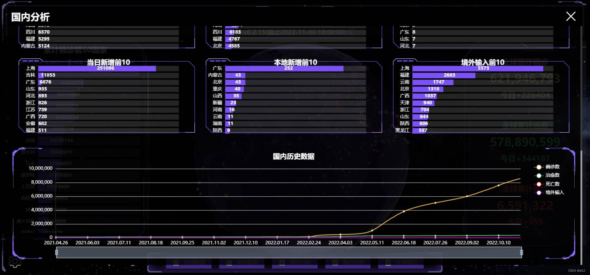
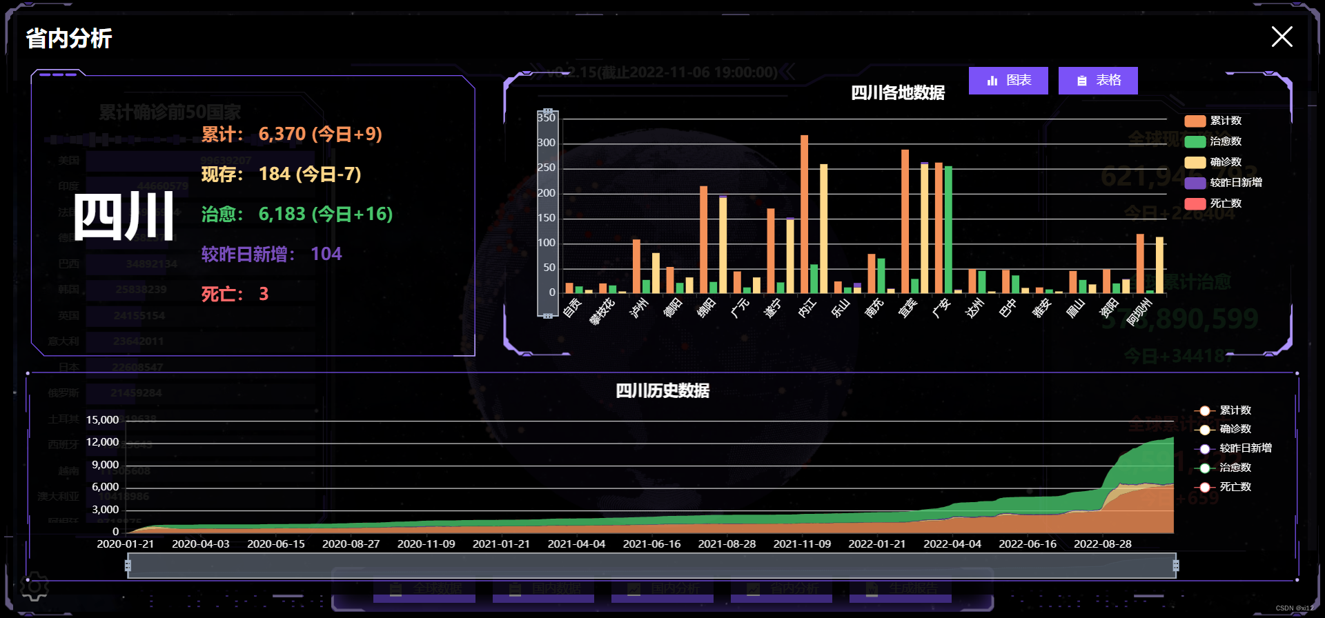
- 省内数据概况。
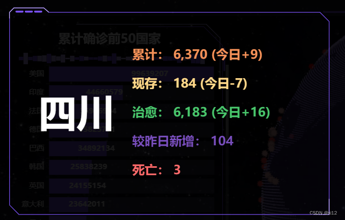
该数值在加载时是有增加动画的,是利用vue响应式原理完成的,在上一篇文章中有提到。 - 省内各地疫情柱状图。
这是具体的echart配置:
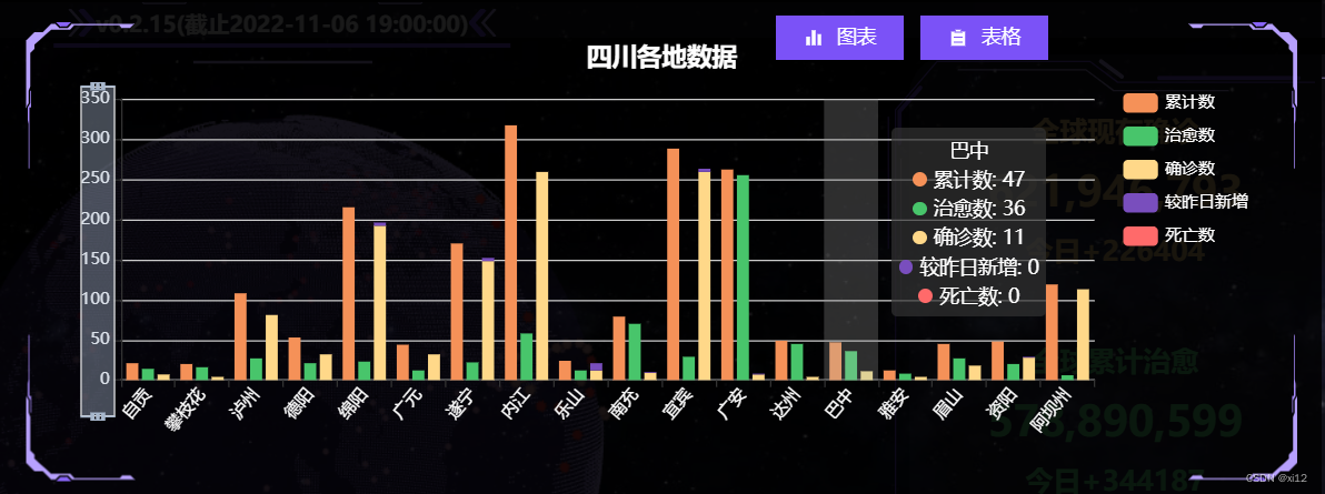
let option = { title: { text: provinceBaseData.value.province + "各地数据", left: "center", top: '5%', textStyle: { color: "#fff", }, }, tooltip: { trigger: 'axis', axisPointer: { type: 'shadow' } }, dataZoom: [ { type: 'inside', }, { show: true, yAxisIndex: 0, filterMode: 'empty', width: 25, height: '70%', showDataShadow: false, left: '3%', top: "center" } ], legend: { data: ['累计数', '治愈数', '确诊数', '较昨日新增', '死亡数'], orient: "vertical", top: "15%", right: "2%", textStyle: { color: "#fff" }, }, grid: { left: '3%', right: '15%', bottom: '10%', containLabel: true }, xAxis: { type: 'category', data: echartData.cityName, axisLabel: { interval: 0, rotate: 50, color: "#fff" }, }, yAxis: { type: 'value', axisLabel: { color: "#fff", }, }, series: [ { name: '累计数', type: 'bar', emphasis: { focus: 'series' }, itemStyle: { color: '#f59158' }, data: echartData.conNum }, { name: '治愈数', type: 'bar', emphasis: { focus: 'series' }, itemStyle: { color: '#48c56b' }, data: echartData.cureNum }, { name: '确诊数', type: 'bar', stack: 'total', emphasis: { focus: 'series' }, itemStyle: { color: '#ffd889' }, data: echartData.econNum }, { name: '较昨日新增', type: 'bar', stack: 'total', emphasis: { focus: 'series' }, itemStyle: { color: '#794ebd' }, data: echartData.asymptomNum }, { name: '死亡数', type: 'bar', stack: 'total', emphasis: { focus: 'series' }, itemStyle: { color: '#ff6a6a' }, data: echartData.deathNum }, ] }; - 省份历史疫情数据图表。
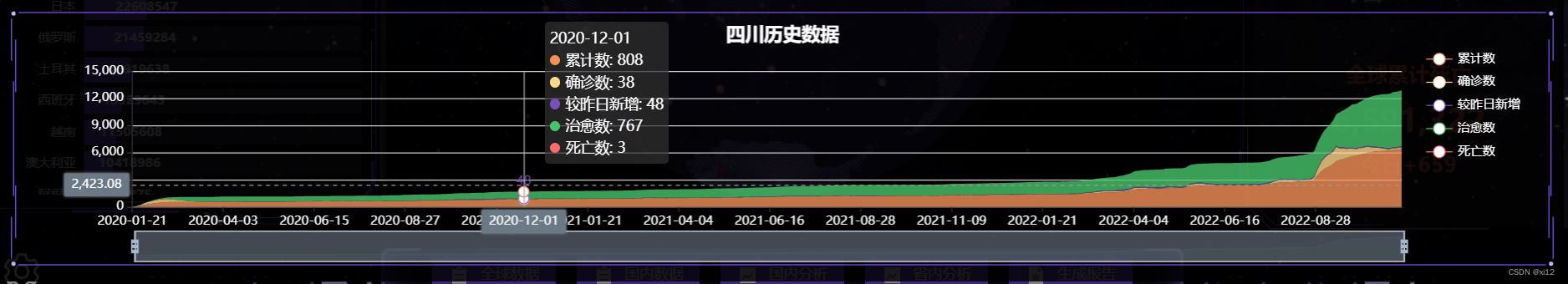
这是该图表配置:
let option = { title: { text: provinceBaseData.value.province + "历史数据", left: "center", top: '5%', textStyle: { color: "#fff", }, }, tooltip: { trigger: 'axis', axisPointer: { type: 'cross', label: { backgroundColor: '#6a7985' } } }, legend: { data: ['累计数', '确诊数', '较昨日新增', '治愈数', '死亡数'], orient: "vertical", top: "15%", right: "2%", textStyle: { color: "#fff" }, }, grid: { left: '8%', }, xAxis: [ { type: 'category', boundaryGap: false, axisLabel: { color: "#fff", }, data: echatrData.time } ], yAxis: [ { type: 'value', axisLabel: { color: "#fff", }, } ], dataZoom: [ { startValue: '' }, { type: 'inside' } ], series: [ { name: '累计数', type: 'line', stack: 'Total', smooth: true, lineStyle: { width: 0 }, showSymbol: false, areaStyle: { opacity: 0.8, color: "#f59158" }, emphasis: { focus: 'series' }, itemStyle: { color: '#f59158' }, data: echatrData.conNum }, { name: '确诊数', type: 'line', stack: 'Total', smooth: true, lineStyle: { width: 0 }, showSymbol: false, areaStyle: { opacity: 0.8, color: "#ffd889" }, itemStyle: { color: '#ffd889' }, emphasis: { focus: 'series' }, data: echatrData.econNum }, { name: '较昨日新增', type: 'line', stack: 'Total', smooth: true, lineStyle: { width: 0 }, showSymbol: false, label: { show: true, position: 'top' }, areaStyle: { opacity: 0.8, color: "#794ebd" }, itemStyle: { color: '#794ebd' }, emphasis: { focus: 'series' }, data: echatrData.asymptomNum }, { name: '治愈数', type: 'line', stack: 'Total', smooth: true, lineStyle: { width: 0 }, showSymbol: false, areaStyle: { opacity: 0.8, color: "#48c56b" }, itemStyle: { color: '#48c56b' }, emphasis: { focus: 'series' }, data: echatrData.cureNum }, { name: '死亡数', type: 'line', stack: 'Total', smooth: true, lineStyle: { width: 0 }, showSymbol: false, areaStyle: { opacity: 0.8, color: "#ff6a6a" }, itemStyle: { color: '#ff6a6a' }, emphasis: { focus: 'series' }, data: echatrData.deathNum }, ] }; 报告生成与下载
报告生成利用的是docxtemplater,这是前端生成word比较方便的一个插件,具体使用方法可以看这里:https://www.cnblogs.com/xi12/p/16863383.html。
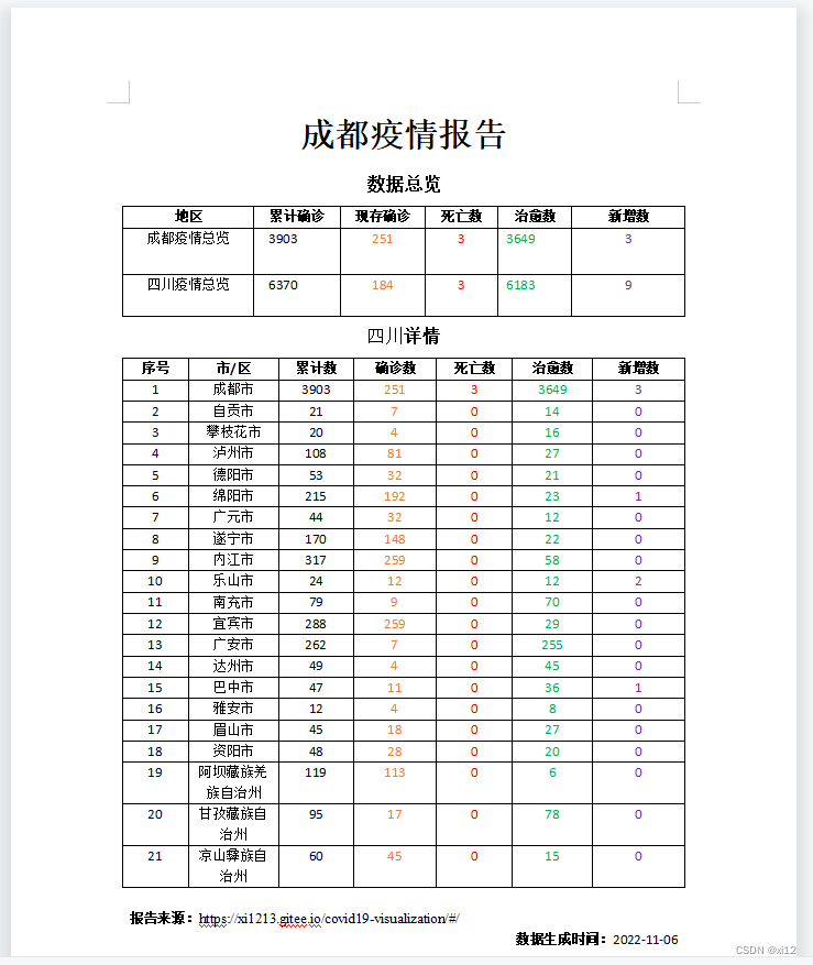
- 这是生成的word报告示例:
dataV修饰
- dataV是一个大屏可视化组件库,这是使用文档:http://datav.jiaminghi.com/guide/。
- dataV是vue2开始的,vue3使用的话会报错,需要做一点修改,具体看这里:https://www.cnblogs.com/xi12/p/16859415.html。
- 我只用了dataV中的一些边框与装饰,你在页面中看到的紫色线框和一些动画的装饰就是dataV的,还是蛮漂亮的。
结语
- 最后我发现人的审美真的变化太快了。
- 项目刚搞完:嗯不错!真漂亮!
- 过去一周后:什么玩意!丑得一批!
- 如果还有后续的话,我可能就要考虑添加自定义主题配色了。