- A+
所属分类:Web前端
公共样式:
<style> * { margin: 0; padding: 0; } .has-flex { display: flex; } </style>
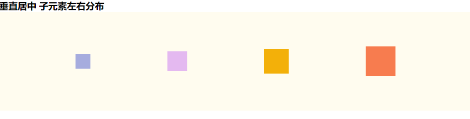
垂直居中 子元素左右分布
css
.father-one { width: 100%; height: 200px; background-color: #fffcef; align-items: center; /*纵轴)方向上的对齐方式。*/ justify-content: space-between; /* 均匀排列每个元素 首个元素放置于起点,末尾元素放置于终点,中间元素的中间间隔相等 */ justify-content: space-around; /* 均匀排列每个元素 每个元素周围分配相同的空间 */ justify-content: space-evenly; /* 均匀排列每个元素 每个元素之间的间隔相等 */ } .fa-one-child1 { height: 30px; width: 30px; background-color: #a6acde; } .fa-one-child2 { height: 40px; width: 40px; background-color: #e4b9f0; } .fa-one-child3 { height: 50px; width: 50px; background-color: #f3b009; } .fa-one-child4 { height: 60px; width: 60px; background-color: #f77c4f; }
html
<!--垂直居中 子元素左右分布 star--> <h3>垂直居中 子元素左右分布</h3> <div class="father-one has-flex"> <div class="fa-one-child1"></div> <div class="fa-one-child2"></div> <div class="fa-one-child3"></div> <div class="fa-one-child4"></div> </div> <!--垂直居中 子元素左右分布 end-->
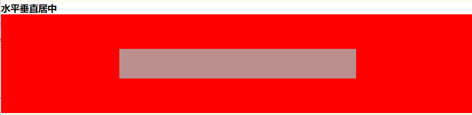
水平垂直居中
css
.father-two { width: 100%; height: 200px; align-items: center; /*纵轴)方向上的对齐方式。*/ justify-content: center; /* 横轴)方向上的对齐方式*/ background-color: red; } .child { width: 50%; height: 60px; background-color: rosybrown; }
html
<!--水平垂直居中 star--> <h3>水平垂直居中</h3> <div class="father-two has-flex"> <div class="child"></div> </div> <!--水平垂直居中 end-->
水平垂直居中 图标在上文字在下
css
.father-three { height: 80px; background-color: #f77c4f; align-items: center; justify-content: center; flex-direction: column; }
html
<!--水平垂直居中 图标在上文字在下 star--> <h3>水平垂直居中 图标在上文字在下</h3> <div class="has-flex father-three"> <i class="fa fa-file-text-o" aria-hidden="true"></i> <p>测试</p> </div> <!--水平垂直居中 图标在上文字在下 end-->

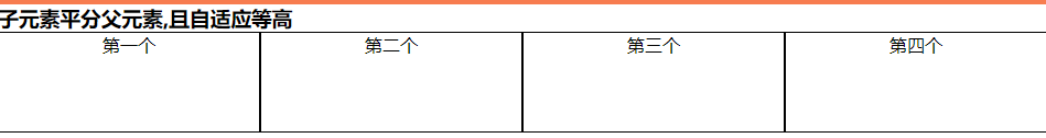
子元素平分父元素,且自适应等高
css
.father-four { background-color: #ffd5eb; } .fa-four-child { flex: 1; text-align: center; background-color: #ffffff; border: 1px solid; }
html
<!--子元素平分父元素,且自适应等高 star--> <h3>子元素平分父元素,且自适应等高 </h3> <div class="has-flex father-four"> <div class="fa-four-child">第一个</div> <div class="fa-four-child">第二个</div> <div class="fa-four-child">第三个</div> <div class="fa-four-child" style="height: 90px">第四个</div> </div> <!--子元素平分父元素,且自适应等高 end-->
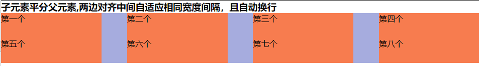
子元素平分父元素,两边对齐中间自适应相同宽度间隔,且自动换行
css
.father-five { height: 100px; background-color: #a6acde; justify-content: space-between; flex-wrap: wrap; } .fa-five-child { width: 21%; background-color: #f77c4f; }
html
<!--子元素平分父元素,两边对齐中间自适应相同宽度间隔,且自动换行 star--> <h3>子元素平分父元素,两边对齐中间自适应相同宽度间隔,且自动换行 </h3> <div class="has-flex father-five"> <div class="fa-five-child">第一个</div> <div class="fa-five-child">第二个</div> <div class="fa-five-child">第三个</div> <div class="fa-five-child">第四个</div> <div class="fa-five-child">第五个</div> <div class="fa-five-child">第六个</div> <div class="fa-five-child">第七个</div> <div class="fa-five-child">第八个</div> </div> <!--子元素平分父元素,两边对齐中间自适应相同宽度间隔,且自动换行 end-->
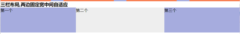
三栏布局,两边固定宽中间自适应
css
.father-six { height: 100px; } .one-child, .three-child { width: 300px; background-color: #a6acde; } .two-child { flex: 1; background-color: #eeeeee; }
html
<!--三栏布局,两边固定宽中间自适应 star--> <h3>三栏布局,两边固定宽中间自适应 </h3> <div class="has-flex father-six"> <div class="fa-six-child one-child">第一个</div> <div class="fa-six-child two-child">第二个</div> <div class="fa-six-child three-child">第三个</div> </div> <!--三栏布局,两边固定宽中间自适应 end-->
对于Flex 布局更详细的讲解请移步:Flex 布局教程:语法篇
相关css面试题:两边宽度已知,如何让中间自适应