- A+
盒模型
标准盒模型、怪异盒模型(IE盒模型) 什么是盒模型?
盒模型的作用:规定了网页元素如何显示以及元素间的相互关系 盒模型的概念:盒模型是css布局的基石,它规定了网页元素如何显示以及元素间的相互关系。 css定义所有的元素都可以拥有像盒子一样的外形和平面空间。即都包含内容区、补白(填充)、 边框、边界(外边距)这就是盒模型。 2、盒模型是怎样组成的?
盒模型的组成部分 content(内容区)+ padding(填充区)+ border(边框区)+ margin(外边界区) <template> <div id="app"> <div class="box"></div> </div> </template> <script> export default { name: 'App', data(){ return { } }, mounted(){ }, methods:{ } } </script> <style scoped> .box{ width: 100px; height: 100px; border: 4px solid red; padding: 5px; margin: 5px; } </style> 效果:
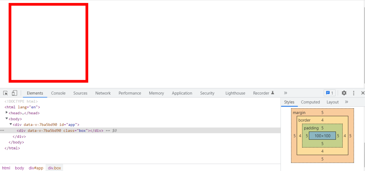
标准盒模型的组成:宽高(content)+ padding + border + margin
怪异盒模型的组成:width(content+border+padding)+ margin
可以用css属性更改是标准盒模型还是怪异盒模型
css属性:box-sizing: border-box(怪异盒模型)/content-box(标准盒模型)
浮动布局
float 属性定义元素往哪个方向浮动。 float元素脱离了文档流,但是不脱离文本流 浮动布局主要是利用float属性来实现,可以给元素设置float属性让元素脱离文档流,然后设置left和right来边改元素在文档上的展示位置以此形成我们想要的布局方式,下面用浮动布局完成一个左右宽度固定中间自适应的三栏布局。
float实现三栏布局
<template> <div id="app"> <div class="content"> <div class="left"> 左 </div> <div class="right"> 右 </div> <div class="middle"> 中 </div> </div> </div> </template> <script> export default { name: 'App', data(){ return { } }, mounted(){ }, methods:{ } } </script> <style scoped> .content{ width:100%; height:200px; } .left { width: 200px; height: 100px; float: left; background-color: red; } .right { width: 200px; height: 100px; float: right; background-color: yellow; } .middle { width:400px; height: 100px; margin-left:100px; background-color: blue; } </style> 效果:
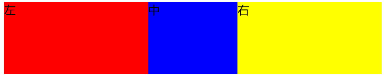
注意:使用float浮动布局middle中间的元素在html中要放在最后,否则黄色区域会换行,因为div是块级元素使用margin后右边区域也是属于它的。
注意:如果给非float元素加上宽度,一定要记得给此元素加上margin-left/right属性, 否侧非float元素会被float元素覆盖住一部份。
定位布局
定位布局是利用position来实现,可以使用absolute绝对定位移动元素的位置,使用绝对定位也会使元素脱离文档流,下面使用绝对定位实现一个三栏布局。
绝对定位实现三栏布局:
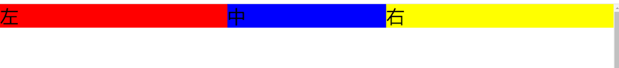
<template> <div id="app"> <!-- 定位布局 --> <div class="content"> <div class="positionLeft"> 左 </div> <div class="positionMiddle"> 中 </div> <div class="positionRight"> 右 </div> </div> </div> </template> <script> export default { name: 'App', data(){ return { } }, mounted(){ }, methods:{ } } </script> <style scoped> /* 定位布局 */ .positionLeft { position: absolute; width: 200px; left: 0; top: 0; background-color: red; } .positionMiddle { background-color: blue; margin: 0 200px; } .positionRight { position: absolute; width: 200px; right: 0; top: 0; background-color: yellow; } </style> 效果:
表格布局
表格是很严格的一行就是一行,一列就是一列,并且他们的位置不会发生变化,所以我们可以利用表格布局来实现我们想要的布局,在以前还没有出现这些浮动、定位属性的时候表格用的是最多的布局方式。通过给父元素设置display: table;,给子元素设置display: table-cell;即可实现三栏布局,使用表格布局还是比较方便的,几乎不需要写什么样式就可以实现。
表格布局实现三栏布局:
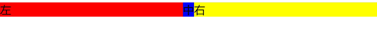
<template> <div id="app"> <!-- 表格布局 --> <div class="parent"> <div class="tableLeft"> 左 </div> <div class="tableMiddle"> 中 </div> <div class="tableRight"> 右 </div> </div> </div> </template> <script> export default { name: 'App', data(){ return { } }, mounted(){ }, methods:{ } } </script> <style scoped> /* 表格布局 */ .parent { display: table; width: 100%; } .parent > div { display: table-cell; } .tableLeft { width: 300px; background-color: red; } .tableRight { width: 300px; background-color: yellow; } .tableMiddle { background-color: blue; } </style> 效果:
flex布局
flex布局也叫弹性布局,是利用css3新出的属性display: flex实现的, 这种布局方式很方便,也不会对文档的结构改变,是当下最热门的一种布局方式, 建议每个前端开发者都要掌握。 flex布局实现三栏布局:
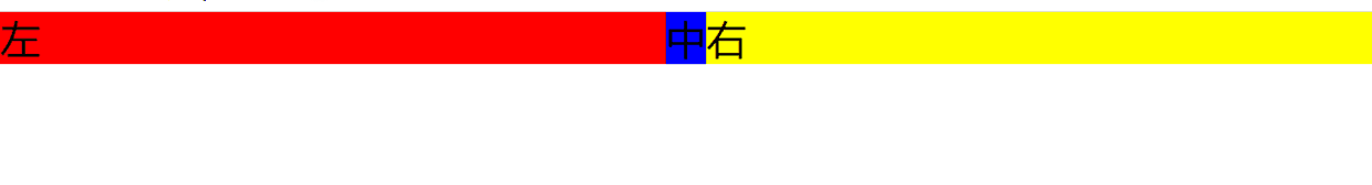
<template> <div id="app"> <!-- flex布局 --> <div class="flexParent"> <div class="flexLeft"> 左 </div> <div class="flexMiddle"> 中 </div> <div class="flexRight"> 右 </div> </div> </div> </template> <script> export default { name: 'App', data(){ return { } }, mounted(){ }, methods:{ } } </script> <style scoped> /* flex布局 */ .flexParent{ display: flex; } .flexLeft { width: 300px; background-color: red; } .flexRight { width: 300px; background-color: yellow; } .flexMiddle { flex: 1; background-color: blue; } </style> 效果:
grid 布局(栅格布局)
百分比布局
响应式布局
等等....