- A+
CSS样式快速入门
前言
前端基础的博客主要分为HTML、CSS和JavaScript,本类博客主要用于记录博主的学习过程和分享学习经验,由于博主学识浅薄,经验不足,难免会出现错误,欢迎大家提出问题。
注:前端基础的文章参考于b站up主遇见狂神说的前端视频,文章中的源码笔记等资源放在百度网盘了,有需要的小伙伴可以自取啊
链接: https://pan.baidu.com/s/1I4HjfPqDUkSypvjHK1eqTw
提取码: zc49
祝大家都学有所成,下面我们进入正题!

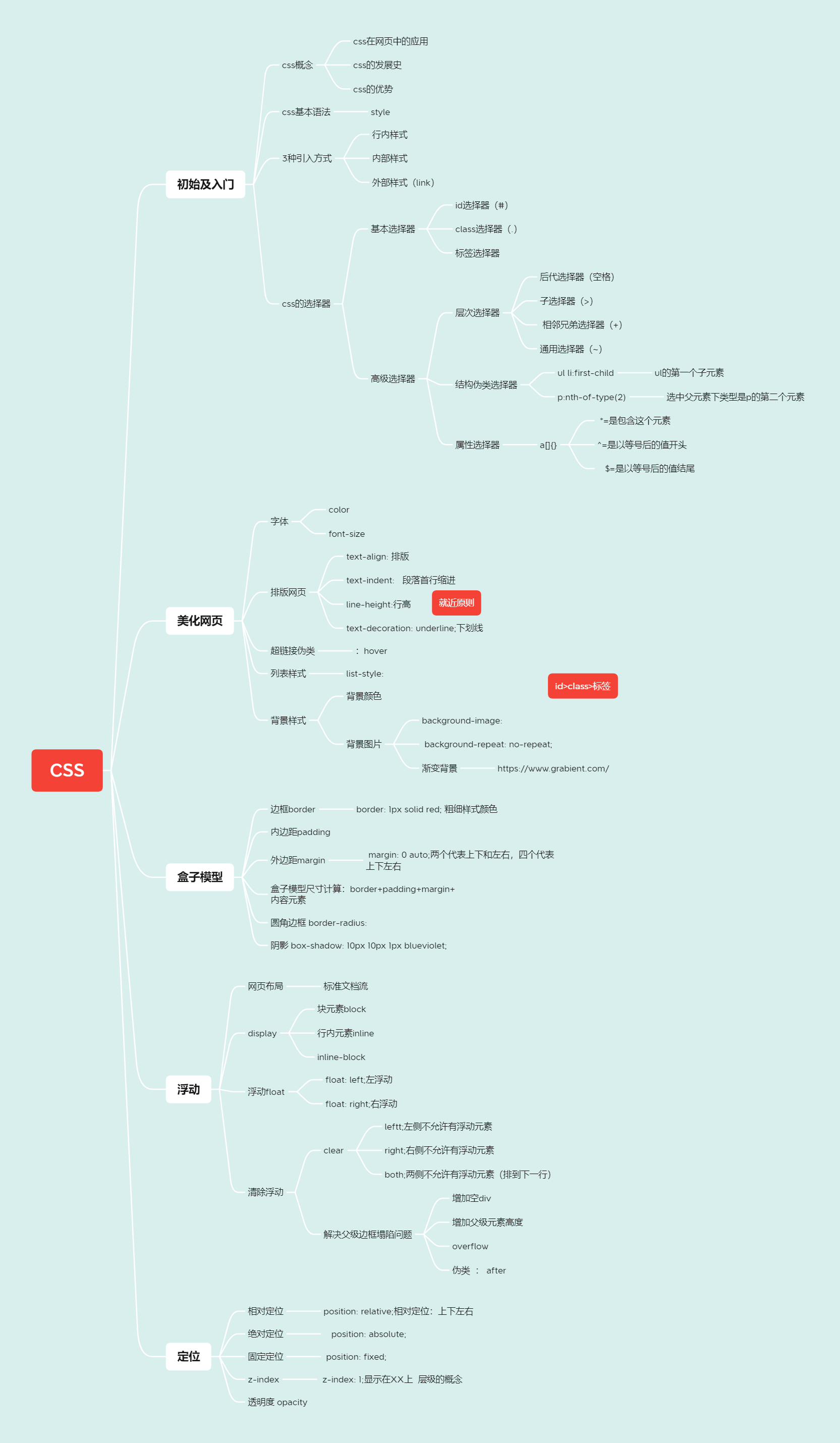
CSS快速入门内容总结
CSS基础的内容都在这张思维导图中了,大家可以先预览以下,后边会对每一个内容做详细的讲解
1、什么是CSS
内容:
1.CSS是什么
2.CSS怎么用(快速入门)
3.CSS选择器(重点+难点)
4.美化网页(文字,阴影,超链接,列表,渐变…)
5.盒子模型
6.浮动
7.定位
8.网页动画(特效效果)
1.1、什么是 CSS
- CSS 指层叠样式表 (Cascading Style Sheets)
- 样式定义如何显示 HTML 元素
- 样式通常存储在样式表中
- 把样式添加到 HTML 4.0 中,是为了解决内容与表现分离的问题
- 外部样式表可以极大提高工作效率
- 外部样式表通常存储在 CSS 文件中
- 多个样式定义可层叠为一个
1.2、发展史
-
CSS1.0
-
CSS2.0 DIV(块)+CSS,HTML与CSS结构分离的思想,网页变得简单,SEO
-
CSS2.1 浮动,定位
-
CSS3.0 圆角,阴影,动画......浏览器兼容性
1.3、快速入门
练习格式:
style:建议使用如下规范,将HTML与CSS分离开
1.4、css的优势
-
内容和表现分离
-
网页结构表现统一,可以实现复用
-
样式十分的丰富
-
建议使用独立于HTML的CSS文件
-
利用SEO,容易被搜索引擎收录
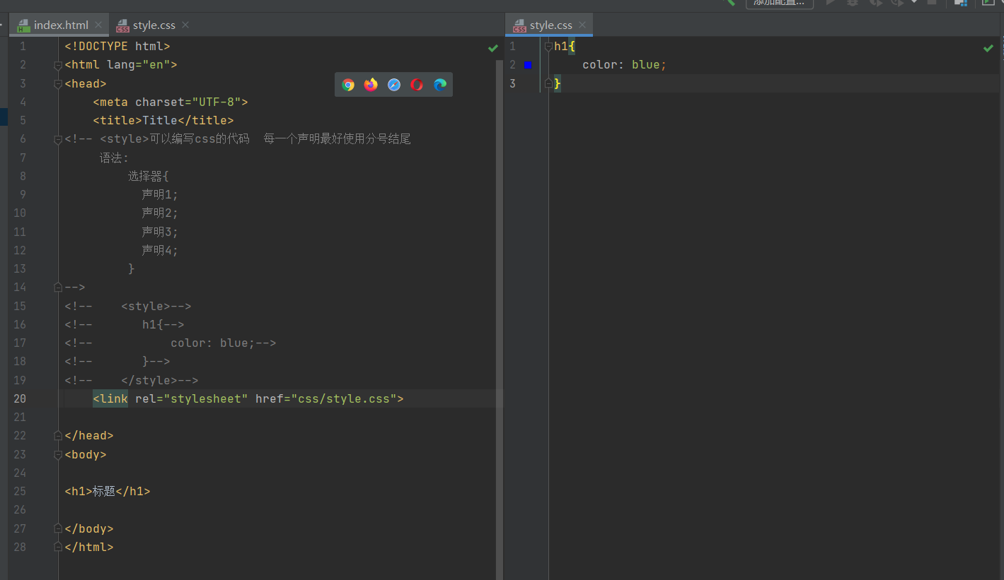
1.5、css的3种导入方式
<!DOCTYPE html> <html lang="en"> <head> <meta charset="UTF-8"> <title>Title</title> <!--内部样式:优先级比行内样式低--> <style> h1{ color: burlywood; } </style> <!--引入外部样式--> <link rel="stylesheet" href="css/style.css"> </head> <body> <!--优先级:就近原则 谁里元素更近,谁优先级更高--> <!--行内样式:在标签元素中,编写一个style属性,编写样式即可--> <h1 style="color: blue">标题</h1> </body> </html> /*外部样式*/ h1{ color: chartreuse; } 扩展:外部样式两种写法
-
链接式link(常用)
<link rel="stylesheet" href="css/style.css"> -
导入式
<!--导入式--> <style> @import "css/style.css"; </style>
2、选择器
作用:选择页面上的某一个或某一类元素
2.1、基本选择器
1.标签选择器:选择一类标签 标签{}
<!DOCTYPE html> <html lang="en"> <head> <meta charset="UTF-8"> <title>Title</title> <style> /*标签选择器,会选择到页面上所有的这个标签的元素*/ h1{ color: red; background: burlywood; } p{ font-size: 80px; } </style> </head> <body> <h1>curry</h1> <h1>curry</h1> <p>curry2</p> </body> </html> 2.类选择器:选择所有class属性一致的标签,可以跨标签, .类名{}
<!DOCTYPE html> <html lang="en"> <head> <meta charset="UTF-8"> <title>Title</title> <style> /*类选择器 .class的名称 好处,可以多个标签归类,是同一个class,可以跨标签复用 */ .qjd11{ color: aqua; } .qjd22{ color: red; } </style> </head> <body> <h1 class="qjd11">11</h1> <h1 class="qjd22">22</h1> <h1 class="qjd11">33</h1> </body> </html> 3.id选择器:全局唯一 #id名{}
<!DOCTYPE html> <html lang="en"> <head> <meta charset="UTF-8"> <title>Title</title> <style> /*id选择器:id必须保证全局唯一 #id名称{} 优先级: 不遵循就近原则,id选择器>class选择器>标签选择器 */ #oo1{ color: #280607; } .oo2{ color: red; } h1{ color: blue; } </style> </head> <body> <h1 id="oo1">o1</h1> <h1 class="oo2">o2</h1> <h1>o3</h1> </body> </html> 优先级:
不遵循就近原则,id选择器>class选择器>标签选择器
2.2、层次选择器
实现如图结构
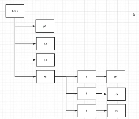
<body> <p>p0</p> <p class="active">p1</p> <p>p2</p> <p>p3</p> <ul> <li> <p>p4</p> </li> <li> <p>p5</p> </li> <li> <p>p6</p> </li> </ul> </body> 1.后代选择器:在某个元素的后面
/*后代选择器*/ body p{ background: #8e72ff; } 2.子选择器:只有一代
/*子选择器*/ body>p{ background: red; } 3.相邻兄弟选择器:同辈
/*相邻兄弟选择器 只有一个,向下延伸,对下不对上*/ .active + p{ background: aqua; } 4,通用选择器
/*通用兄弟选择器 当前选中元素的向下的所有兄弟元素 */ .active~p{ background: darkcyan; } 2.3、结构伪类选择器
伪类:条件
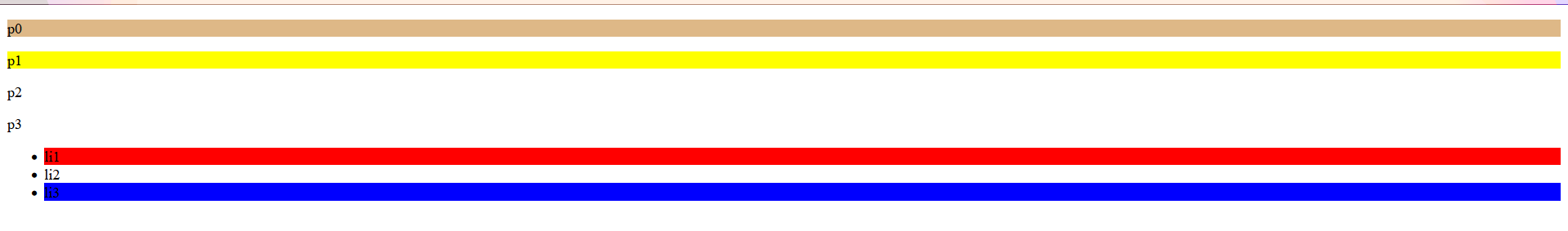
<!DOCTYPE html> <html lang="en"> <head> <meta charset="UTF-8"> <title>Title</title> <!-- 不使用class,id选择器--> <style> /*ul的第一个子元素*/ ul li:first-child{ background: red; } /*ul的最后一个子元素*/ ul li:last-child{ background: blue; } </style> </head> <body> <p>p0</p> <p>p1</p> <p>p2</p> <p>p3</p> <ul> <li>li1</li> <li>li2</li> <li>li3</li> </ul> </body> </html> 了解:
/*选中p1:选择当前p元素的父级元素,选中父级元素的第一个,并且是当前元素才生效*/ p:nth-child(1){ background: burlywood; } /*选中父元素下类型是p的第二个元素*/ p:nth-of-type(2){ background: yellow; } 结果展示
2.4、属性选择器(常用)
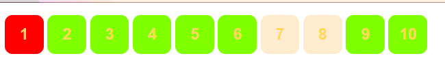
将id和class结合
/*a[]{}
属性名;属性名=属性值(可以使用正则表达式匹配)
=是绝对等于
*=是包含这个元素
^=是以等号后的值开头
$=是以等号后的值结尾
*/
实现:
<!DOCTYPE html> <html lang="en"> <head> <meta charset="UTF-8"> <title>Title</title> <style> .demo a{ float: left; display: block; height: 50px; width: 50px; border-radius: 10px; background: aqua; text-align: center; color: #ffd95d; text-decoration: none; margin-right: 5px; font: bold 20px/50px Arial; } /*a[]{} 属性名;属性名=属性值(可以使用正则表达式匹配) =是绝对等于 *=是包含这个元素 ^=是以等号后的值开头 &=是以等号后的值结尾 */ /*存在id属性的元素*/ a[id]{ background: yellow; } /*id=first的元素*/ a[id=first]{ background: yellow; } /*class中有link的元素*/ a[class*="link"]{ background: chartreuse; } /*href中以http开头的元素*/ a[href^=http]{ background: red; } /*href中以pdf结尾的元素*/ a[href$=pdf]{ background: blanchedalmond; } </style> </head> <body> <p class="demo"> <a href="https://www.baidu.com/" class="link item first" id="first">1</a> <a href="" class="link item active" target="_blank" title="test">2</a> <a href="images/123.html" class="link item">3</a> <a href="images/123.png" class="link item">4</a> <a href="images/123.jpg" class="link item">5</a> <a href="abc" class="link item">6</a> <a href="/a.pdf" class="link item">7</a> <a href="/abc.pdf" class="link item">8</a> <a href="abc.doc" class="link item">9</a> <a href="abcd.doc" class="link item last">10</a> </p> </body> </html> 结果展示
3、美化网页元素
3.1、为什么要美化网页
1.有效的传递页面信息
2.美化网页,吸引用户
3.凸显页面的主题
4.提高用户的体验
span标签:重点要突出的字,用span标签套起来
<!DOCTYPE html> <html lang="en"> <head> <meta charset="UTF-8"> <title>Title</title> <style> #title1{ font-size: 50px; } </style> </head> <body> 我要学<span id="title1">Java</span> </body> </html> 3.2、字体样式
<!-- font-family:字体 font-size:字体大小 font-weight:字体粗细 color:字体颜色 --> <style> body{ font-family: 隶书; } h1{ font-size: 60px; } .p1{ font-weight: bold; } </style> 3.3、文本样式
1.颜色 color rgb rgba
2.文本对齐方式 text-align: center;居中
3.首行缩进 text-indent: 2em; 段落首行缩进
4.行高 line-height:单行文字上下居中 line-height = height
5.装饰 text-decoration:
6.文本图片水平对齐 vertical-align: middle;
<!DOCTYPE html> <html lang="en"> <head> <meta charset="UTF-8"> <title>Title</title> <!--颜色: 单词 RGB 0~F RGBA A:o~1 text-align: 排版 text-indent: 2em; 段落首行缩进 height: 300px; line-height: 300px; 行高 和 块 的高度一致就可以上下居中 --> <style> h1{ color: rgba(0,255,255,0.9); text-align: center; } .p1{ text-indent: 2em; } .p3{ background: #ffd95d; height: 300px; line-height: 300px; } /*下划线*/ .a1{ text-decoration: underline; } /*中划线*/ .a2{ text-decoration: line-through; } /*上划线*/ .a3{ text-decoration: overline; } /*超链接去下划线*/ a{ text-decoration: none; } </style> </head> <body> <a href=""></a> <p class="a1">123123</p> <p class="a2">123123</p> <p class="a3">123123</p> <h1>三体 </h1> <p class="p1">《三体》是刘慈欣创作的长篇科幻小说系列,由《三体》《三体2:黑暗森林》《三体3:死神永生》组成,第一部于2006年5月起在《科幻世界》杂志上连载,第二部于2008年5月首次出版, 第三部则于2010年11月出版。</p> <p>作品讲述了地球人类文明和三体文明的信息交流、生死搏杀及两个文明在宇宙中的兴衰历程。其第一部经过刘宇昆翻译后获得了第73届雨果奖最佳长篇小说奖 [1] 。</p> <p class="p3">2019年,列入“新中国70年70部长篇小说典藏”。 [62]</p> </body> </html> 3.4、超链接伪类
/*鼠标悬浮的颜色(只需要记住hover)*/ a:hover{ color: #ffd95d; } 3.5、文本阴影
阴影属性:text-shadow: aqua 10px 10px 2px;
/*text-shadow: aqua 10px 10px 2px; 阴影颜色,水平偏移,垂直偏移,阴影半径 */ #price{ text-shadow: aqua 10px 10px 2px; } 3.6、列表
实现如下网页
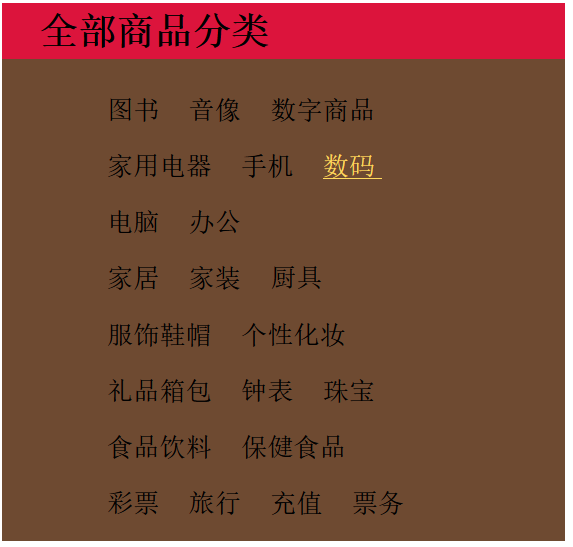
HTML
<!DOCTYPE html> <html lang="en"> <head> <meta charset="UTF-8"> <title>列表样式</title> <link rel="stylesheet" href="style.css" type="text/css"> </head> <body> <div id="nav"> <h2 class="title">全部商品分类</h2> <ul> <li> <a href="#">图书</a> <a href="#">音像</a> <a href="#">数字商品</a> </li> <li> <a href="#">家用电器</a> <a href="#">手机</a> <a href="#">数码</a> </li> <li> <a href="#">电脑</a> <a href="#">办公</a> </li> <li> <a href="#">家居</a> <a href="#">家装</a> <a href="#">厨具</a> </li> <li> <a href="#">服饰鞋帽</a> <a href="#">个性化妆</a> </li> <li> <a href="#">礼品箱包</a> <a href="#">钟表</a> <a href="#">珠宝</a> </li> <li> <a href="#">食品饮料</a> <a href="#">保健食品</a> </li> <li> <a href="#">彩票</a> <a href="#">旅行</a> <a href="#">充值</a> <a href="#">票务</a> </li> </ul> </div> </body> </html> CSS
#nav{ width: 300px; background: #6e4a31; } .title{ font-size: 20px; font-weight: bold; text-indent: 1em; line-height: 30px; background: crimson; } /*ul li*/ /*list-style: none; 去掉圆点 circle 空心圆 decimal 数字 square 正方形 */ ul{ background: #6e4a31; } ul li{ height: 30px; list-style: none; text-indent: 1em; } a{ text-decoration: none; font-size: 14px; color: black; } a:hover{ color: #ffd95d; text-decoration: underline; } 3.7、背景
- 背景颜色
- 背景图片
<style> div{ width: 1000px; height: 700px; border: 1px solid red; background-image: url("images/cc.jpg"); /*默认是全部平铺的 repeat*/ } .div1{ background-repeat: repeat-x; } .div2{ background-repeat: repeat-y; } .div3{ background-repeat: no-repeat; } </style> 3.8、渐变
这里推荐一个渐变色比较好用的网站:https://www.grabient.com/
background-color: #0093E9; background-image: linear-gradient(160deg, #0093E9 0%, #80D0C7 100%); 4、盒子模型
4.1、什么是盒子模型
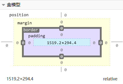
- margin:外边距
- border:边框
- padding:内边距
4.2、边框
1.边框的粗细
2.边框的样式
3.边框的颜色
<style> body{ /*body总有一个默认的外边距 margin: 0;*/ margin: 0; padding: 0; text-decoration: none; } /*border: 1px solid red; 粗细样式颜色*/ #box{ width: 300px; border: 1px solid red; } h2{ font-size: 16px; background-color: blanchedalmond; line-height: 30px; margin: 0; } form{ background: #85FFBD; } div:nth-of-type(1) input{ border: 3px solid black; } div:nth-of-type(2) input{ border: 3px dashed burlywood; } div:nth-of-type(3) input{ border: 2px solid powderblue; } </style> 4.3、内外边距
<!DOCTYPE html> <html lang="en"> <head> <meta charset="UTF-8"> <title>Title</title> <!--外边距的妙用:居中元素 要求:块元素,块元素有固定的宽度 margin: 0 auto;两个代表上下和左右,四个代表上下左右 --> <style> body{ /*body总有一个默认的外边距 margin: 0;*/ margin: 0; padding: 0; text-decoration: none; } /*border: 1px solid red; 粗细样式颜色*/ #box{ width: 300px; border: 1px solid red; margin: 0 auto; } h2{ font-size: 16px; background-color: blanchedalmond; line-height: 30px; margin: 0; } form{ background: #85FFBD; } input{ border: 1px solid black; } div:nth-of-type(1){ padding: 10px 2px; } </style> </head> <body> <div id="box"> <h2>会员登录</h2> <form action="#"> <div> <span>姓名:</span> <input type="text"> </div> <div> <span>密码:</span> <input type="text"> </div> <div> <span>邮箱:</span> <input type="text"> </div> </form> </div> </body> </html> 盒子的计算方式:这个元素到底多大
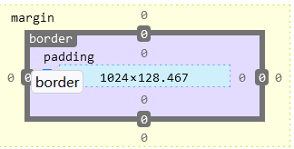
margin+border+padding
4.4、圆角边框
4个角
<!DOCTYPE html> <html lang="en"> <head> <meta charset="UTF-8"> <title>Title</title> <style> /*左上 右下 右下 左下 顺时针方向 圆圈:圆角=半径 */ div{ width: 100px; height: 100px; border: 5px solid red; border-radius: 10px; } img{ border-radius: 25px; } </style> </head> <body> <div></div> <img src="images/3-1.jpg" alt="CSS样式快速入门" alt=""> </body> </html> 4.5、盒子阴影
<!DOCTYPE html> <html lang="en"> <head> <meta charset="UTF-8"> <title>Title</title> <style> div{ width: 100px; height: 100px; border: 5px solid red; box-shadow: 10px 10px 1px blueviolet; } </style> </head> <body> <div></div> </body> </html> 5、浮动
5.1、标准文档流
块级元素:独占一行
- h p div 列表...
行内元素:不独占一行
- span a img strong...
行内元素可以被包含在块级元素中,反之不可以
5.2、display
<!DOCTYPE html> <html lang="en"> <head> <meta charset="UTF-8"> <title>Title</title> <!--display: block; 块元素 display: inline; 行内元素 display: inline-block; 既是块元素又是行内元素,可以在一行 display: none; 消失 --> <style> div{ width: 100px; height: 100px; border: 1px solid red; display: inline; } span{ width: 100px; height: 100px; border: 1px solid red; display: inline-block; } </style> </head> <body> <div>div块元素</div> <span>span行内元素</span> </body> </html> display也是一种实现行内元素排列的方式,但是我们很多情况都是使用float
5.3、float 属性
float 属性用于定位和格式化内容,例如让图像向左浮动到容器中的文本那里。
float 属性可以设置以下值之一:
- left - 元素浮动到其容器的左侧
- right - 元素浮动在其容器的右侧
- none - 元素不会浮动(将显示在文本中刚出现的位置)。默认值。
- inherit - 元素继承其父级的 float 值
最简单的用法是,float 属性可实现(报纸上)文字包围图片的效果。
下例指定图像应在文本中向左浮动:

img { float: left; } 5.4、父级边框塌陷的问题
clear:
- clear:right;右侧不允许有浮动元素
- clear:leftt;左侧不允许有浮动元素
- clear:both;两侧不允许有浮动元素(排到下一行)
overflow
overflow 属性指定在元素的内容太大而无法放入指定区域时是剪裁内容还是添加滚动条。
overflow 属性可设置以下值:
visible- 默认。溢出没有被剪裁。内容在元素框外渲染hidden- 溢出被剪裁,其余内容将不可见scroll- 溢出被剪裁,同时添加滚动条以查看其余内容auto- 与scroll类似,但仅在必要时添加滚动条
注释:overflow 属性仅适用于具有指定高度的块元素。
解决方案:
-
增加父级元素的高度
简单,但是元素假设有了固定的高度就会被限制
-
增加一个空的div标签清除浮动
简单,代码中尽量避免空div
-
overflow(在父级元素增加一个overflow:hidden)
简单,下拉的一些场景会是网页不美观
-
父类添加一个伪类:after(推荐使用)
#father: after{ content''; display: block; clear: both; } 5.5、对比
-
display
-
方向不可以控制
-
float
浮动起来的话会脱离标准文档流,所以要解决父级边框塌陷的问题
6、定位
6.1、相对定位
<!DOCTYPE html> <html lang="en"> <head> <meta charset="UTF-8"> <title>Title</title> <!--相对定位 相对于自己原来的位置进行偏移 --> <style> body{ padding: 20px; } div{ margin: 10px; padding: 5px; font-size: 12px; line-height: 25px; } #father{ border: 1px solid red; padding: 0; } #first{ background-color: #ffd95d; border: 1px dashed #2600ff; position: relative;/*相对定位:上下左右*/ top: -20px;/*向上移*/ left: 20px;/*向右移*/ } #second{ background-color: #85FFBD; border: 1px dashed #44ff00; position: relative;/*相对定位:上下左右*/ bottom: -10px;/*向下移*/ right: 20px;/*向左移*/ } #third{ background-color: #0099ff; border: 1px dashed #0099ff; } </style> </head> <body> <div id="father"> <div id="first">第一个盒子</div> <div id="second">第二个盒子</div> <div id="third">第三个盒子</div> </div> </body> </html> 相对定位: position: relative;
相对于原来的位置进行指定的偏移,相对定位的话,他仍然在标准文档流中,原来的位置会被保留
position: relative;/*相对定位:上下左右*/ top: -20px;/*向上移*/ left: 20px;/*向右移*/ bottom: -10px;/*向下移*/ right: 20px;/*向左移*/ 练习:
实现如下图
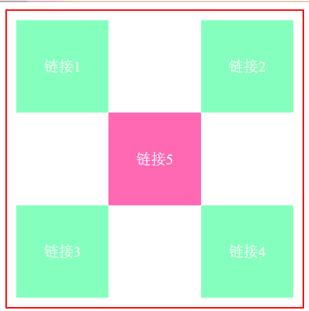
<!DOCTYPE html> <html lang="en"> <head> <meta charset="UTF-8"> <title>Title</title> <style> #box{ width: 300px; height: 300px; border: 2px solid red; padding: 10px; } a{ width: 100px; height: 100px; text-decoration: none; background-color: #85FFBD; line-height: 100px; text-align: center; color: white; display: block; } a:hover{ background: hotpink; } .a2,.a4{ position: relative; right: -200px; top: -100px; } .a5{ position: relative; right: -100px; top: -300px; } </style> </head> <body> <div id="box"> <a href="#" class="a1">链接1</a> <a href="#" class="a2">链接2</a> <a href="#" class="a3">链接3</a> <a href="#" class="a4">链接4</a> <a href="#" class="a5">链接5</a> </div> </body> </html> 6.2、绝对定位
定位:基于XX定位,上下左右
-
没有父级元素定位的前提下,相对于浏览器定位
-
假设父级元素存在定位,我们通常会相对于父级元素进行偏移
-
在父级元素范围内移动
-
相对于父级元素或浏览器进行指定的偏移,绝对定位的话,他不在标准文档流中,原来的位置不会被保留
<!DOCTYPE html> <html lang="en"> <head> <meta charset="UTF-8"> <title>Title</title> <style> div{ margin: 10px; padding: 5px; font-size: 12px; line-height: 25px; } #father{ border: 1px solid red; padding: 0; position: relative; } #first{ background-color: #ffd95d; border: 1px dashed #2600ff; } #second{ background-color: #85FFBD; border: 1px dashed #44ff00; position: absolute; right: 30px; top: -10px; } #third{ background-color: #0099ff; border: 1px dashed #0099ff; } </style> </head> <body> <div id="father"> <div id="first">第一个盒子</div> <div id="second">第二个盒子</div> <div id="third">第三个盒子</div> </div> </body> </html>
6.3、固定定位
<!DOCTYPE html> <html lang="en"> <head> <meta charset="UTF-8"> <title>Title</title> <style> body{ height: 800px; } div:nth-of-type(1){ /*绝对定位absolute,没有父级元素相对于浏览器*/ width: 100px; height: 100px; background: #85FFBD; position: absolute; right: 0; bottom: 0; } div:nth-of-type(2){ /*固定定位fixed*/ width: 50px; height: 50px; background: yellow; position: fixed; right: 0; bottom: 0; } </style> </head> <body> <div>div1</div> <div>div2</div> </body> </html> 6.4、z-index
图层
z-index:默认是0,最高无限
html
<!DOCTYPE html> <html lang="en"> <head> <meta charset="UTF-8"> <title>Title</title> <link rel="stylesheet" href="style.css"> </head> <body> <div id="content"> <ul> <li><img src="images/cc.jpg" alt="CSS样式快速入门" alt=""></li> <li class="tipText">学习框架</li> <li class="tipBg"></li> <li>2022年6月29日19:34:12</li> <li>地点:火星</li> </ul> </div> </body> </html> css
#content{ width: 600px; margin: 0px; padding: 0px; overflow: hidden; font-size: 12px; line-height: 25px; border: 1px solid red; } ul,li{ margin: 0px; padding: 0px; list-style: none; } /*父级元素相对定位*/ #content ul{ position: relative; } .tipText,.tipBg{ position: absolute; width: 600px; height: 60px; color: red; top: 316px; } .tipText{ color: #280607; z-index: 1;/*显示在tipBg上 层级的概念*/ } .tipBg{ background: #44ff00; opacity: 0.5;/*背景透明度*/ /*filter: alpha(opacity=50);!*背景透明度*!*/ } 好啦,CSS快速入门的文章到这里就结束了,大家觉得还可以的话帮帮忙点个推荐吧