- A+
一、Css基本语法
1.Html和Css没分开时
点击查看代码
<!DOCTYPE html> <html lang="en"> <head> <!--规范,<style>可以编写css的代码,每一个声明,最好使用分号隔开 语法: 选择器{ 声明1; 声明2; 声明3; } --> <meta charset="UTF-8"> <title>MyFirstss页面</title> <style> h1{ color:red; } </style> </head> <body> <h1>TWQ标题</h1> </body> </html> 运行结果图
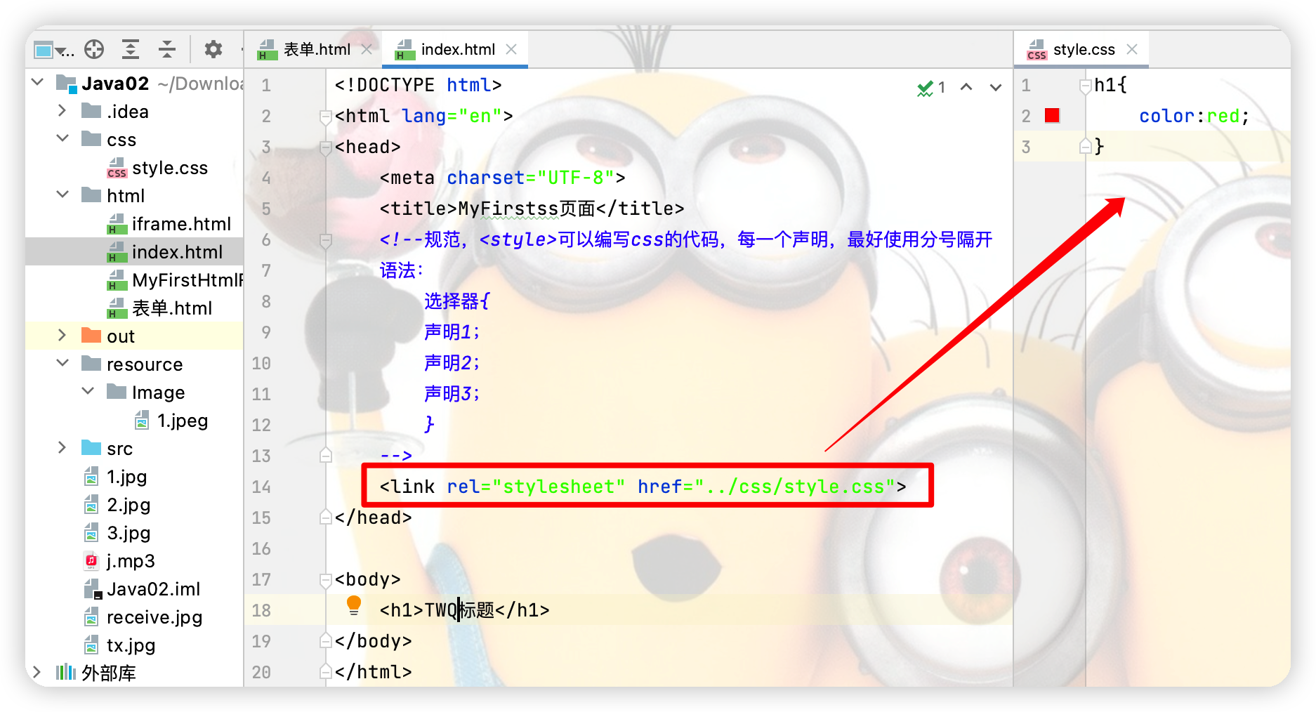
2.Html和Css分开后
依然可以达到上图的效果
3.Css三种导入方式
点击查看代码
<head> <meta charset="UTF-8"> <title>MyFirstss页面</title> <!--规范,<style>可以编写css的代码,每一个声明,最好使用分号隔开 语法: 选择器{ 声明1; 声明2; 声明3; } --> <!-- 方式二:外部样式--> <link rel="stylesheet" href="../css/style.css"> <!-- 方式三:内部样式 --> <style> h1{ color: aqua; } </style> </head> <body> <!--优先级:就近原则:若没写方式一,则方式二和方式三谁离h1最近就采用谁的样式--> <!--方式一:行内样式:在标签元素中,编写一个style属性,编写样式即可--> <h1 style="color: red">TWQ标题</h1> </body> 二、选择器
1.基本选择器
(1)标签选择器
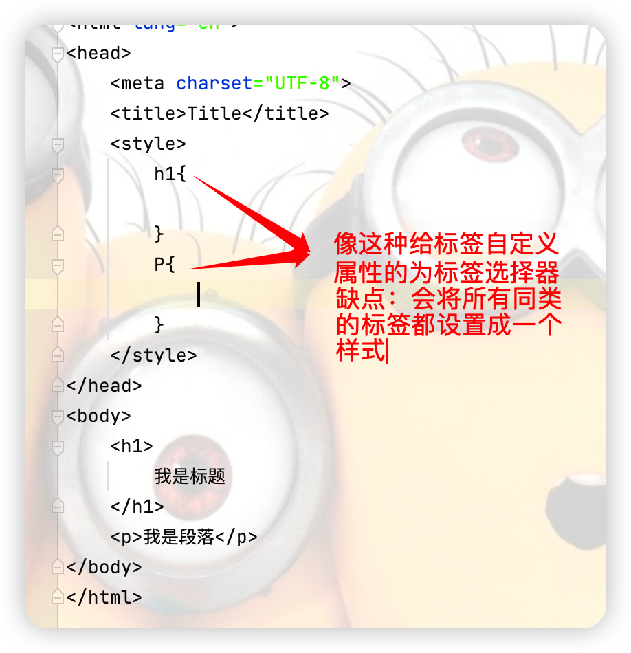
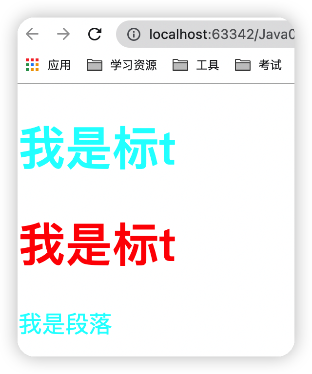
(2)类 选择器 class
点击查看代码
<!DOCTYPE html> <html lang="en"> <head> <meta charset="UTF-8"> <title>Title</title> <style> /*类选择器的格式:.class的名称{} 好处:可以多个标签归类,是同一个class,可以复用*/ .title1{ color: aqua; } .title2{ color: red; } </style> </head> <body> <h1 class="title1">我是标t</h1> <h1 class="title2">我是标t</h1> <!-- 由于p标签的class名和标题1的class名相同,因此会有相同的样式--> <p class="title1">我是段落</p> </body> </html> 运行结果如下
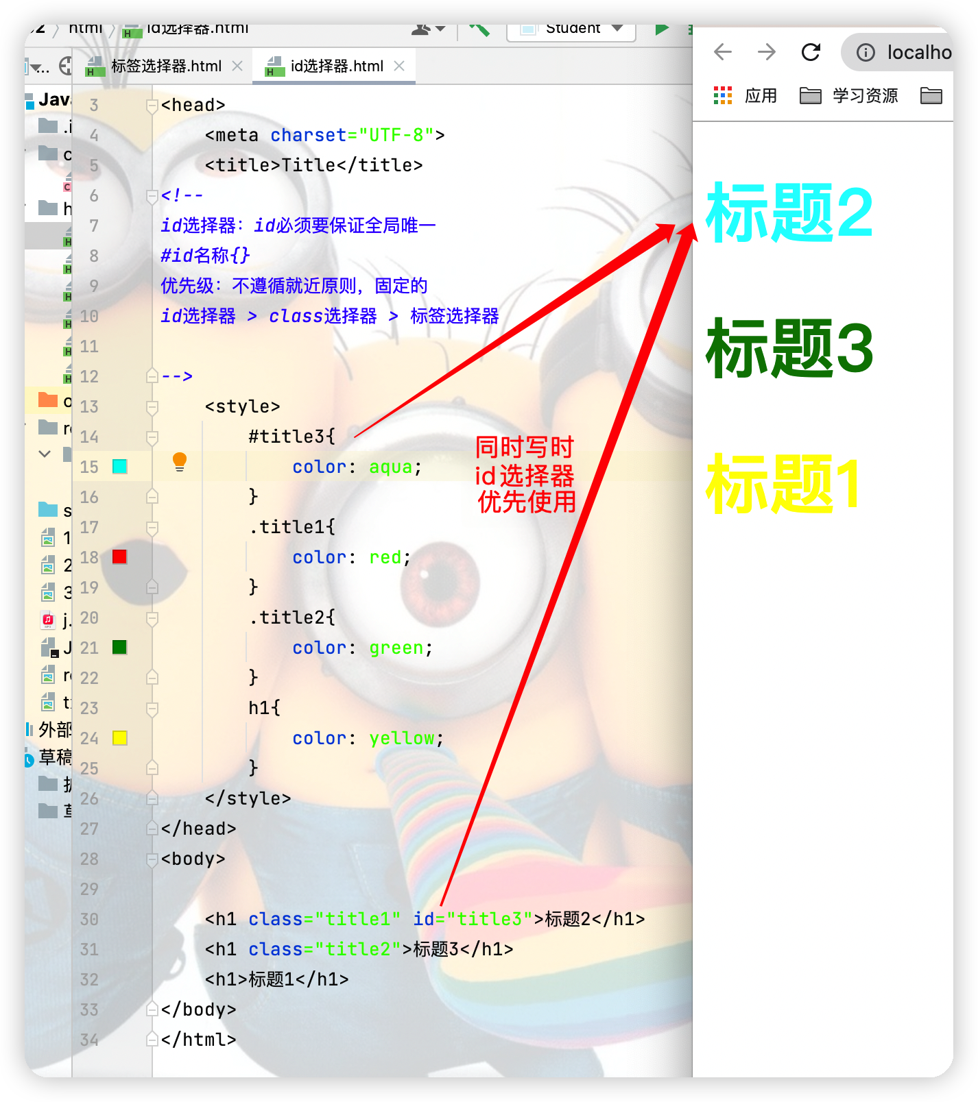
(3)id 选择器 class
点击查看代码
<!DOCTYPE html> <html lang="en"> <head> <meta charset="UTF-8"> <title>Title</title> <!-- id选择器:id必须要保证全局唯一 #id名称{} 优先级:不遵循就近原则,固定的 id选择器 > class选择器 > 标签选择器 --> <style> #title3{ color: aqua; } .title1{ color: red; } .title2{ color: green; } h1{ color: yellow; } </style> </head> <body> <h1 class="title1" id="title3">标题2</h1> <h1 class="title2">标题3</h1> <h1>标题1</h1> </body> </html> 运行结果图
2.高级选择器
(1)层次选择器
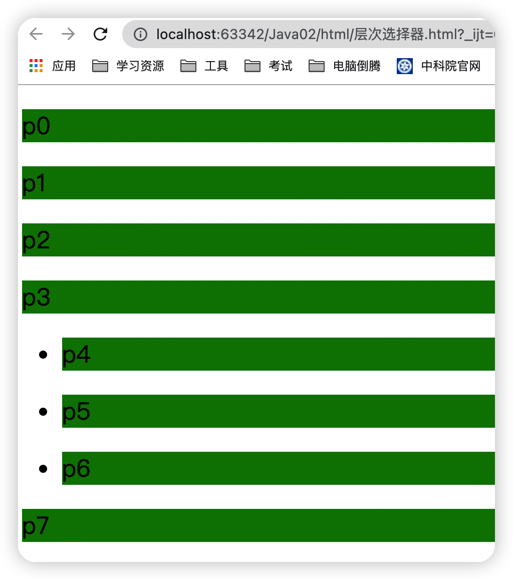
①后代选择器
点击查看代码
<style> body p{ background: green; } </style> 运行结果图
②子代选择器 一代 儿子
点击查看代码
body>p{ background: aqua; } 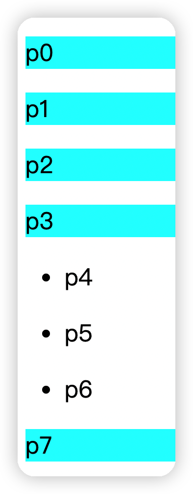
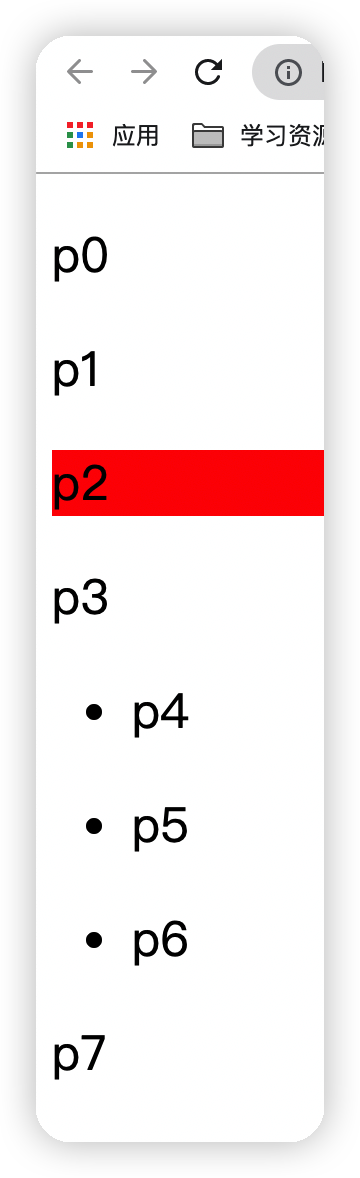
③相邻兄弟选择器
作用于相邻兄弟,只有一个(向下)
点击查看代码
.twq +P{ background: red; } 运行结果图
④通用选择器
作用于当前选中元素向下的所有兄弟元素
点击查看代码
.twq~p{ background: yellow; } 运行结果图
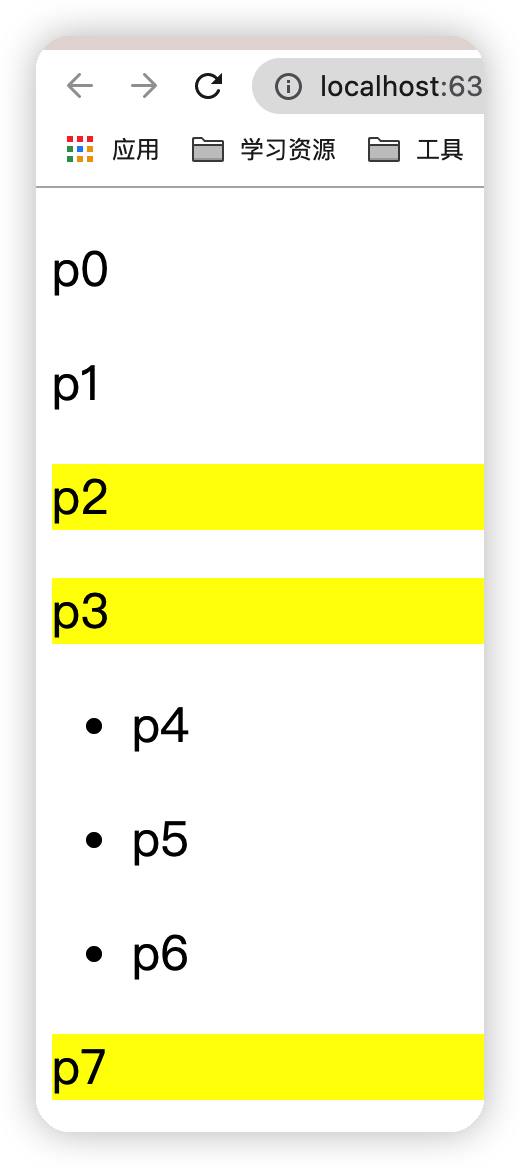
(2)结构 伪类选择器
点击查看代码
<head> <meta charset="UTF-8"> <title>Title</title> <style> /*ul中的第一个子元素*/ ul li:first-child{ background: yellow; } /*ul中的最后一个子元素*/ ul li:last-child{ background: red; } /*选中p1:定位到父元素,选择当前的第一个元素 选择当前p元素的父级元素,当选中父级元素的第一个时,只有第一个元素是p标签类型时才会生效 */ p:nth-child(2){ background: aqua; } /*选中父元素,下的p元素的第二个,类型*/ p:nth-of-type(1){ background: green; } /*当鼠标放到该标签上时可以让其背景颜色变成黑色*/ a:hover{ background: black; } </style> </head> <body> <a href="">123</a> <p>p1</p> <p>p2</p> <p>p3</p> <ul> <li>li1</li> <li>li2</li> <li>li3</li> </ul> </body> 运行结果图
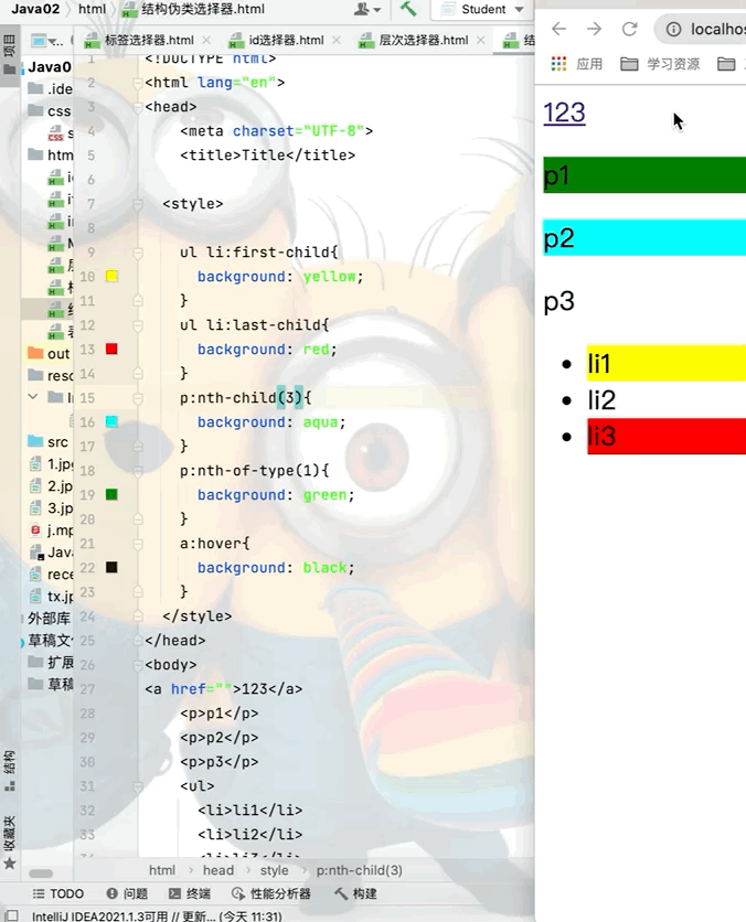
(3)属性选择器(重点)
点击查看代码
<head> <meta charset="UTF-8"> <title>Title</title> <style> /*后代选择器*/ .demo a{ float: left; /*以块的形式展示*/ display: block; /*设置块的高和宽*/ height: 50px; width: 50px; /*设置块的圆角边框*/ border-radius: 10px; /*设置块的背景颜色*/ background: blue; /*文字设置居中*/ text-align: center; /*文字颜色为灰色*/ color: gray; /*去掉文字的下划线*/ text-decoration: none; /*外边距,每个元素之间的间隙为5px*/ margin-right: 5px; /*bold:粗体 20px为字体大小 因为块是高和宽都是50的正方形所以设置50px行高可以居中*/ font:bold 20px/50px Arial; } /*属性名,[属性名 = 属性值(正则)]*/ /*存在id属性的元素 a[]{}*/ a[id]{ background: yellow; } /*将id等于first的a标签背景颜色设置为红色*/ a[id=first]{ background: red; } /*将class中含有links的元素背景颜色设为天蓝*/ a[class*="links"]{ background: aqua; } /*选中href中一http开头的元素*/ /* =绝对等于 *=包含这个元素 ^=以这个开头 $=以这个结尾 */ a[href^=http]{ background: aquamarine; } </style> </head> <body> <p class="demo"> <a href="https://www.cnblogs.com/" class="links item first" id="first">1</a> <a href="" class="links item active" target="_blank" title="test">2</a> <a href="tw1/123.html" class="links item">3</a> <a href="image/12.jpg" class="links item" id="first">4</a> <a href="image/12.png" class="links item">5</a> <a href="abc">6</a> <a href="12">7</a> <a href="/a.pdf">8</a> <a href="/ab.pdf">9</a> <a href="" class="links item last">10</a> </p> </body> 运行结果图
三、美化网页元素
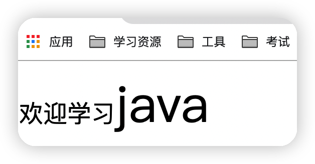
1.span标签
本身并没有多大的作用,约定俗成将span标签作为突出强调一些东西
点击查看代码
<head> <meta charset="UTF-8"> <title>Title</title> <style> #title1{ font-size: 50px; } </style> </head> <body> 欢迎学习<span id="title1">java</span> </body> 运行结果图
2.字体样式
点击查看代码
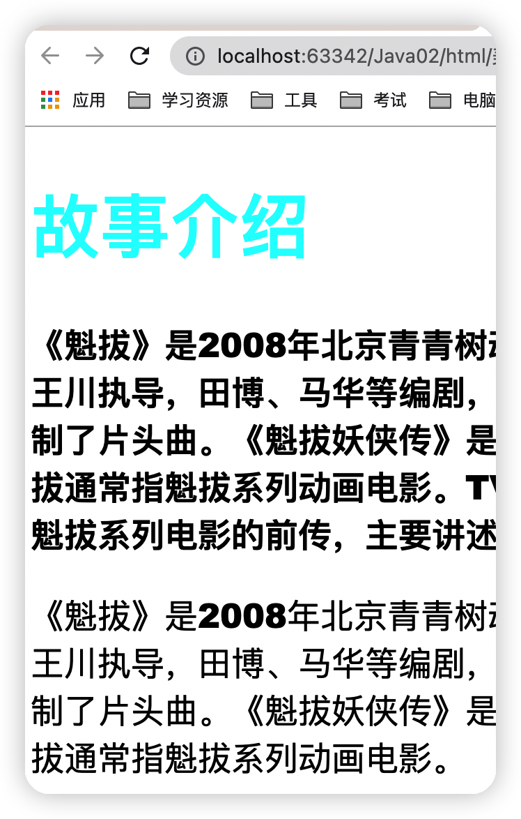
<head> <meta charset="UTF-8"> <title>Title</title> <!-- font-family:字体 font-size:字体大小 font-weight:字体粗细 color:字体颜色 --> <style> body{ font-family: "Arial Black",楷体; } h1{ font-size: 50px; color: aqua; } .p1{ font-weight: bolder; } /*字体风格 oblique:斜体 bolder:粗细 12px:字体大小 "楷体":字体样式 */ p{ font oblique bolder 12px "楷体"; } </style> </head> <body> <h1>故事介绍</h1> <p class="p1"> 《魁拔》是2008年北京青青树动漫科技有限公司以系列动画电影的第一部《魁拔之十万火急》为基础,重新剪辑而成的TV动画。由王川执导,田博、马华等编剧,刘婧荦,竹内顺子等配音。 TV版完整保留了电影的世界观、人物设定、故事内容和情节主线,但重制了片头曲。《魁拔妖侠传》是魁拔系列电影的前传,主要讲述的是有关卡拉肖克潘家族的故事,与电影关系并不大。大家所说的魁拔通常指魁拔系列动画电影。TV版完整保留了电影的世界观、人物设定、故事内容和情节主线,但重制了片头曲。《魁拔妖侠传》是魁拔系列电影的前传,主要讲述的是有关卡拉肖克潘家族的故事,与电影关系并不大。大家所说的魁拔通常指魁拔系列动画电影。 </p> <p> 《魁拔》是2008年北京青青树动漫科技有限公司以系列动画电影的第一部《魁拔之十万火急》为基础,重新剪辑而成的TV动画。由王川执导,田博、马华等编剧,刘婧荦,竹内顺子等配音。 TV版完整保留了电影的世界观、人物设定、故事内容和情节主线,但重制了片头曲。《魁拔妖侠传》是魁拔系列电影的前传,主要讲述的是有关卡拉肖克潘家族的故事,与电影关系并不大。大家所说的魁拔通常指魁拔系列动画电影。 </p> </body> 运行结果图 下图是上面所有样式合在一起的最终结果,如果想单独实现某一效果,可以将其他代码注释掉
3.文本样式
(1)颜色
①单词
color: red;
②RGB: FF0000表示红色、00FF00表示绿色、0000FF表示黑色
color: #0073ff;
color: rgb(0,2,3);
③RGBA 透明度:数值在0-1之间
color: rgba(0,2,3,0.5);
(2)文本对齐方式
text-align:排版,居中
text-align:center;
(3)首行缩进
2em表示首行缩进两个汉字
text-indent:2em
(4)行高
块高和行高一致的时候可以实现文本的上下居中
height:300px; line-height:300px
(5)装饰
①下划线
text-decoration:underline;
②中划线
text-decoration:line-through;
③上划线
text-decoration:overline;
④超链接a标签默认有下划线去除方法
text-decoration:none;
(6)文本和图片水平对齐
点击查看代码
<head> <meta charset="UTF-8"> <title>Title</title> <style> img,span{ vertical-align:middle; } </style> </head> <body> <img src="../resource/Image/1.jpeg" alt="" width="200" height="200"> <span>《魁拔》是2008年北京青青树动漫科技有限公司以系列动画</span> </body> </head> 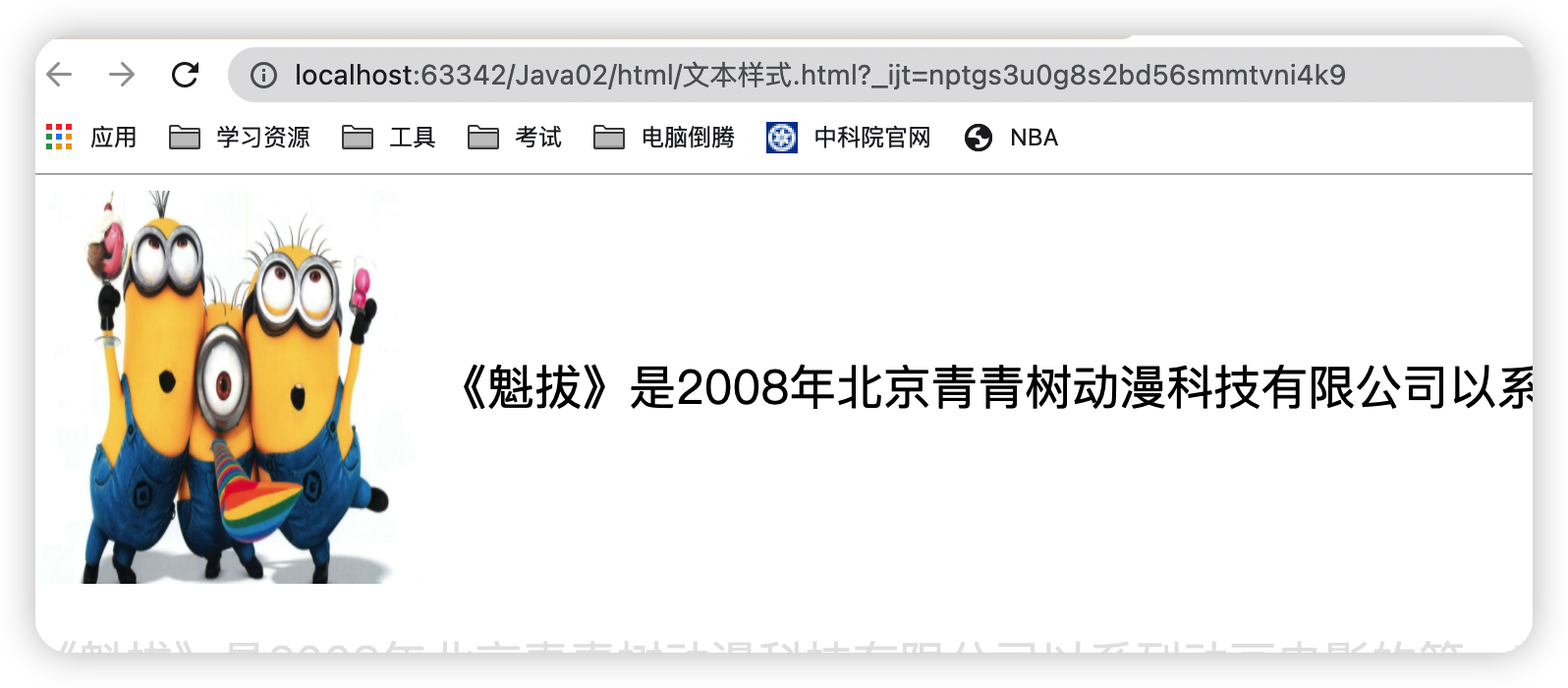
4.超链接伪类
点击查看代码
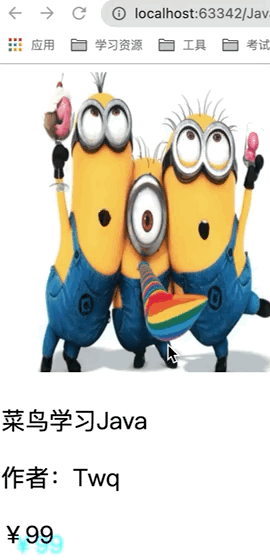
<head> <meta charset="UTF-8"> <title>Title</title> <style> /*默认的颜色*/ a{ text-decoration: none; color: black; } /*鼠标悬浮的状态*/ a:hover{ color: aqua; font-size: 50px; } /*鼠标按住未释放的状态*/ a:active{ color: yellow; } /*!*鼠标点击完之后的颜色*!*/ /*a:visited{*/ /* color: red;*/ /*}*/ /*text-shadow:阴影颜色 ,水平偏移,垂直偏移,阴影半径*/ #price{ text-shadow: aqua 10px 10px 2px; } </style> </head> <body> <a href="#"> <img src="../resource/Image/1.jpeg" alt="" width="300px" height="300px"> </a> <p> <a href="#">菜鸟学习Java</a> </p> <p> <a href="">作者:Twq</a> </p> <p id="price">¥99</p> </body> 运行结果图
5.列表样式练习
(1).list-style: 的使用
①去掉无序列表前面的黑点
点击查看代码
ul li{ height: 30px; list-style: none; } 运行结果图
②黑点变成空心圆
list-style: circle;
③黑点变成数字
list-style: decimal;
④黑点变成正方形
list-style: square;
(2)修改整个ul的背景颜色
点击查看代码
ul{ background:red; } (3)小练习
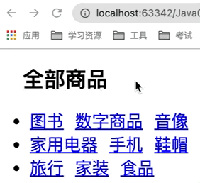
目的:实现效果
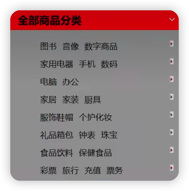
HTML代码:
点击查看代码
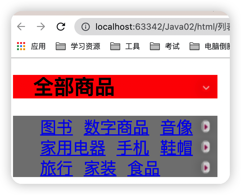
<!DOCTYPE html> <html lang="en"> <head> <meta charset="UTF-8"> <title>Title</title> <link rel="stylesheet" href="../../css/style.css"> </head> <body> <div id="nav"> <h2 class="title">全部商品</h2> <ul> <li><a href="#">图书</a> <a href="#">数字商品</a> <a href="#">音像</a></li> <li><a href="#">家用电器</a> <a href="#">手机</a> <a href="#">鞋帽</a></li> <li><a href="#">旅行</a> <a href="#">家装</a> <a href="#">食品</a></li> </ul> </div> </body> </html> Css代码
点击查看代码
#nav{ width: 300px; } .title{ font-size: 30px; font-weight: bold; text-indent: 1em; line-height: 35px; /*颜色,图片,图片位置,平铺方式*/ background: red url("../resource/Image/img_2.png") 259px -3px no-repeat; } ul{ background: gray; } ul li{ height: 30px; list-style: none; background: url("../resource/Image/img_1.png") 218px -12px no-repeat; } 运行结果图
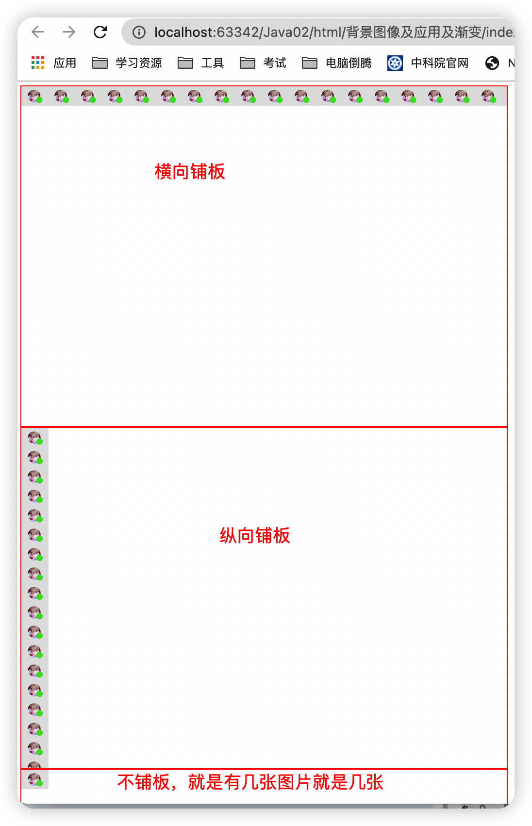
6.背景图片
点击查看代码
<head> <meta charset="UTF-8"> <title>Title</title> <style> /*border:边框的粗细 边框的样式 边框的颜色*/ div{ width: 1000px; height: 700px; border: 1px solid red; /*默认是全部平铺的 repeat*/ background-image: url("../../resource/Image/img.png"); } /*自动横向平铺*/ .div1{ background-repeat: repeat-x; } /*自动纵向平铺*/ .div2{ background-repeat: repeat-y; } /*不平铺*/ .div3{ background-repeat: no-repeat; } </style> </head> <body> <div class="div1"></div> <div class="div2"></div> <div class="div3"></div> </body> 运行结果图
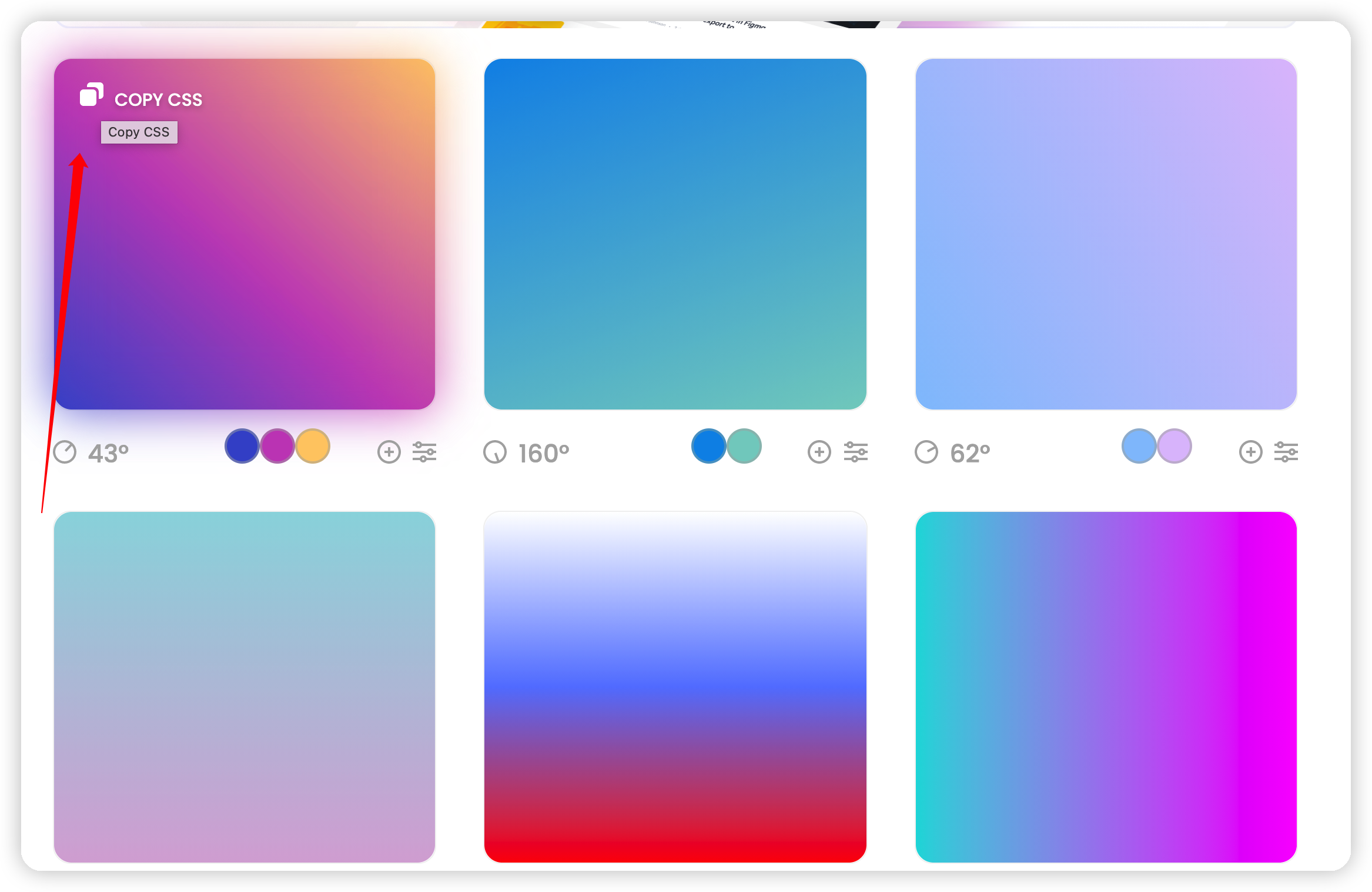
7.渐变
https://www.grabient.com/看这个网站即可,可以进行复制渐变的css代码
四、盒子模型
1.什么是盒子模型
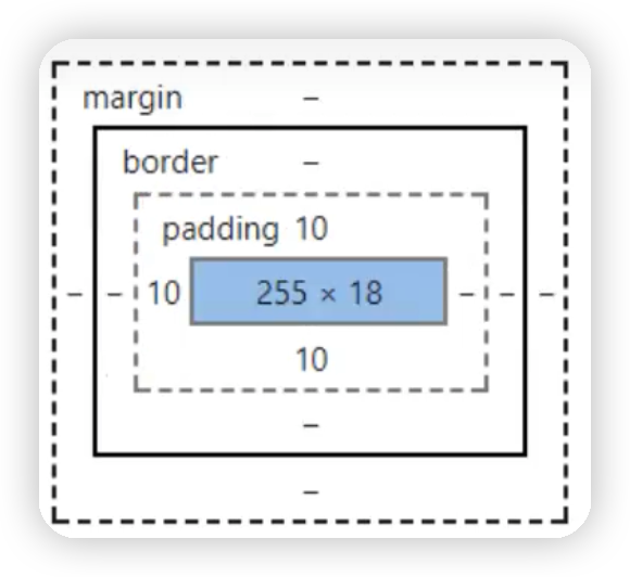
margin:外边距
padding:内边距
border:边框
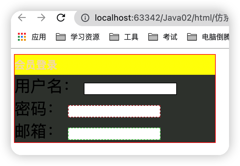
2.边框
点击查看代码
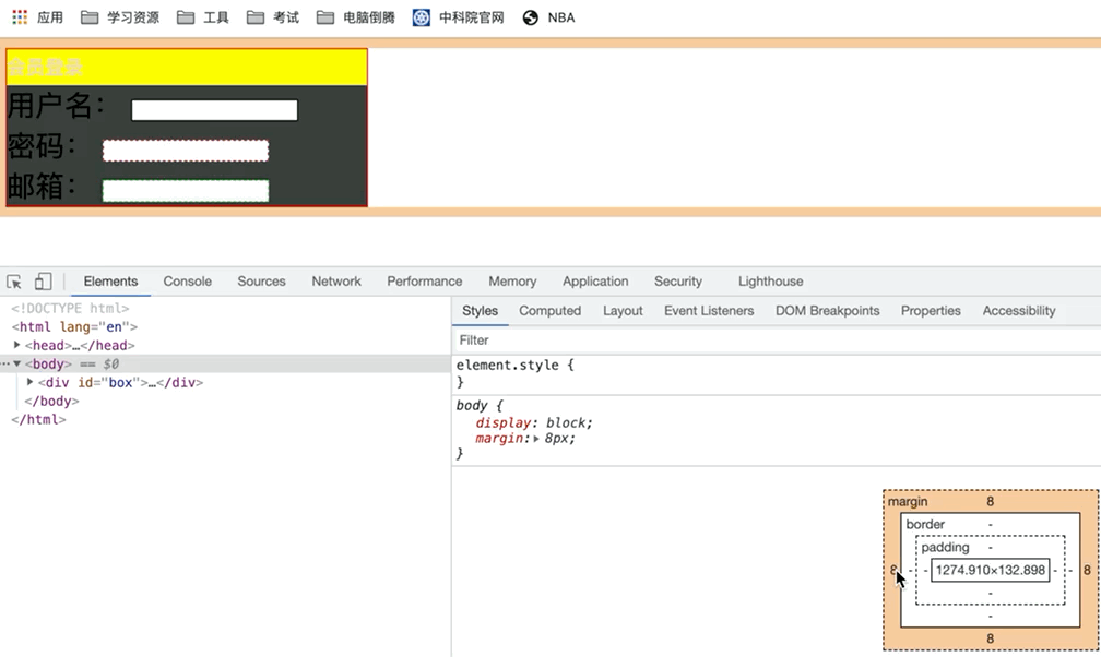
<!DOCTYPE html> <html lang="en"> <head> <meta charset="UTF-8"> <title>Title</title> <style> /*h2,ul,l,a,body{*/ /* !*body总有一个默认的外边距margin:0,常见操作*!*/ /* margin: 0;*/ /* padding: 0;*/ /* text-decoration: none;*/ /*}*/ #box{ width: 300px; border:1px solid red; } form{ background: #3b403b; } h2{ font-size:16px; background: yellow; line-height: 30px; color: wheat; margin: 0; } div:nth-of-type(1)>input{ border:1px solid black; } div:nth-of-type(2)>input{ border:1px dashed #bf2d2d; } div:nth-of-type(3)>input{ border:1px dashed #60e767; } </style> </head> <body> <div id="box"> <h2>会员登录</h2> <form action="#"> <div> <span>用户名:</span> <input type="text"> </div> <div> <span>密码:</span> <input type="text"> </div> <div> <span>邮箱:</span> <input type="text"> </div> </form> </div> </body> </html> 运行结果图
3.内外边距
内外边距可以通过如下方式区调节内外边距的大小,以及调节内外边距代码的写法
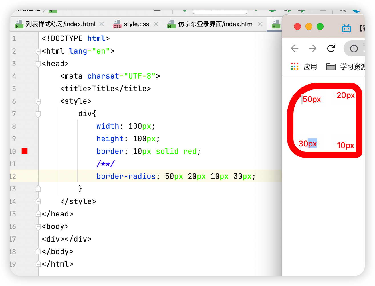
4.圆角边框
五、浮动
1.float
html代码
点击查看代码
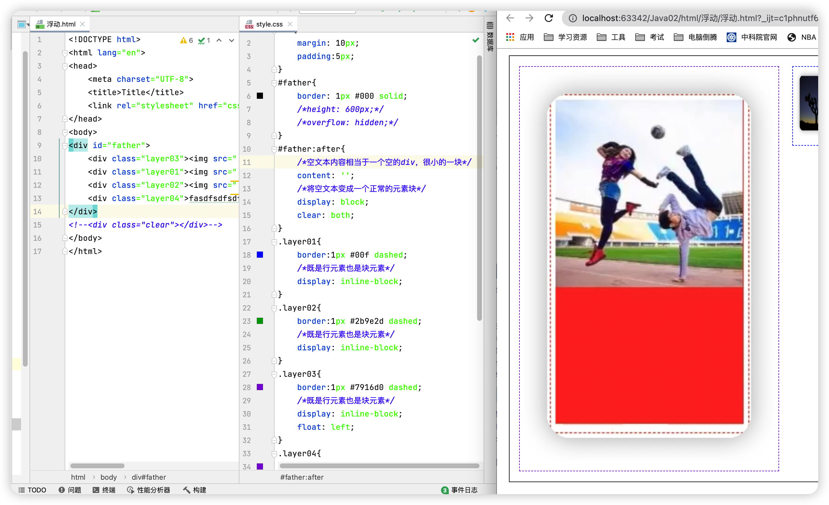
<!DOCTYPE html> <html lang="en"> <head> <meta charset="UTF-8"> <title>Title</title> <link rel="stylesheet" href="css/style.css"> </head> <body> <div id="father"> <div class="layer03"><img src="../../resource/Image/4.png" alt="Css3入门详解" alt=""></div> <div class="layer01"><img src="../../resource/Image/2.png" alt="Css3入门详解" alt=""width="100"height="100"></div> <div class="layer02"><img src="../../resource/Image/3.png" alt="Css3入门详解" alt="" width="100" height="100"></div> <div class="layer04">fasdfsdfsdfffudong发of很费时间</div> </div> </body> </html> Css代码
点击查看代码
div{ margin: 10px; padding:5px; } #father{ border: 1px #000 solid; } .layer01{ border:1px #00f dashed; /*既是行元素也是块元素*/ display: inline-block; } .layer02{ border:1px #2b9e2d dashed; /*既是行元素也是块元素*/ display: inline-block; } .layer03{ border:1px #7916d0 dashed; /*既是行元素也是块元素*/ display: inline-block; float: left; } .layer04{ border:1px #7916d0 dashed; /*既是行元素也是块元素*/ font-size: 12px; line-height: 23px; display: inline-block; float:right; } 运行结果图
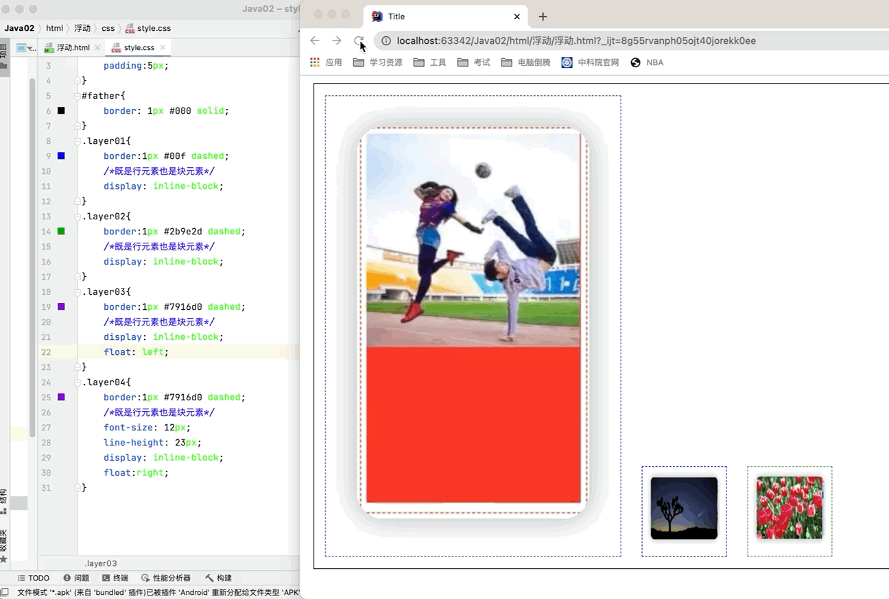
由上图知当第一张图片浮动起来之后就越过了边框的长度
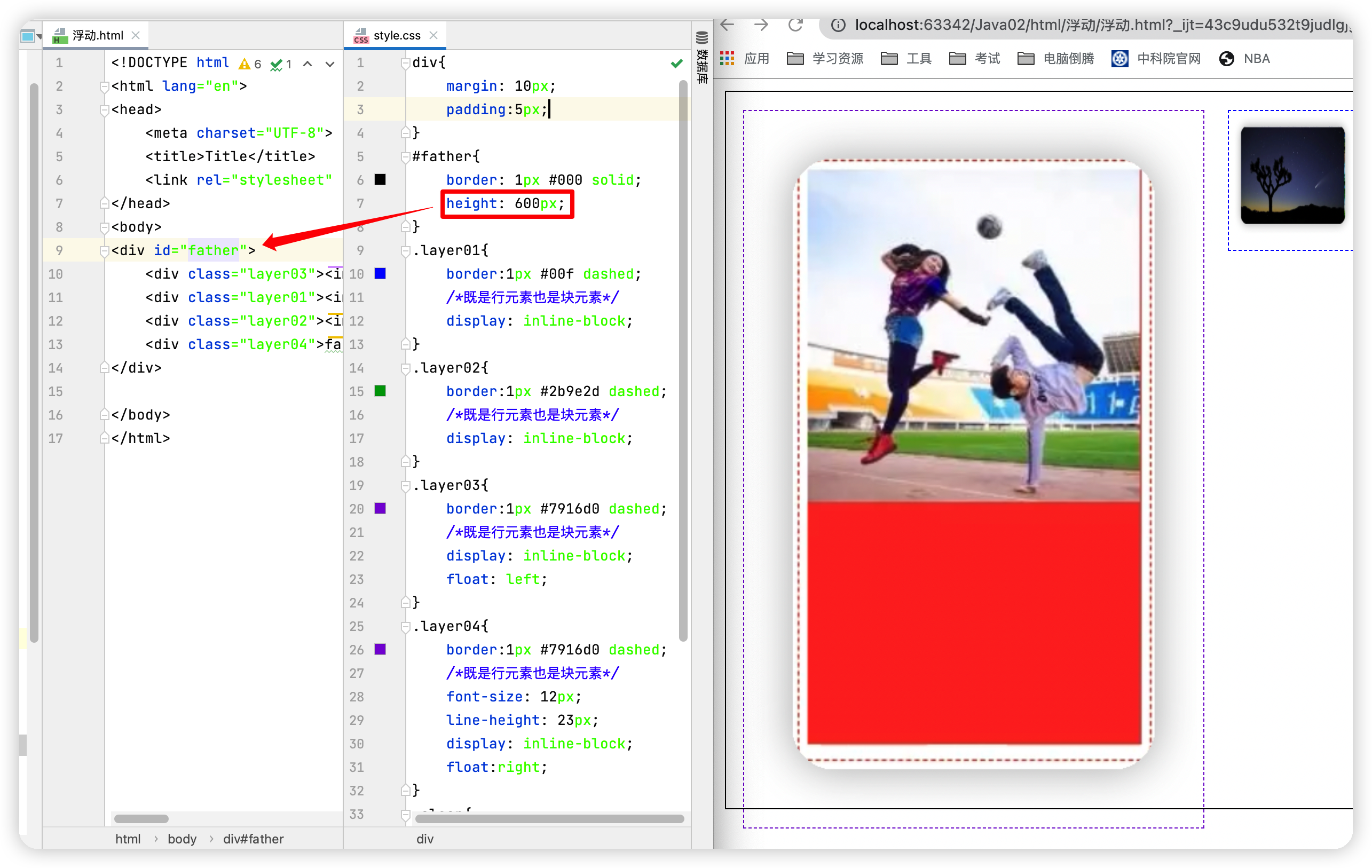
父级边框塌陷的解决方法:
①增加父级元素的高度
缺点:代码中避免使用div
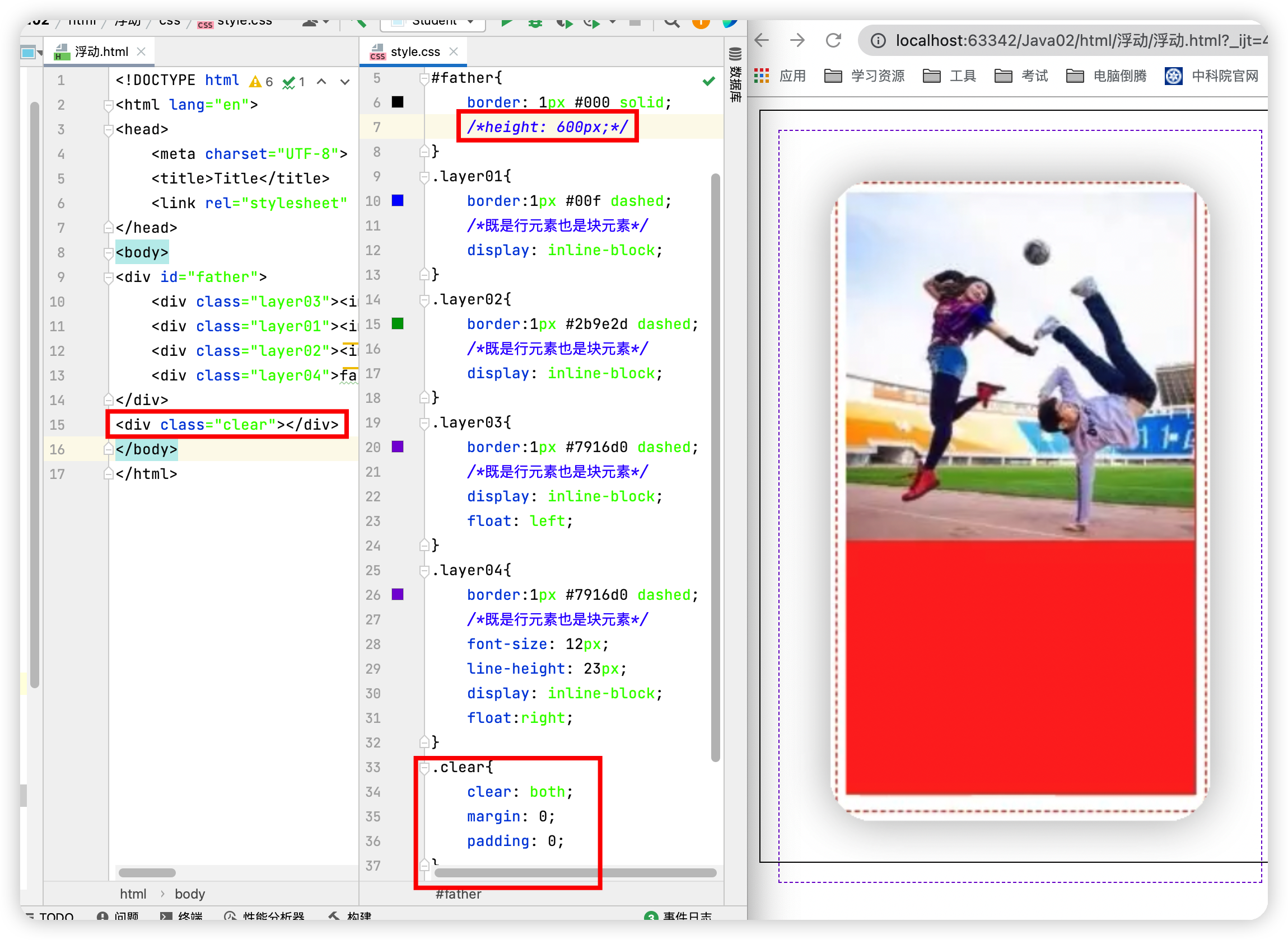
②增加一个空的div标签来清除浮动
缺点:元素假设有了固定的高度,就会被限制
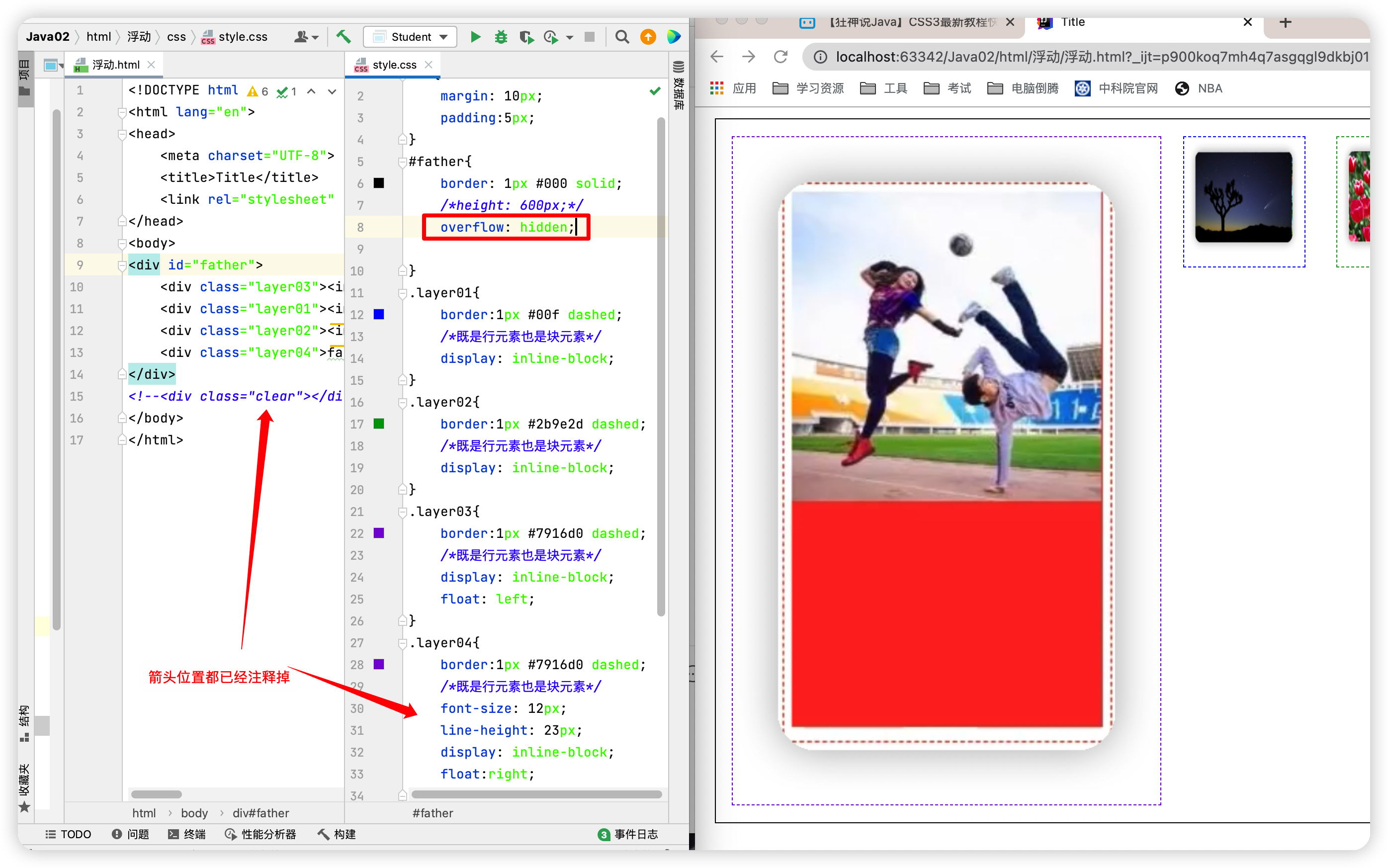
③在父级元素中增加一个overflow
缺点:下拉的一些场景避免使用
④父类中添加一个伪类:after
优点:推荐使用
六、定位
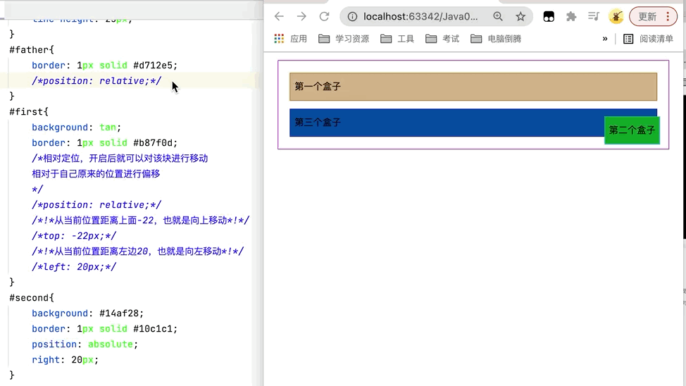
1.相对定位
点击查看代码
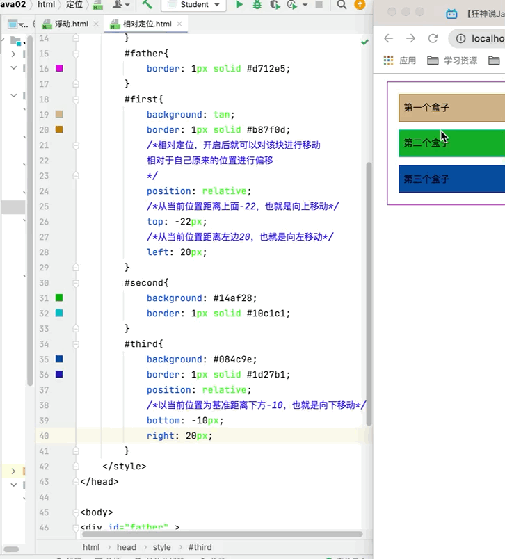
<!DOCTYPE html> <html lang="en"> <head> <meta charset="UTF-8"> <title>Title</title> <style> div{ /*外边距*/ margin: 10px; /*内边距*/ padding: 5px; font-size: 12px; line-height: 25px; } #father{ border: 1px solid #d712e5; } #first{ background: tan; border: 1px solid #b87f0d; /*相对定位,开启后就可以对该块进行移动 相对于自己原来的位置进行偏移 */ position: relative; /*从当前位置距离上面-22,也就是向上移动*/ top: -22px; /*从当前位置距离左边20,也就是向右移动*/ left: 20px; } #second{ background: #14af28; border: 1px solid #10c1c1; } #third{ background: #084c9e; border: 1px solid #1d27b1; position: relative; /*以当前位置为基准距离下方-10,也就是向下移动*/ bottom: -10px; /*以当前位置为基准距离右边20,也就是向做移动*/ right: -20px; } </style> </head> <body> <div id="father" > <div id="first">第一个盒子</div> <div id="second">第二个盒子</div> <div id="third">第三个盒子</div> </div> </body> </html> 运行结果图
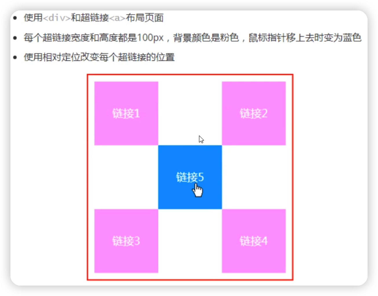
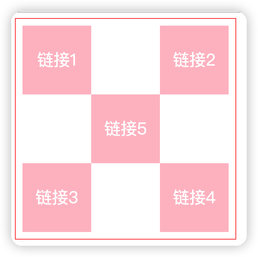
小练习见下图
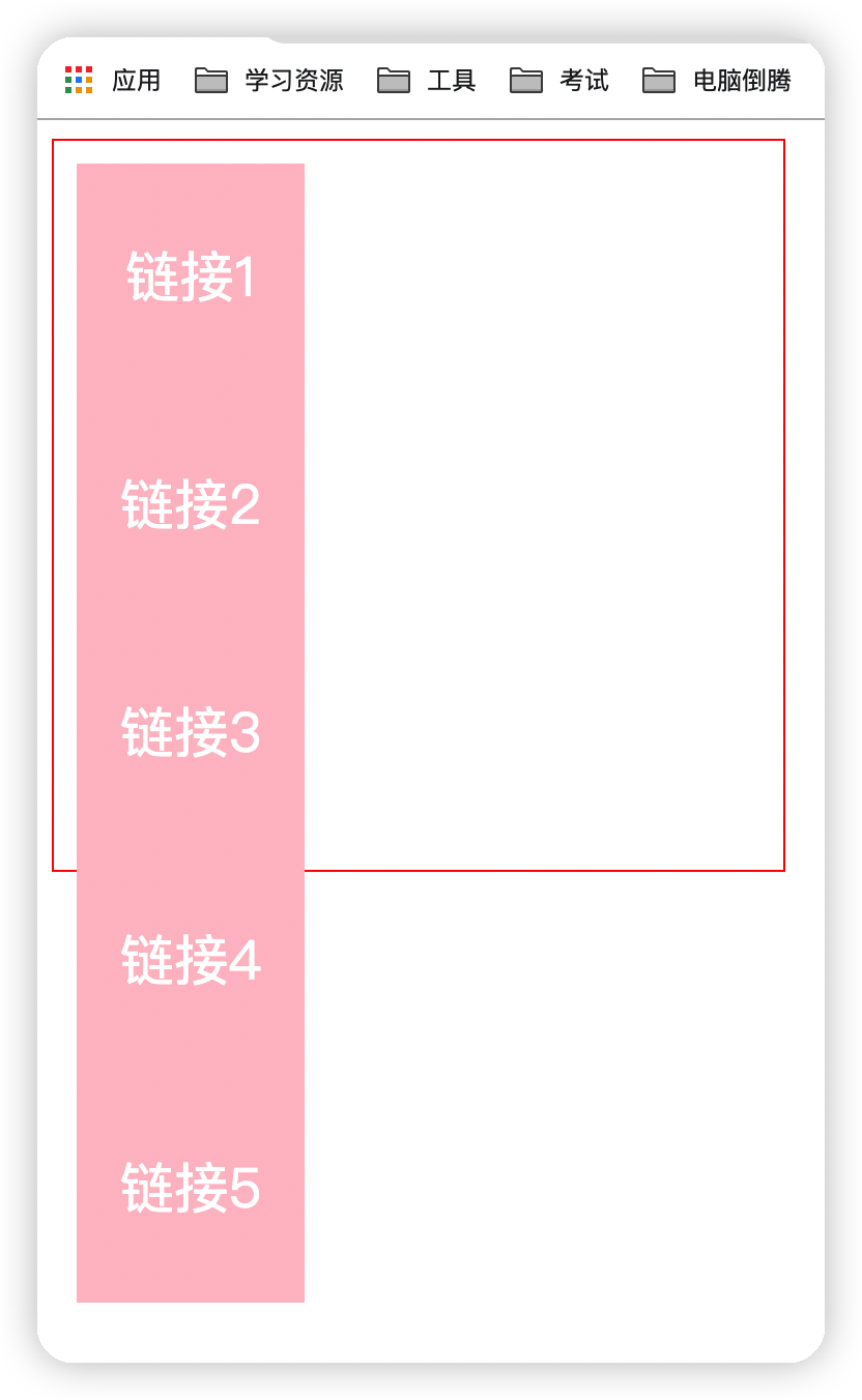
平移之前的状态
点击查看代码
<!DOCTYPE html> <html lang="en"> <head> <meta charset="UTF-8"> <title>Title</title> <style> #box{ border: 1px solid red; width: 300px; height: 300px; padding: 10px; } a{ display: block; width: 100px; height: 100px; background: pink; text-decoration: none; line-height: 100px; text-align: center; color: white; } a:hover{ background: #8d8dc6; } .a2,.a4{ position: relative; left: 200px; top: -100px; } .a5{ position: relative; top: -300px; right: -100px; } </style> </head> <body> <div id="box"> <a href="#" class="a1">链接1</a> <a href="#" class="a2">链接2</a> <a href="#" class="a3">链接3</a> <a href="#" class="a4">链接4</a> <a href="#" class="a5">链接5</a> </div> </body> </html> 运行结果图
2.绝对定位
①在没有父级元素定位的前提下,相对于浏览器定位 ②假设父级元素存在定位,我们通常会相对于父级元素进行偏移
③在父级范围内移动,相对于父级或浏览器的位置,进行指定的偏移,绝对定位后,它不在标准的文档流中,原来的位置不会被保留
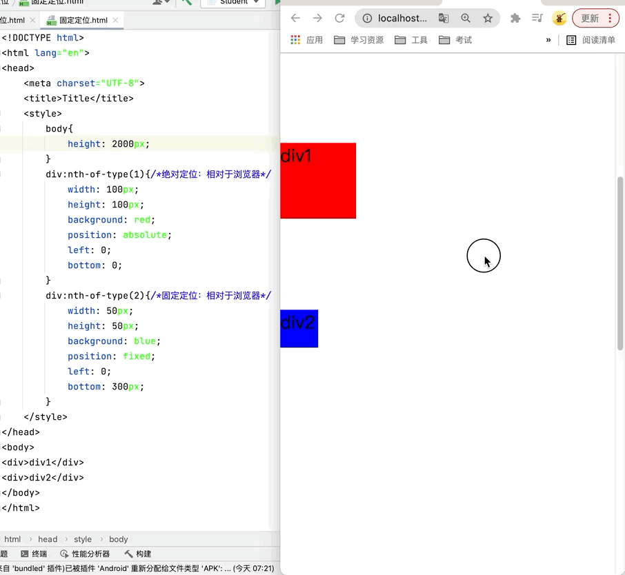
3.固定定位
点击查看代码
<!DOCTYPE html> <html lang="en"> <head> <meta charset="UTF-8"> <title>Title</title> <style> body{ height: 2000px; } div:nth-of-type(1){/*绝对定位:相对于浏览器*/ width: 100px; height: 100px; background: red; position: absolute; left: 0; bottom: 0; } div:nth-of-type(2){/*fixted,固定定位*/ width: 50px; height: 50px; background: blue; position: fixed; left: 0; bottom: 300px; } </style> </head> <body> <div>div1</div> <div>div2</div> </body> </html> 运行结果图
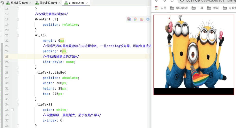
4.z-index
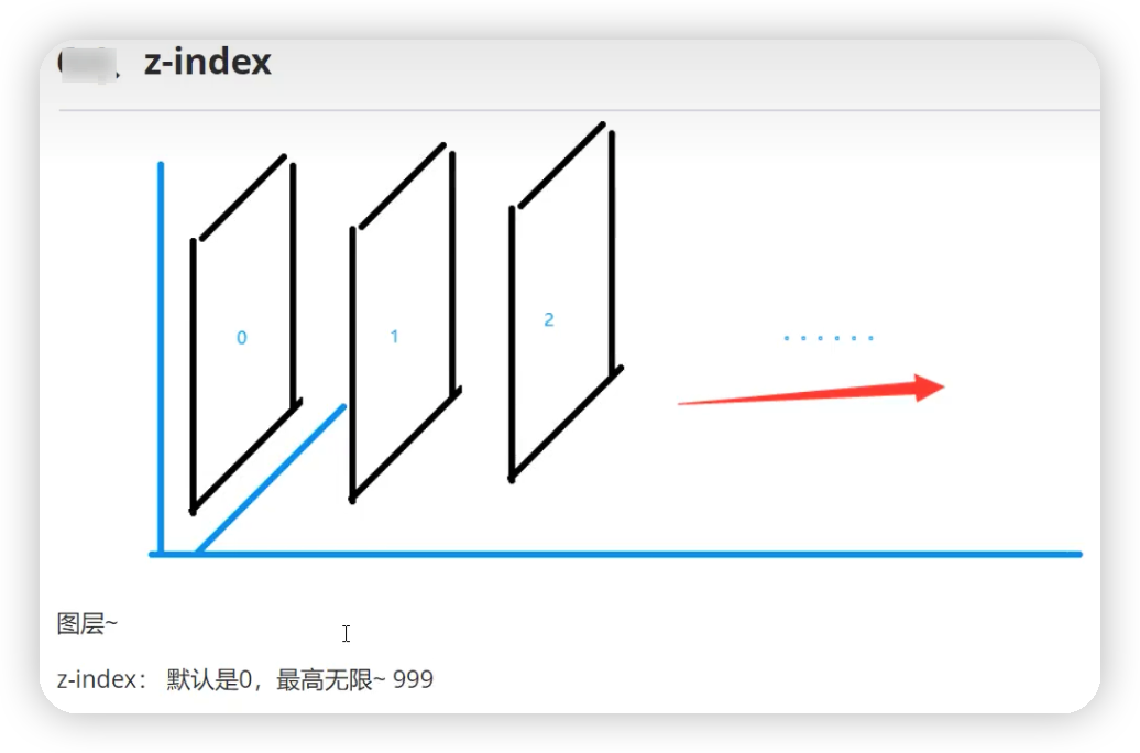
点击查看代码
<!DOCTYPE html> <html lang="en"> <head> <meta charset="UTF-8"> <title>Title</title> <style> #content{ padding: 0px; margin: 0px; width: 300px; height: 300px; border: red solid 1px; overflow: hidden; line-height: 25px; font-size: 12px; } /*父级元素相对定位*/ #content ul{ position: relative; } ul,li{ margin: 0px; /*无序列表的黑点是存放在内边距中的,一旦padding设为零,可能会直接去掉黑点*/ padding: 0px; /*手动去掉黑点的方法*/ list-style: none; } .tipText,.tipBg{ position: absolute; width: 300px; height: 25px; top: 275px; } .tipText{ color: white; /*设置层级,层级越大,显示在最外层*/ z-index: 0; } .tipBg{ background: black; /*设置透明度*/ /*opacity: 0.5;*/ } </style> </head> <body> <div id="content"> <ul> <li><img src="../../resource/Image/1.jpeg" alt="" height="300px" width="300px"></li> <li class="tipText">新手学习Java,看TWQ的博客,简单易懂</li> <li class="tipBg"></li> <li>时间:2099-01-01</li> <li>地点:月球一号基地</li> </ul> </div> </body> </html> 运行结果图