- A+
所属分类:Web前端
最全的CSS盒子(div)水平垂直居中布局,对CSS 布局掌握程度决定你在 Web 开发中的开发页面速度。
相对于屏幕

方法一:利用定位
<div class="box"></div> <style> body { background: green; } .box { position: fixed; top: 50%; left: 50%; margin: -150px 0 0 -150px; width: 300px; height: 300px; background: orange; } </style> 设置 Position 为 fixed 定位,top 和 left 各设置 50%,margin 设置负的容器宽高的一半。
方法二:利用 transform
<div class="box"></div> <style> body { background: green; } .box { position: fixed; top: 50%; left: 50%; width: 300px; height: 300px; transform: translate(-50%, -50%); background: orange; } </style> 设置 Position 为 fixed 定位,top 和 left 各设置 50%,transform 的 translate 设置上、左 -50%。
方法三:利用 margin auto
<div class="box"></div> <style> body { background: green; } .box { position: fixed; top: 0; right: 0; bottom: 0; left: 0; margin: auto; width: 300px; height: 300px; background: orange; } </style> 设置 Position 为 fixed 定位,上、右、下、左设置为 0,margin 设置为 auto。
相对于父容器
方法一:利用定位
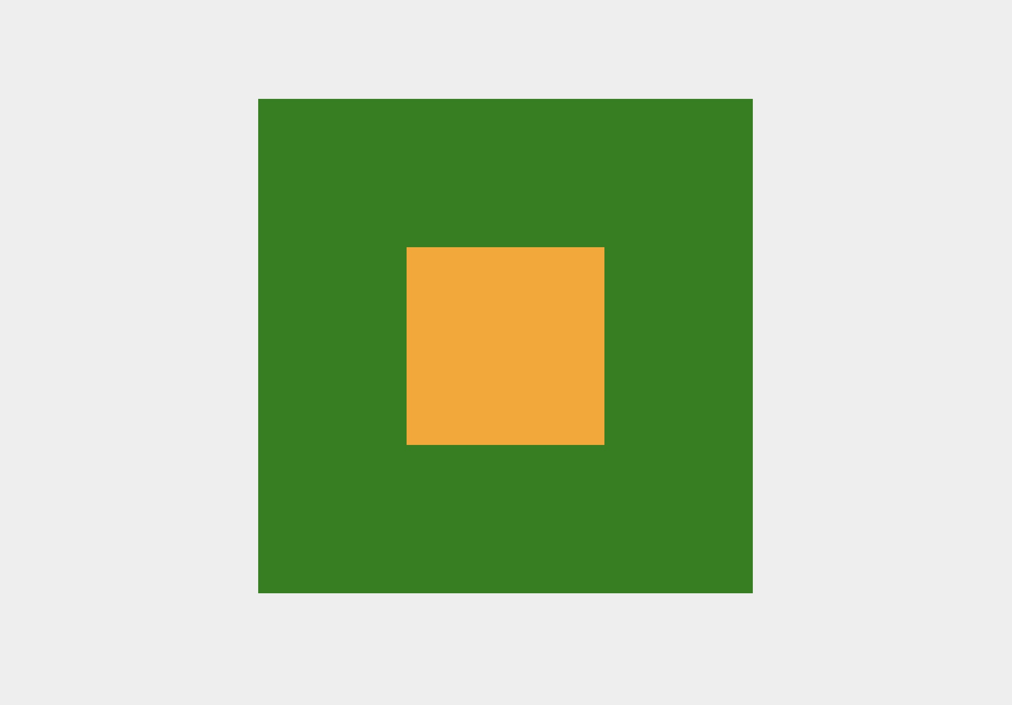
<div class="parent"> <div class="child"></div> </div> <style> .parent { position: relative; margin: 100px auto 0; width: 500px; height: 500px; background: green; } .child { position: absolute; top: 50%; left: 50%; margin: -100px 0 0 -100px; width: 200px; height: 200px; background: orange; } </style> 父容器设置为相对定位,子容器设置为绝对定位,top 和 left 各设置 50%,margin 设置负的子容器宽高的一半。
方法二:利用 transform
<div class="parent"> <div class="child"></div> </div> <style> .parent { position: relative; margin: 100px auto 0; width: 500px; height: 500px; background: green; } .child { position: absolute; top: 50%; left: 50%; transform: translate(-50%, -50%); width: 200px; height: 200px; background: orange; } </style> 父容器设置为相对定位,子容器设置为绝对定位,top 和 left 各设置 50%,transform 的 translate 设置上、左 -50%。
方法三:利用 margin auto
<div class="parent"> <div class="child"></div> </div> <style> .parent { position: relative; margin: 100px auto 0; width: 500px; height: 500px; background: green; } .child { position: absolute; top: 0; right: 0; bottom: 0; left: 0; margin: auto; width: 200px; height: 200px; background: orange; } </style> 父容器设置为相对定位,子容器设置为绝对定位,上、右、下、左设置为 0,margin 设置为 auto。
方法四:利用 flex
<div class="parent"> <div class="child"></div> </div> <style> .parent { position: relative; margin: 100px auto 0; width: 500px; height: 500px; display: flex; justify-content: center; align-items: center; background: green; } .child { width: 200px; height: 200px; background: orange; } </style> 父容器 display 设置为 flex,水平垂直设置为居中。
方法五:计算父盒子与子盒子的空间距离
<div class="parent"> <div class="child"></div> </div> <style> .parent { margin: 100px auto 0; width: 500px; height: 500px; overflow: hidden; background: green; } .child { margin: 150px auto; width: 200px; height: 200px; background: orange; } </style> 计算父盒子与子盒子的空间距离。
微信交流群
前端面试:剑指 Offer (3群)