- A+
所属分类:Web前端
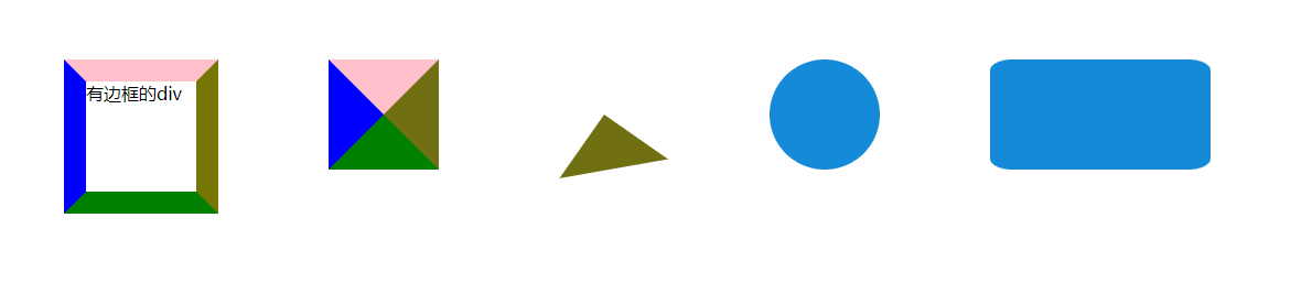
1、CSS画一个三角形:(div宽高为0,border存在且颜色不一)
step1: 设置宽度,高度为 0 的一个div盒子;
step2: 为了方便理解,将盒子的 4 个边框分别设置一样的宽度boder,不同的颜色;
step3: transparent将其他三个 边框隐藏掉,就能看到效果了。
如果对三角形的样式有特殊要求: 可以通过动画效果来实现: transform : rotate(80deg) 通过旋转实现
2、圆形,椭圆,圆角长方形:
通过改变 border-radius的比例,可以显示不同的图形,比如圆角正方形、圆角长方形
3、效果图:
4、代码:
<!DOCTYPE html> <html lang="en"> <head> <meta charset="UTF-8"> <meta http-equiv="X-UA-Compatible" content="IE=edge"> <meta name="viewport" content="width=device-width, initial-scale=1.0"> <title>Document</title> <style> body { display: flex; } div { margin: 50px 50px; } .step0 { width: 100px; height: 100px; border-top: solid 20px pink ; border-right: solid 20px rgb(118, 118, 5); border-bottom: solid 20px green; border-left: solid 20px blue; } .step1 { width: 0px; height: 0px; border-top: solid 50px pink ; border-right: solid 50px rgb(112, 112, 18); border-bottom: solid 50px green; border-left: solid 50px blue; } .triangle { width: 0px; height: 0px; border-top: solid 50px transparent; border-right: solid 50px rgb(112, 112, 18); border-bottom: solid 50px transparent; border-left: solid 50px transparent; /* 旋转 */ transform: rotate(80deg); } /* 画一个圆 */ .circle{ width: 100px; height: 100px; background-color: rgb(21, 138, 216); border-radius: 50%; } /* 画一个椭圆 */ .ellipse{ width: 200px; height: 100px; background-color: rgb(21, 138, 216); border-radius: 50%; } /* 通过改变 border-radius的比例,可以显示不同的图形,比如圆角正方形、圆角长方形 */ </style> </head> <body> <div class="step0"> 有边框的div </div> <div class="step1"> </div> <div class="triangle"> </div> <div class="circle"> </div> <div class="ellipse"> </div> </body> </html>